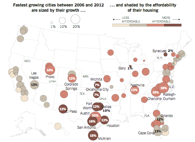
Some of the nation’s fastest growing cities are inland, away from the coast where housing prices are high. To support an article about the demographic shift, the New York Times created this map. Circle size represents growth over a six-year period while the colour of the bubble represents housing prices.
Credit for the piece goes to the New York Times graphics department.
Leave a Reply
You must be logged in to post a comment.