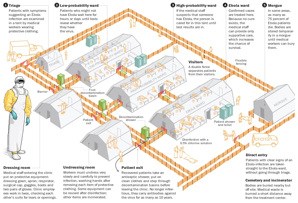
Last week we looked at the BBC and its rendition of an Ebola treatment centre. This week we are looking at the Washington Post and how they treated the same material. As you can imagine, with the same source material, the treatment is fairly similar. I do appreciate the colour applied to the various elements called out in the illustration. Though, to be super nitpick-y, I could probably do less orange with the fence. It becomes a bit distracting from some of the other details.
Credit for the piece goes to Patterson Clark.
Leave a Reply
You must be logged in to post a comment.