Tag: illustration
-
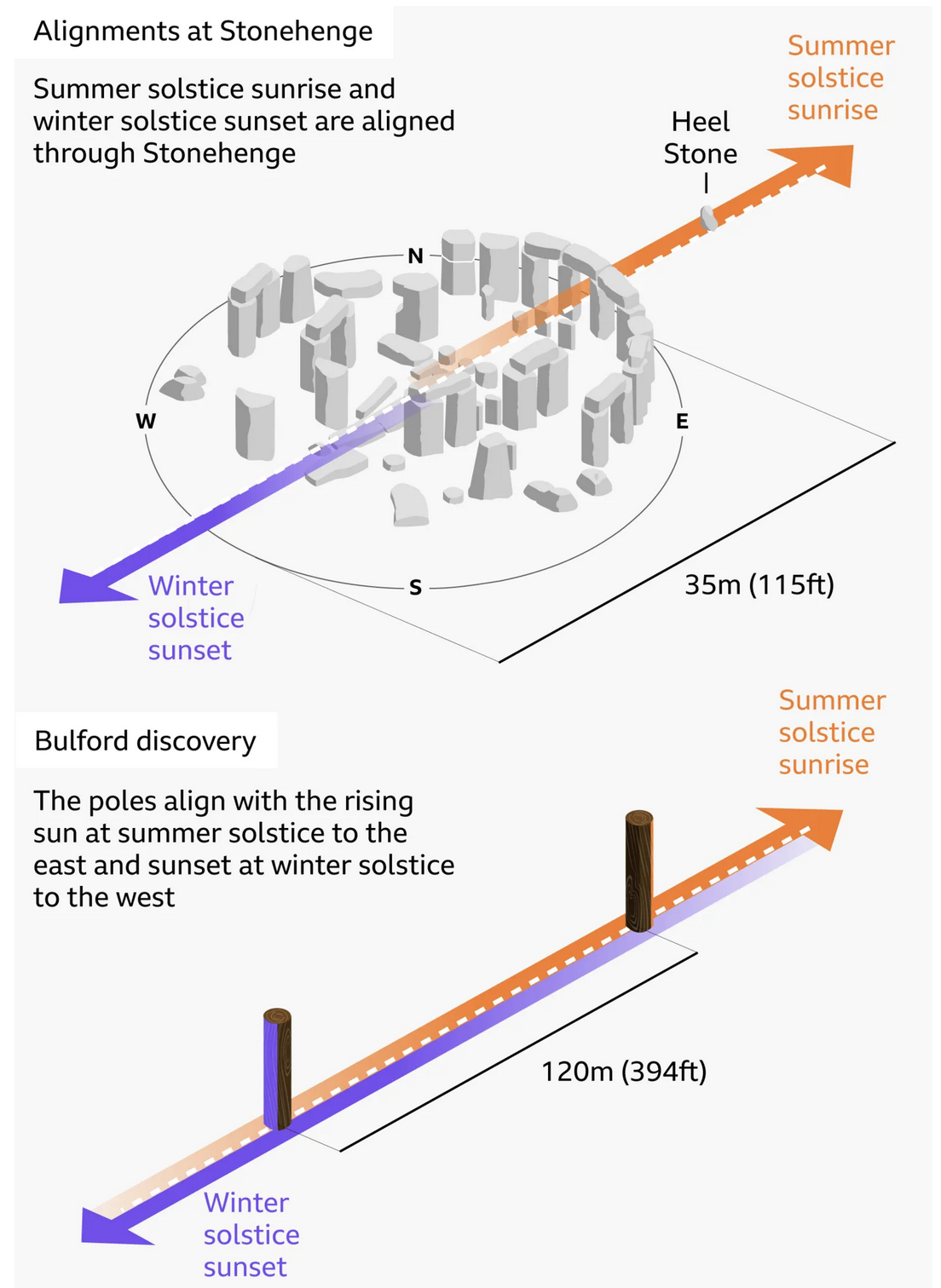
Stone Hard(ing)ly Beats Wood
At least in chronological dating. I debated posting this today or Monday, given that this weekend is a three-day holiday in the States, and that the selected graphic—in this case an illustration—explains the alignment of Stonehenge and—the focus of the BBC article wherein this graphic appears—a prehistoric, pre-Stonehenge, well, henge of wood posts only a…
-

Vexing Vexillology
Happy Friday, all. As a young child, I always loved flags. I collected international ones from random places in the US. I no longer collect them, but I still love their design and was fortunate to live in a city that has a good one: Chicago. (Philadelphia and Pennsylvania, sadly, do not have good flags.)…
-
Board of Modern Religious Architecture
Yesterday evening I received an e-mail about some of my work over on my Ganister website, where I try to capture, record, and preserve the history of the small quarry town in western Pennsylvania whence my grandfather came. The e-mail’s contents led me back to some old photographs I took from my trip to the…
-
The Long, Winding Road
At the beginning of the week I wrote about a table as a chart, for which I designed a light-duty interactive bar chart. Tables can be great, when used well, but they are not ideal for showing trends in data—hence the term data visualisation. But today is now Friday and we made it to the…
-
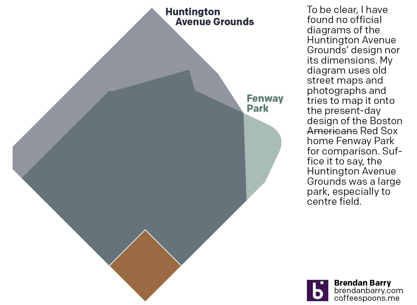
Back to Boston’s Beginning
And I don’t mean the city’s. No, 125 years ago today, the Boston Americans, later to be renamed the Boston Red Sox, played their first home game. Not at Fenway Park, mind you, but their original home—the Huntington Avenue Grounds. I decided to make a graphic comparing Huntington Avenue to Fenway, but could not find…
-

Just a Little Annoying
To be clear, this is a comment on a hero graphic—not an actual graphic representing data. Nevertheless, it does represent the borders of states within the United States. Most obviously, because there is not a giant state called Mosquita occupying the centre of the United States. (Fun fact: there is a Mosquito Coast located in…
-
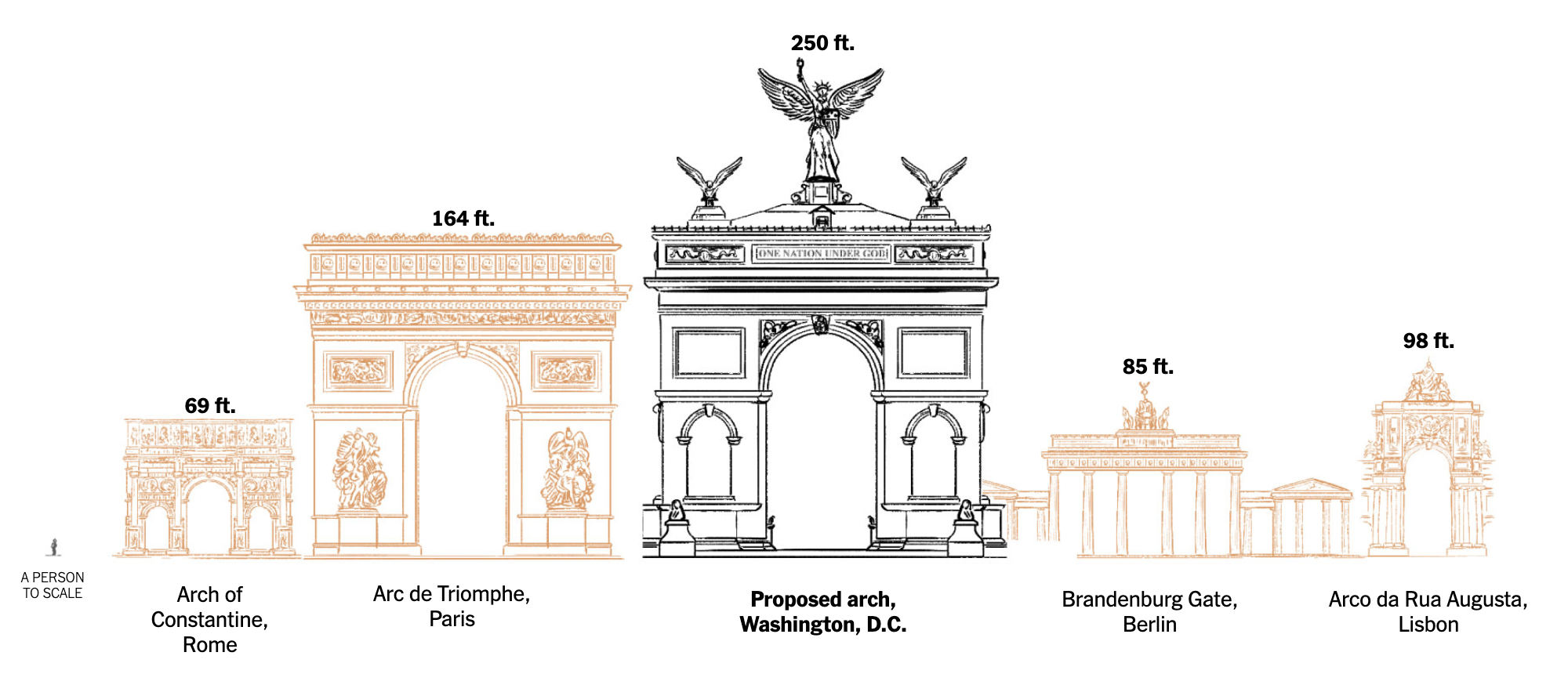
An Arch to Nowhere?
Last week the New York Times published an article comparing the proposed triumphal arch by President Trump to other triumphal arches both in the United States and abroad. Firstly, it ought to be pointed out, as my title alludes, significant questions remain about the legality of the proposed arch. Personally, I’m still waiting for Infrastructure…
-

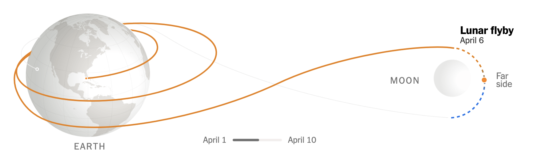
To the Moon and Beyond 2: Just Passing By
Today’s post was what I alluded to on Friday, thinking it was a fit then but realising perhaps it fit better here because of what a lot of graphics show when it comes to Artemis II and mankind’s return to (the orbit of) the Moon. Most graphics typically show the elongated eight track with the…
-
To the Moon, and Beyond!
At least a little beyond. Like the orbital height beyond. For those unaware, if the weather holds, later this evening East Coast time, NASA will launch the Artemis II mission from Cape Canaveral with the intention of sending a crew of four astronauts—three Americans, one Canadian—to the Moon. The last man on the Moon was…
-
Reticulating Splines
Happy Friday, all. In looking at my calendar the other day, I saw that in three weeks I will be in Appalachia for Orthodox Easter. That means driving through Pennsylvania’s Ridge and Valley region and then sleeping in the mountains. But wherefore the mountains? Thankfully, xkcd posted a map explaining why all the natural features.…