Let’s face it, lots of people think tables are boring. They convey data very quickly and very efficiently. But they often don’t look “pretty” enough. So, today, I just wanted to show a table from the Washington Post from last week.
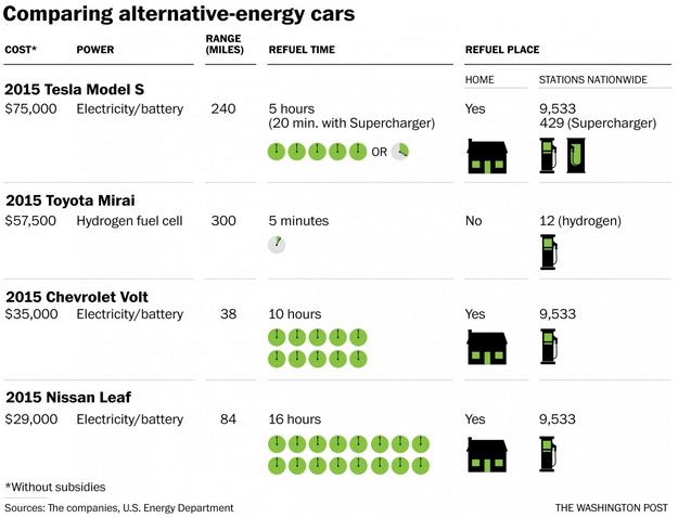
It does nothing fancy. Nor do the illustrations actually communicate the information more quickly or more clearly. But, look! Green clocks and charging stations!
Credit for the piece goes to the Washington Post’s graphics department.
Leave a Reply
You must be logged in to post a comment.