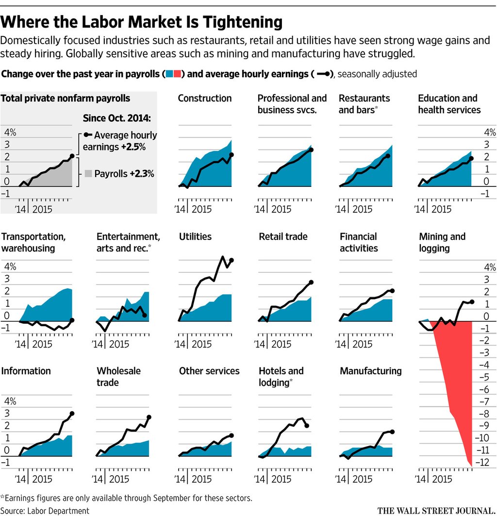
You should all know by now I am sucker for small multiples. So it should come as no surprise to you that I liked this piece from Friday from the Wall Street Journal. It looks at payroll and wage growth across various sectors in the American economy. And what I really like is that they took a space at the beginning to explain how to read the charts.

Credit for the piece goes to the Wall Street Journal graphics department.
Leave a Reply
You must be logged in to post a comment.