Tag: line chart
-
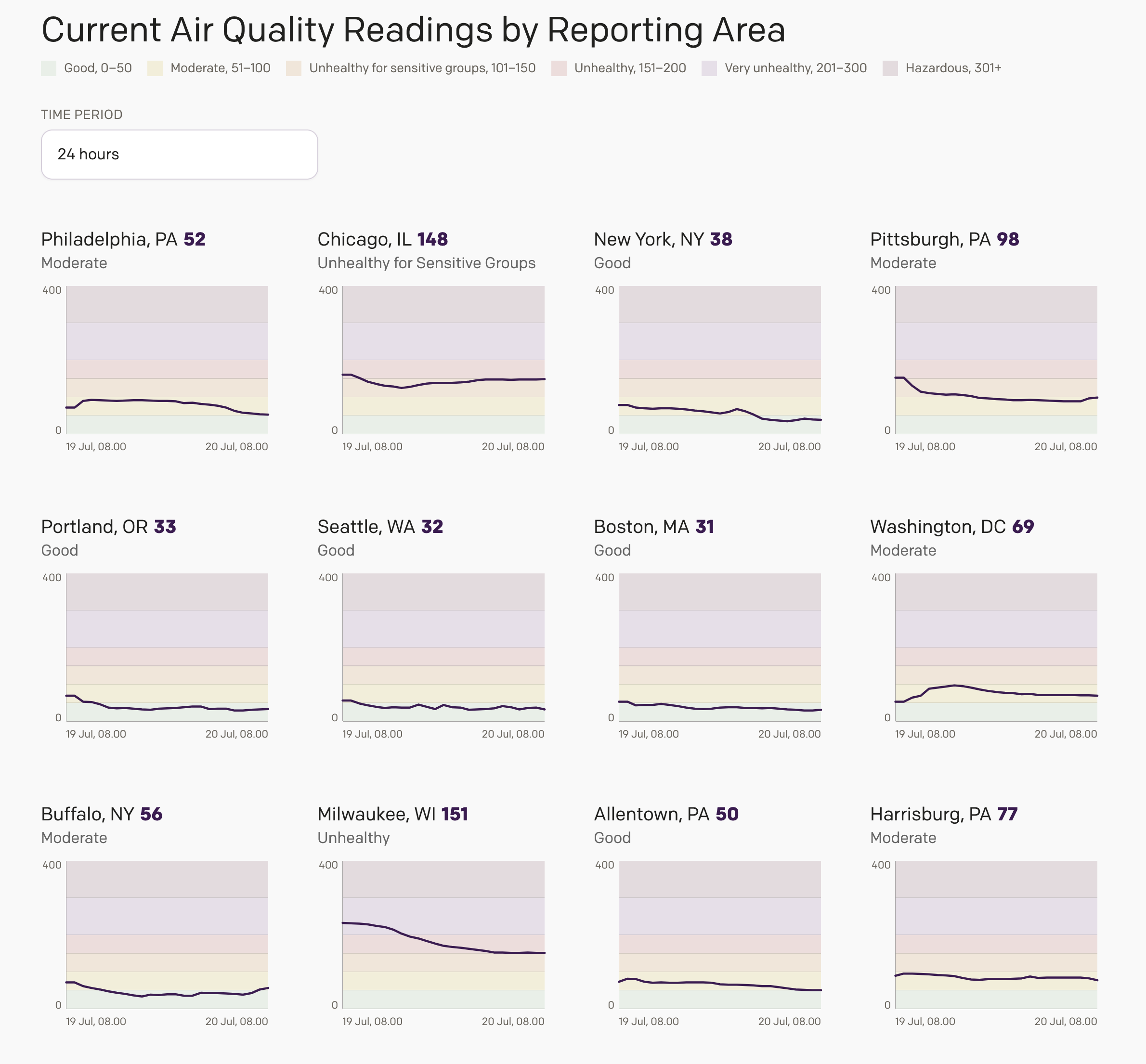
Smoke Here, Smoke There, Smoke Was (Almost) Everywhere
Friday I wrote about an interactive air quality web application I designed for my website after seeing a similar type of dynamically generated graphic in my local rag, the Philadelphia Inquirer. I did not have a lot of time to finish the project, and so it lacked the planned overview page, where I intended to…
-
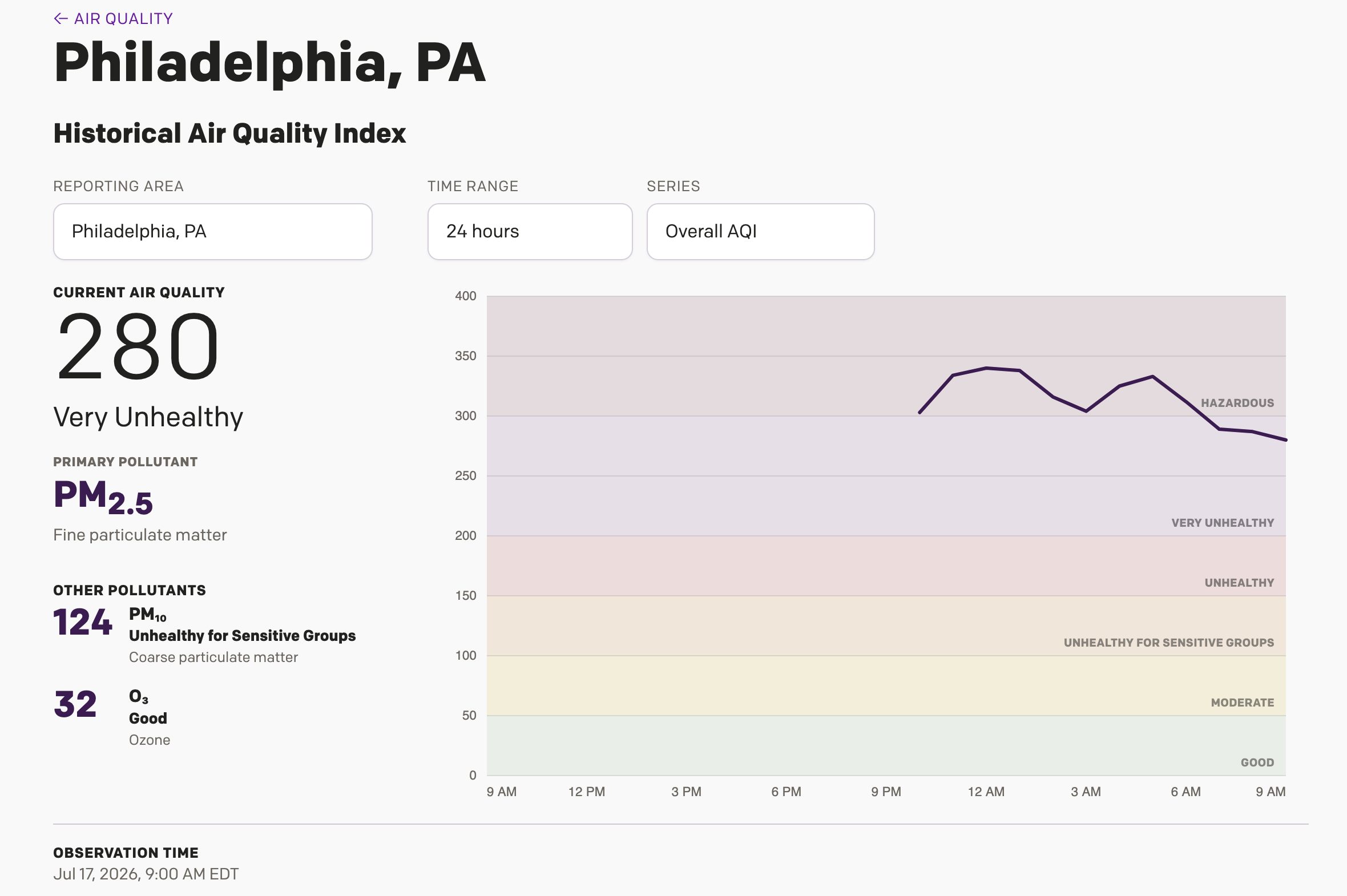
Is It Always Smoky in Philadelphia?
Yesterday I wrote about a Philadelphia Inquirer article, which included an interactive display showing different monitoring stations around the Philadelphia area cataloguing just how bad the Minnesota/Canadian wildfire smoke is in the region. I noted during my piece that it was unclear if the little bars were actually recording the AQI values or just a…
-
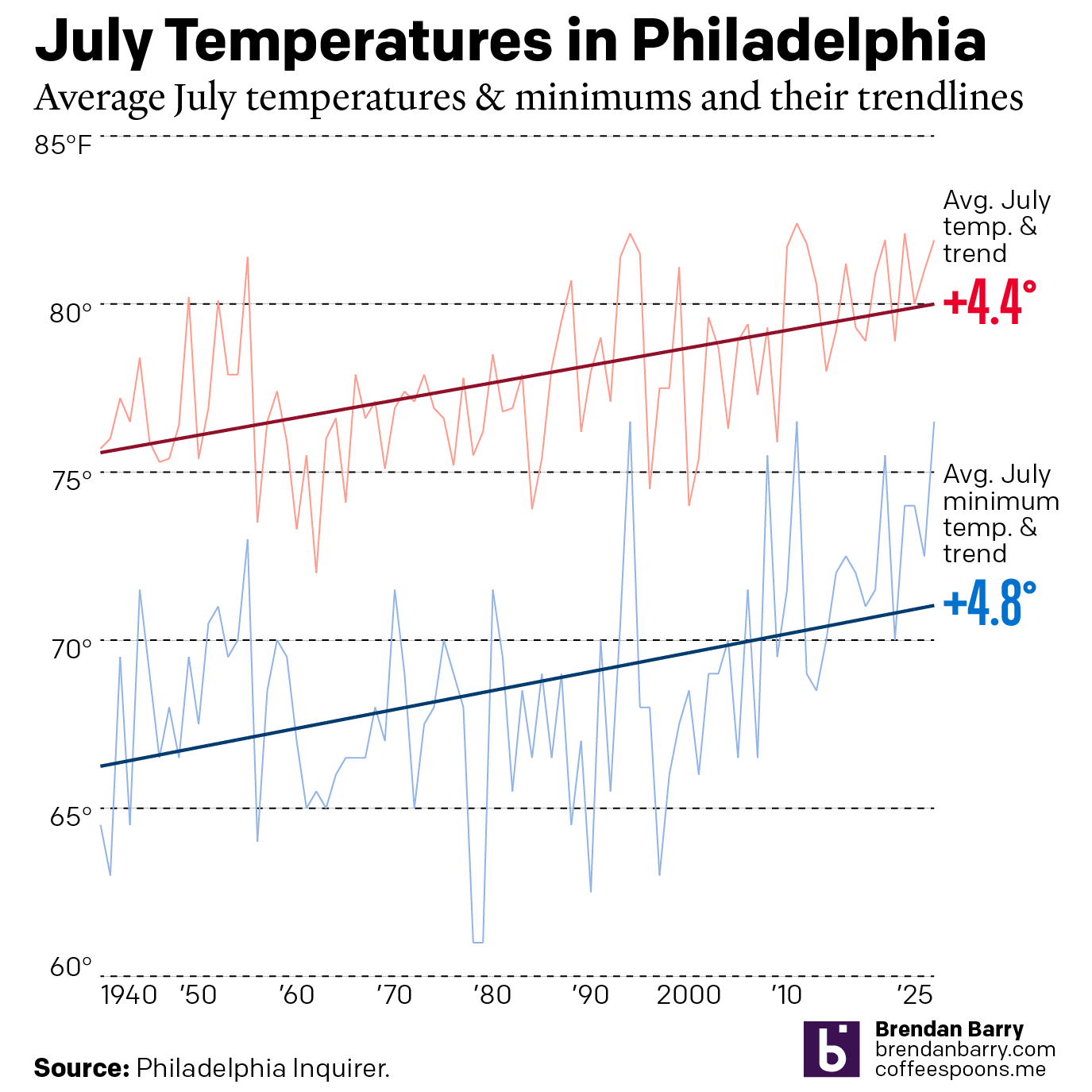
Just a Wee Bit Warm
This past weekend was a hot one in Philadelphia (and many other places across the eastern United States). As we enter July, the Philadelphia Inquirer published an article examining climate change’s impact on summer temperatures. Spoiler: it’s hotter. The article included two interactive line charts. The first one plotted the average high temperature of July…
-
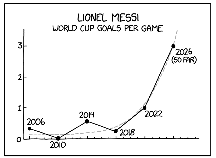
A Messi Hat Trick
Messi. Messy. Get it? The World Cup continues across North America, including in my own hometown of Philadelphia. Argentina has not played in the city, but even here in Philadelphia, you could hear of Lionel Messi’s scoring three goals—a hat trick—against Algeria a little more than a week ago. Messi, the famous Argentinian footballer, then…
-
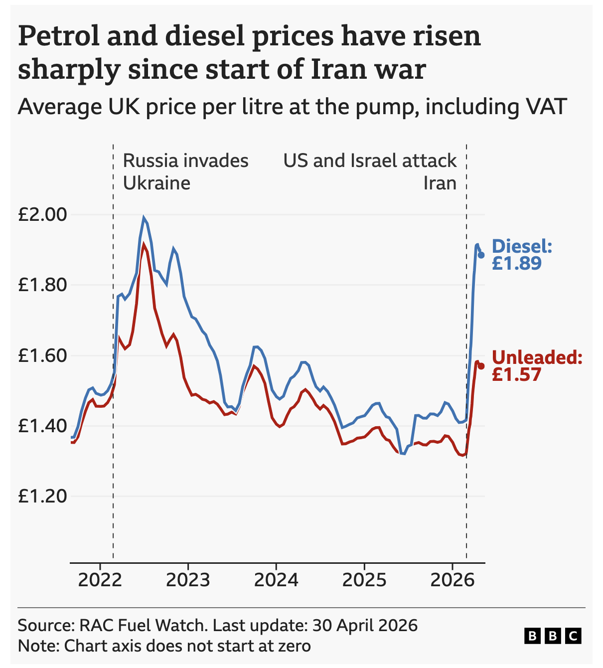
Pain at the Pump Across the Pond
Over the past week I did a bit more driving than usual. Every single day I watched the digital display at the local Wawa tick up by a penny or two. But I read the news and see reports of fuel shortages and restrictions, especially in Europe and Asia. This morning the BBC reported on…
-
The Axis in Poland
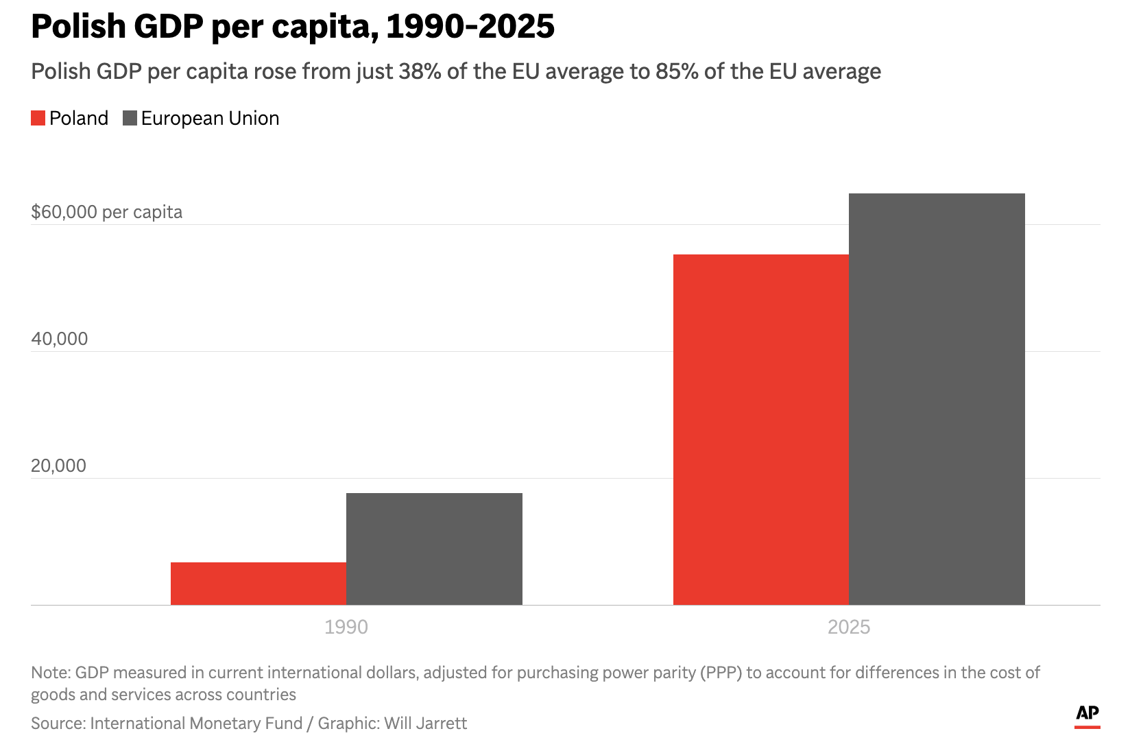
Earlier this week I read an Associated Press (AP) article about Poland’s economic growth since the end of Communism in the former Soviet-bloc state. Generally speaking, things are good in Eastern Europe, though a revanchist Russia to Poland’s east rekindles memories of an earlier era and the disaster after the Molotov–Ribbentrop Pact. The article included…
-
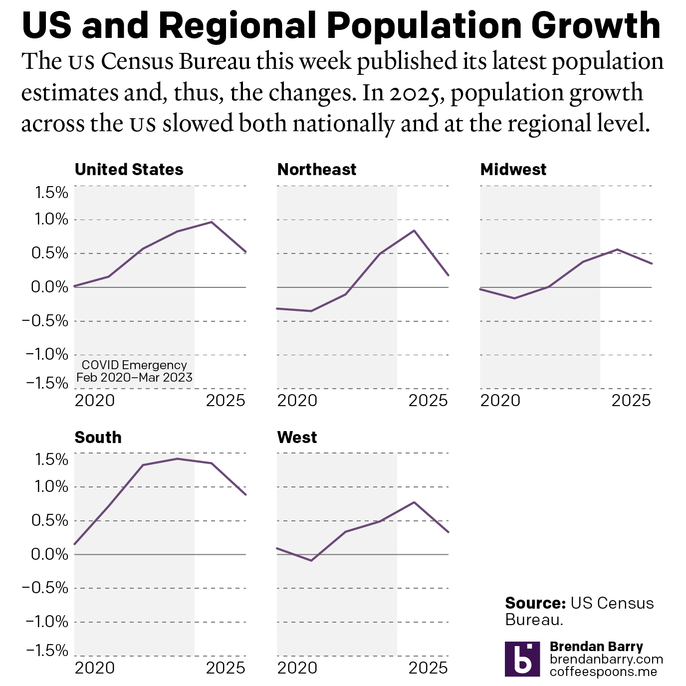
The Slowing of the Growth
This week the US Census Bureau released their population estimates for the most recent year and that includes the rate changes for the US, the Census Bureau defined regions, and the 50 states and Puerto Rico. I spent this morning digging into some of the data and whilst I will try to later to get…
-
Space Is Cool
Well we made it to Friday. One of my longtime goals is to see the aurora borealis, or Northern Lights. My plan for the winter of 2020 was to travel to Norway, maybe visit a friend, and then head north to Tromsø and take in the Polar Night and, fingers crossed, catch the show. Then…
-
Pour One Out—For Your Liver
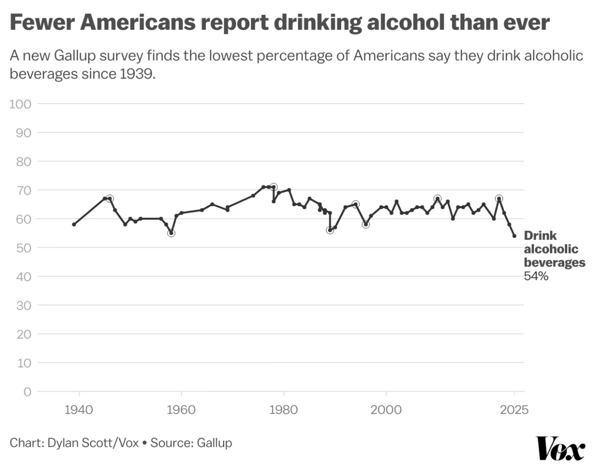
Last month Vox published an article about the trend in America wherein people are drinking less alcohol. They cited a Gallup poll conducted since 1939 and which reported only 54% of Americans reported partaking in America’s national tipple—except for that brief dalliance with Prohibition—making this the least-drinking society since, well, at least 1939. Vox charted…
-
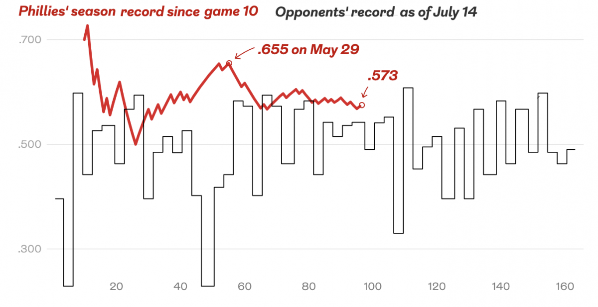
Bring on the Beantown Boys
For my longtime readers, you know that despite living in both Chicago and now Philadelphia, I am and have been since way back in 1999, a Boston Red Sox fan. And this week, the Carmine Hose make their biennial visit down I-95 to South Philadelphia. And I will be there in person to watch. This…