Last week the New York Times published a great piece on the shrinking middle class and they used a series of small multiples to tell the story. They broke the story up into several sections, based on the trends in the data, e.g. in the screenshot below the designer sorted by areas where the middle class fell but upper class rose.
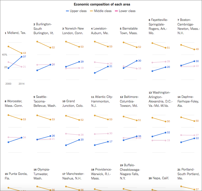
From the responsive design side of things, the piece works well on narrower screens too, because the design choice of small multiple tiles permits the piece to stack and rearrange tiles.
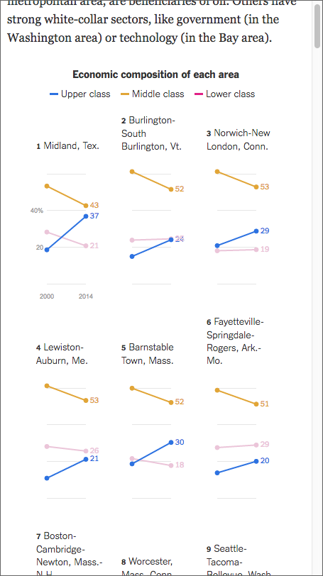
Credit for the piece goes to Quoctrung Bui.
Leave a Reply
You must be logged in to post a comment.