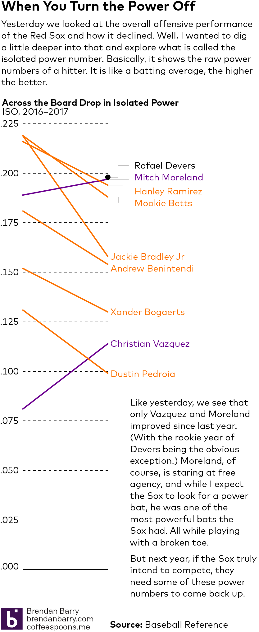
Following on yesterday’s post about the Red Sox offence, I wanted to follow up and look into their power numbers. So here we have a smaller scale graphic. Nothing too fancy, but the data backs what my eyes saw all year. A definite power drain up and down the Red Sox lineup in 2017.
Leave a Reply
You must be logged in to post a comment.