Tag: sports
-
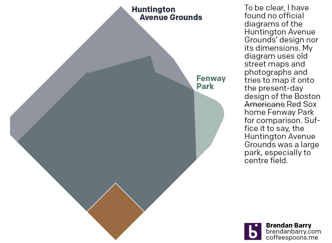
Back to Boston’s Beginning
And I don’t mean the city’s. No, 125 years ago today, the Boston Americans, later to be renamed the Boston Red Sox, played their first home game. Not at Fenway Park, mind you, but their original home—the Huntington Avenue Grounds. I decided to make a graphic comparing Huntington Avenue to Fenway, but could not find…
-
Damon the Bad
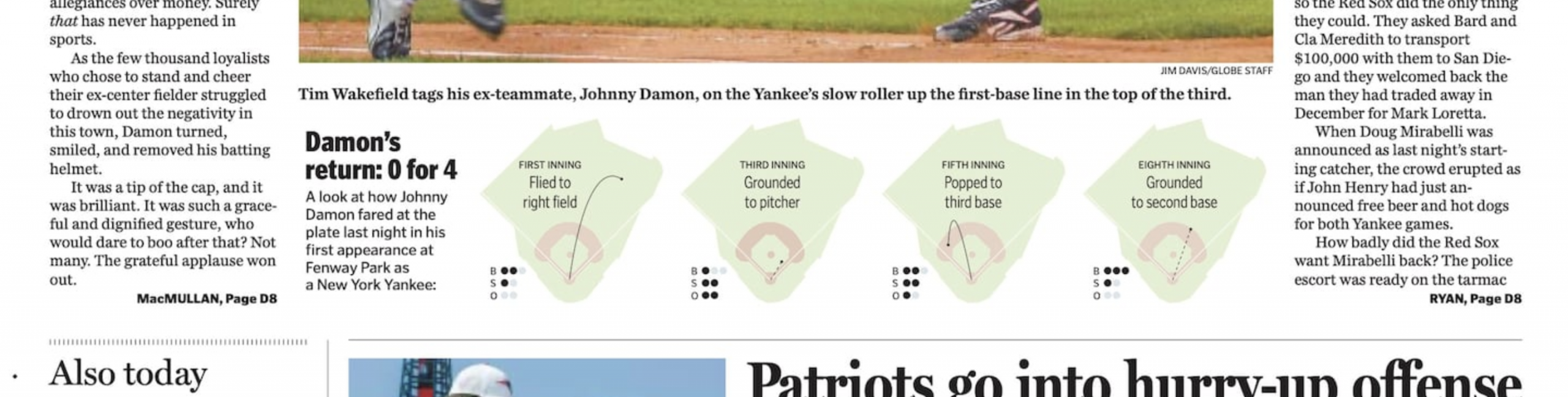
I guess we’re going to stick with the baseball this week. I forgot this year is the 20th anniversary of the Doug Mirabelli game. For those unfamiliar with the story, the Red Sox long employed knuckleballer Tim Wakefield, one of my all-time favourite pitchers. The knuckleball, however, is very difficult to catch because its lack…
-

AC to Philly Expressway?
And I am not talking about Atlantic City. No, on Saturday, the Red Sox fired their manager Alex Cora and his entire staff. Or, rather, the staff loyal to him. I wrote about that on Monday. Little did we know that Saturday night, Alex Cora and the chief of baseball operations for the Philadelphia Phillies,…
-
Binders Full of Ballplayers
March is International Women’s Month. This year it is also the month within which the baseball season starts. The Sox played in Cincinnati and I have lots of new things to cover and I am sure I will bring some of them up here on Coffeespoons. (Looking at NESN’s new scorebug in particular.) One thing…
-

Opening Day
Happy Opening Day, everyone. Baseball is back. The Red Sox are back. Last year, I only posted my predictions on social media because they don’t include charts or graphs really. (But I did revisit them at year’s end.) These are mostly just tables. But, why not? Last year, shortly after Opening Day, I wrote about…
-

Philadelphia Blue Jays
Last weekend one of my good mates and I went out watch Game 7 of the World Series, wherein the Los Angeles Dodgers defeated the Toronto Blue Jays for Major League Baseball’s championship. Whilst we watched, I pointed out that the Jays’ pitcher at the moment hailed from a suburb of Philadelphia. He was well…
-
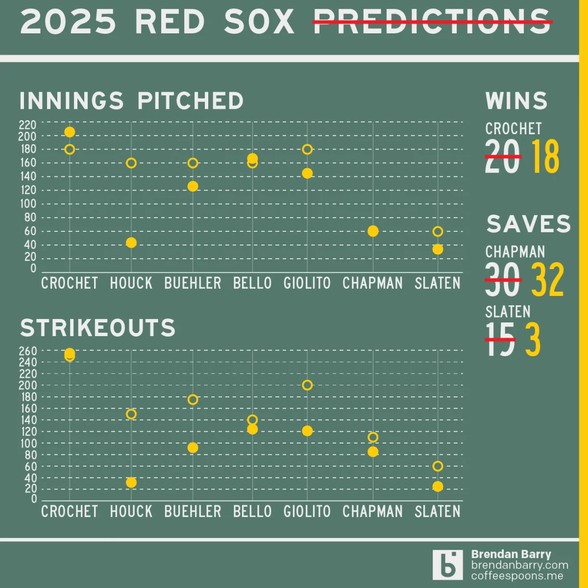
Revisiting My 2025 Red Sox Predictions
Back in March I posted my predictions for the 2025 Boston Red Sox on my social media feeds. I chose not to post it here, because the images had no real data visualisation and the only real information graphic was my prediction of the playoffs via a bracket. I did, however, write about how the…
-
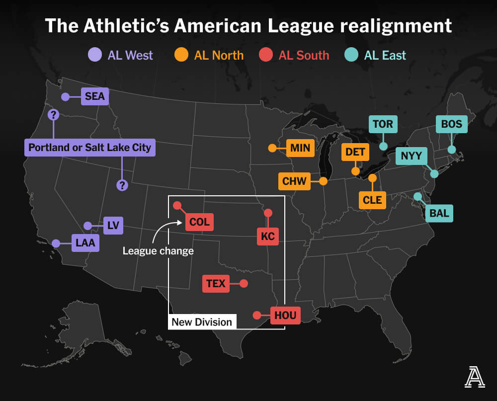
MLB’s Realignment
Last weekend, Major League Baseball Commissioner Rob Manfred created a mild furore when he discussed the sport’s looming expansion and how it would likely prompt a geographic realignment. I am old enough I still recall baseball’s two leagues—the American and National—organised into only two divisions—East and West. In the early 1990s, baseball expanded and created…
-
Bring on the Beantown Boys
For my longtime readers, you know that despite living in both Chicago and now Philadelphia, I am and have been since way back in 1999, a Boston Red Sox fan. And this week, the Carmine Hose make their biennial visit down I-95 to South Philadelphia. And I will be there in person to watch. This…
-
Tired of These Motherf*cking Sox on This Motherf*cking Plane
At least, that’s what I imagine South Siders saying in Chicago as they watch the White Sox team charter plane land at Midway. For those not following America’s Major League Baseball season, the Chicago White Sox are one of two clubs claiming Chicago as their home. (The other being the Cubs.) And the White Sox—not…