This past weekend I read an article over on Reuters about the cost of electricity for Americans, especially as it pertains to unfinished electrical generation projects. To be fair, I did not read it thinking I would be getting an opportunity to talk about something here on Coffeespoons. Rather, I just received a letter from my own electricity provider warning me that my rates were going up next month.
Joy.
I digress, when I was reading the article I reached a point where I ran into this graphic.
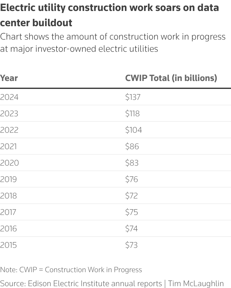
At first I wondered if maybe the image of a table calling itself a chart was a fallback in case something broke. Alas, no. I waited a few days to see if the graphic was ultimately replaced. Perhaps a designer threw it in there for a quick publish, meaning to return to the article later and upload something else. Alas, no.
Tables are great, make no mistake. They help you quickly find precise values in precise locations. If I need to know the Construction Works in Progress (CWIP) value in 2018 to compare it to 2025, easy peasy. Tables, however, are not great at showing trends visually. So I opted to give it a go, but using some new things I have been working on in terms of adding interactive data visualisation directly to my Coffeespoons posts for occasions just like this. Thus I present the CWIP chart.
I disagree with the current trend of placing data labels all over the chart. Instead, the interactivity makes those available to users on mouseover or tap. This is not meant to be a research tool with precise values available for analysts, rather this visualises the trend of increasing investment in electricity generation. If the user needs the precise value, to the billions, he or she can interact with the bar.
Conceptually, this is just a simple bar chart—nothing too fancy here. The main takeaway from the data is the rising investment and construction, which a series of growing bars does very effectively.
Credit for the original piece goes to Tim McLaughlin.
Credit for the interactive piece is mine.
Comments
One response to “Go Fly a Kite”
[…] the beginning of the week I wrote about a table as a chart, for which I designed a light-duty interactive bar chart. Tables can be great, […]