
Tag: interactive design
-
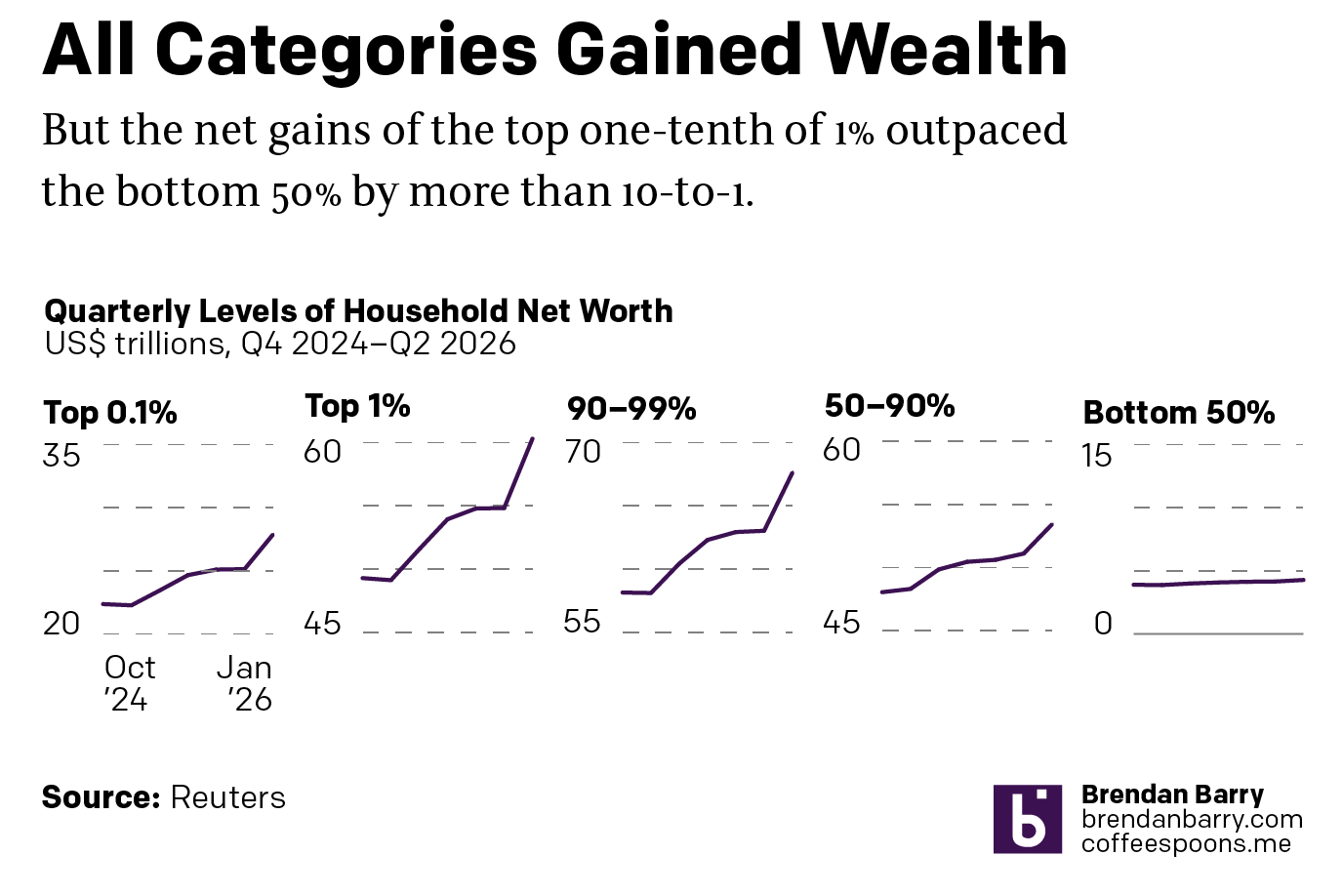
When Height Matters
I was reading an interesting article from Reuters this weekend about the disparities in wealth in the United States. The article included this interactive graphic, small multiples of line charts showing US household wealth from October 2024 through January 2026. At surface level we have a nice little graphic. We are looking at wealth across…
-
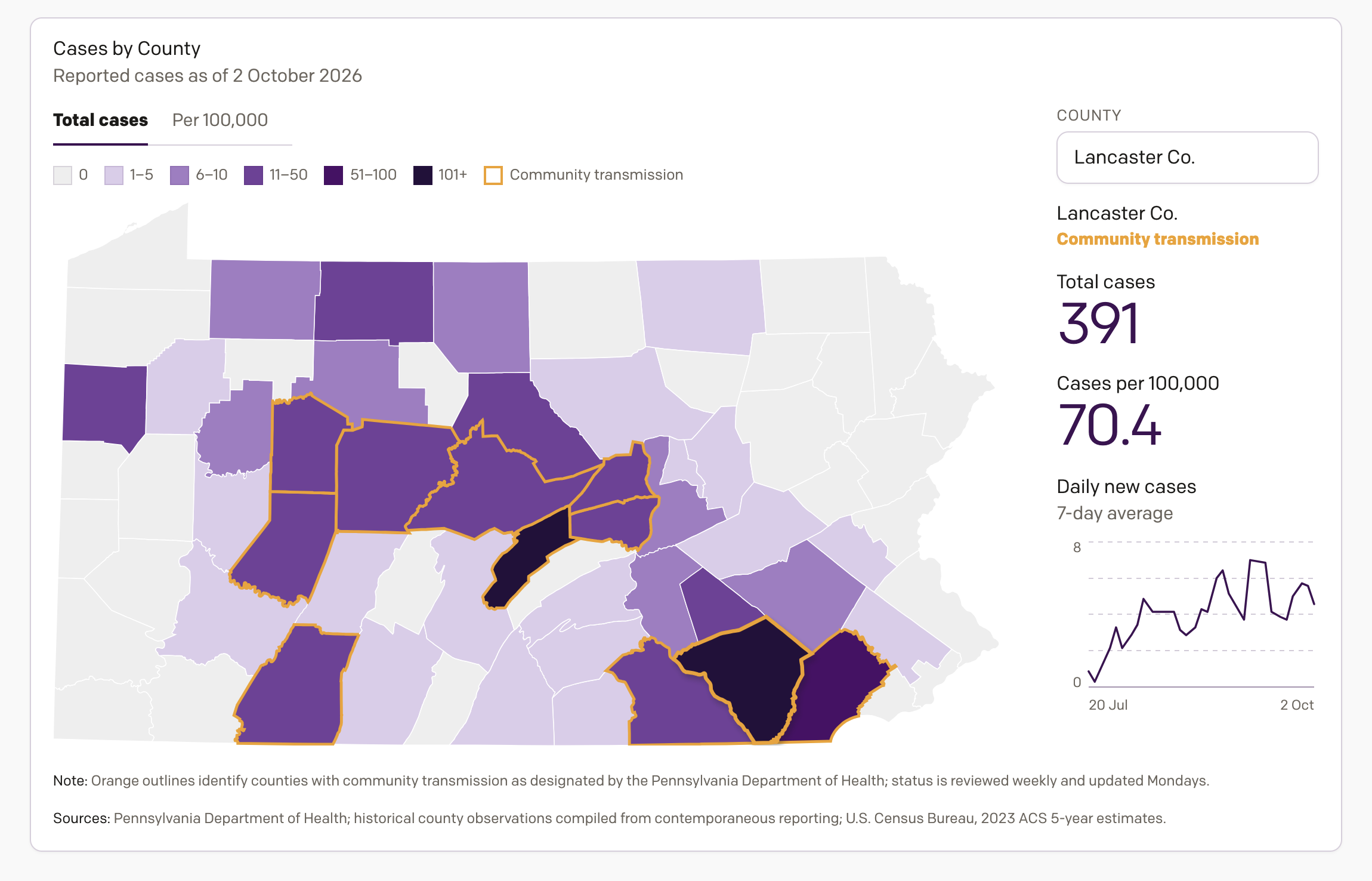
Tracking Measles in Pennsylvania
One project on which I have been working the last few weeks is an interactive data visualisation piece tracking the 2026 measles outbreak in Pennsylvania. A few years ago now I closely followed the COVID-19 pandemic, mapping it and charting it in a near daily series of datagraphics—to be clear, and this is a broad…
-
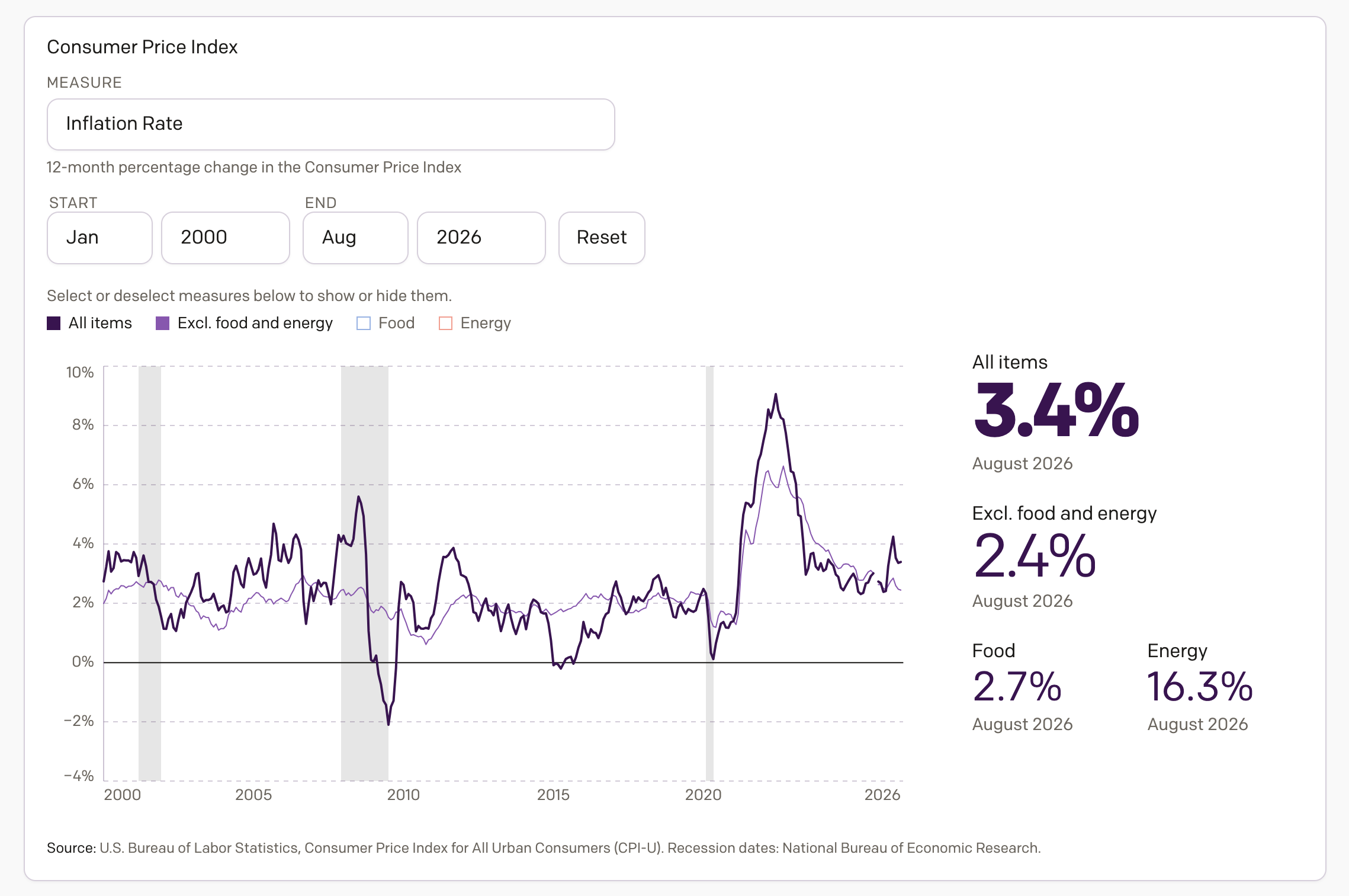
Inflation in America
Apologies for the lack of posting over the last month, but it was a very busy month. And so here I am back to share something I have been working on the last several weeks, an interactive application exploring inflation in America. Spoiler: it’s too damn high. The screenshot above links to the piece now…
-
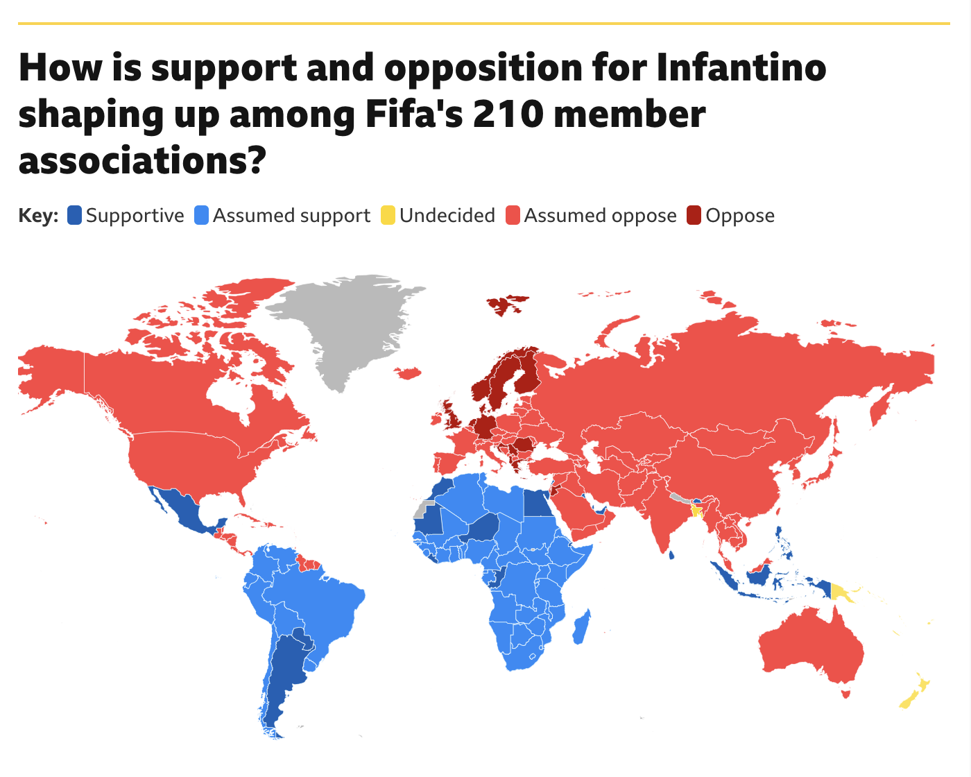
Will Infantino’s Own Goal Cost Him?
Fifa president Gianni Infantino has had a rough go of it of late. Turns out the world is not too enthused about the prospect known as Profit. He may have a strong right kick, but the world does not want to sacrifice the sport at Profit’s altar. At least not yet. And so Infantino’s plan,…
-
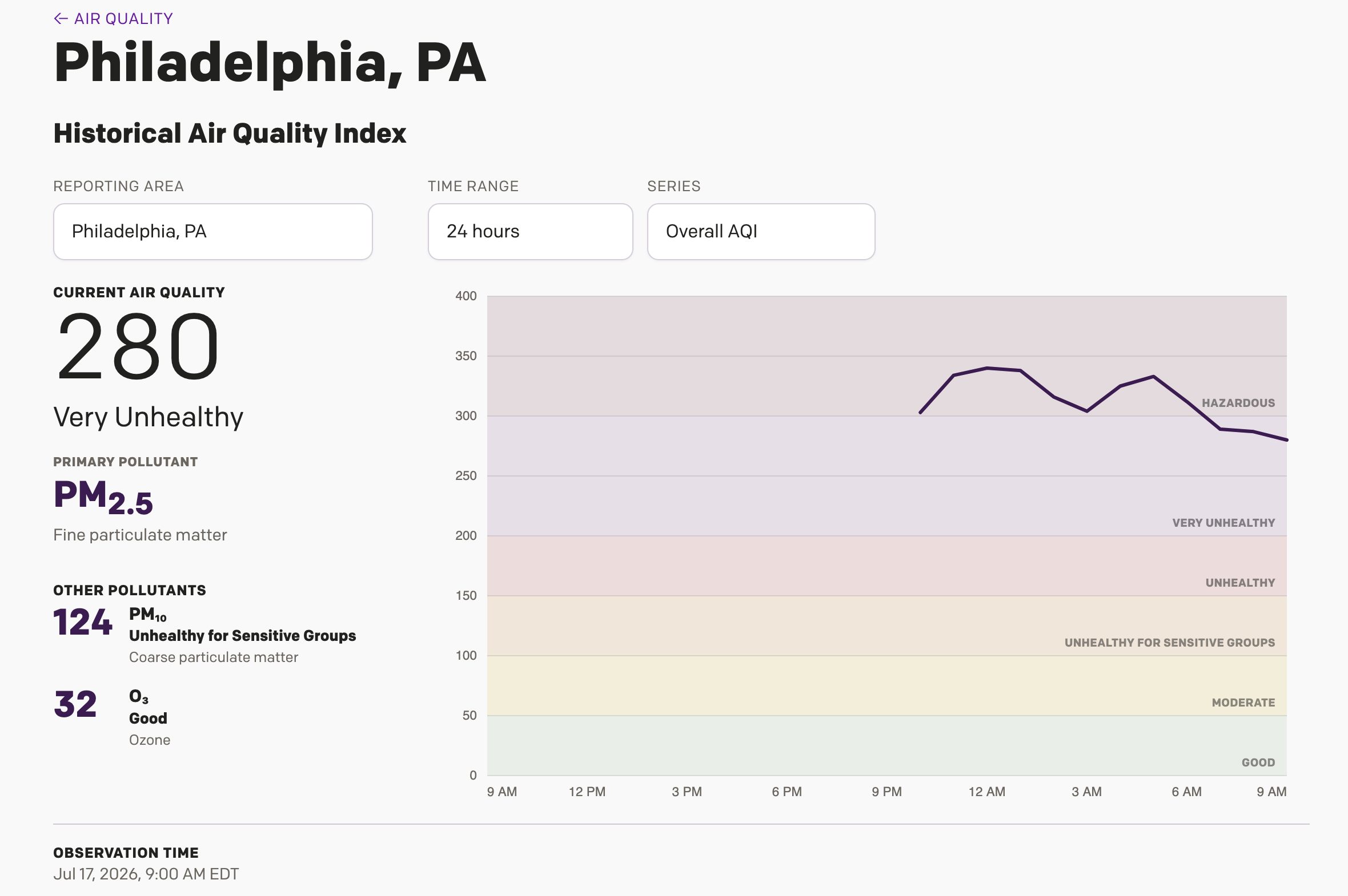
Is It Always Smoky in Philadelphia?
Yesterday I wrote about a Philadelphia Inquirer article, which included an interactive display showing different monitoring stations around the Philadelphia area cataloguing just how bad the Minnesota/Canadian wildfire smoke is in the region. I noted during my piece that it was unclear if the little bars were actually recording the AQI values or just a…
-
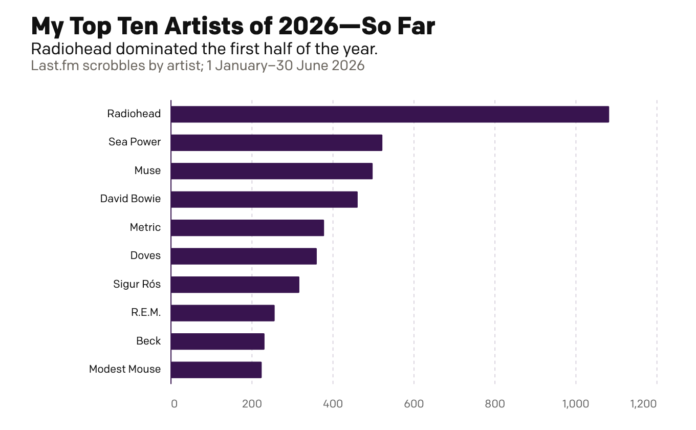
My First Half of Music (Streams)
Because I am headed out of town for several days, today is basically this week’s Friday post—just for fun. Last week I looked at my musical tastes via the vinyl. Today I look at the digital streams of music. This is far less surprising and arguably more representative of my tastes more broadly. Unlike records,…
-
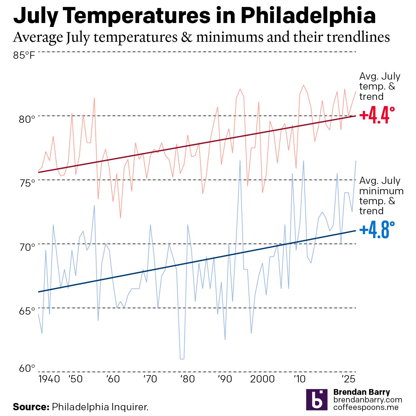
Just a Wee Bit Warm
This past weekend was a hot one in Philadelphia (and many other places across the eastern United States). As we enter July, the Philadelphia Inquirer published an article examining climate change’s impact on summer temperatures. Spoiler: it’s hotter. The article included two interactive line charts. The first one plotted the average high temperature of July…
-
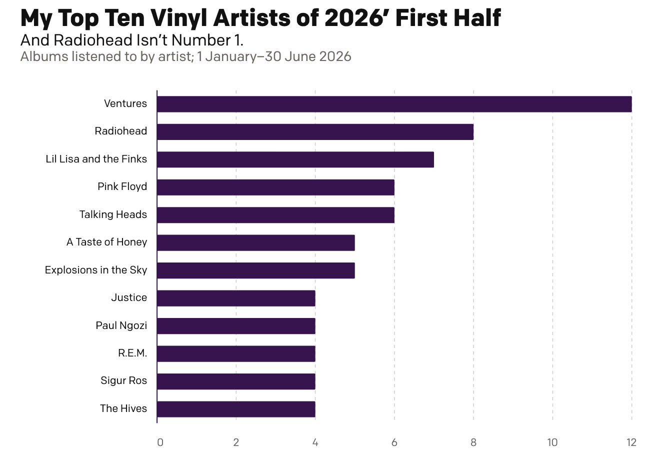
My First Half of Music (Records)
Two Christmases ago, my mother gifted me a record player. Ever since I have been slowly buying records—and then listening to them. And over the last year I have been recording those record plays and with 2026 now half over, I decided to run the numbers and see where I am at. As context, my…
-
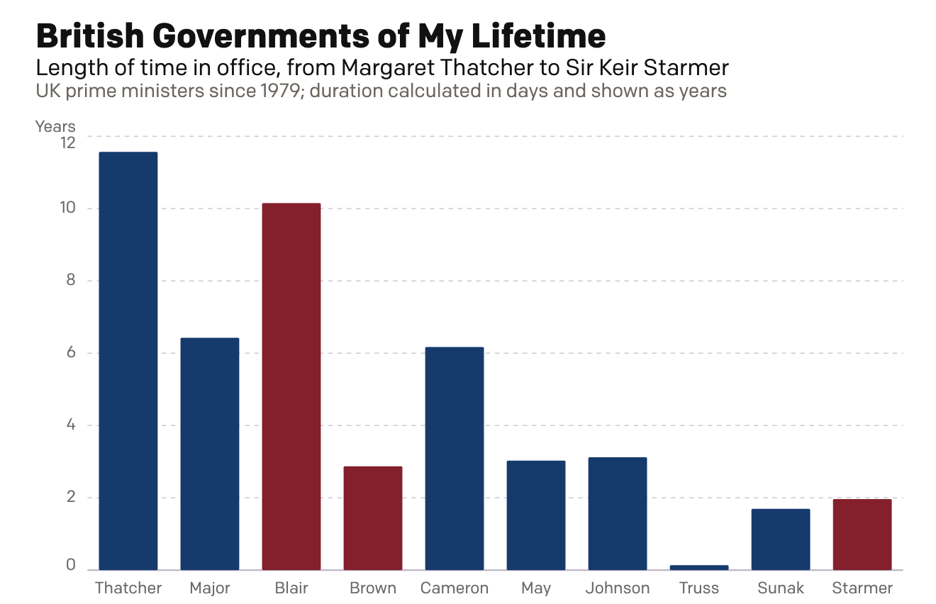
A Dan Miller Coronation?
Six weeks ago I created a small interactive chart on the news that Wes Streeting, the then British health secretary, resigned in order to challenge Prime Minister Sir Keir Starmer for the leadership of the Labour Party. Six weeks hence, Starmer has resigned. Lo and behold, my interactive graphic still works: British Governments of My…