
Tag: bar chart
-
I Prefer My Smoke in My Scotch
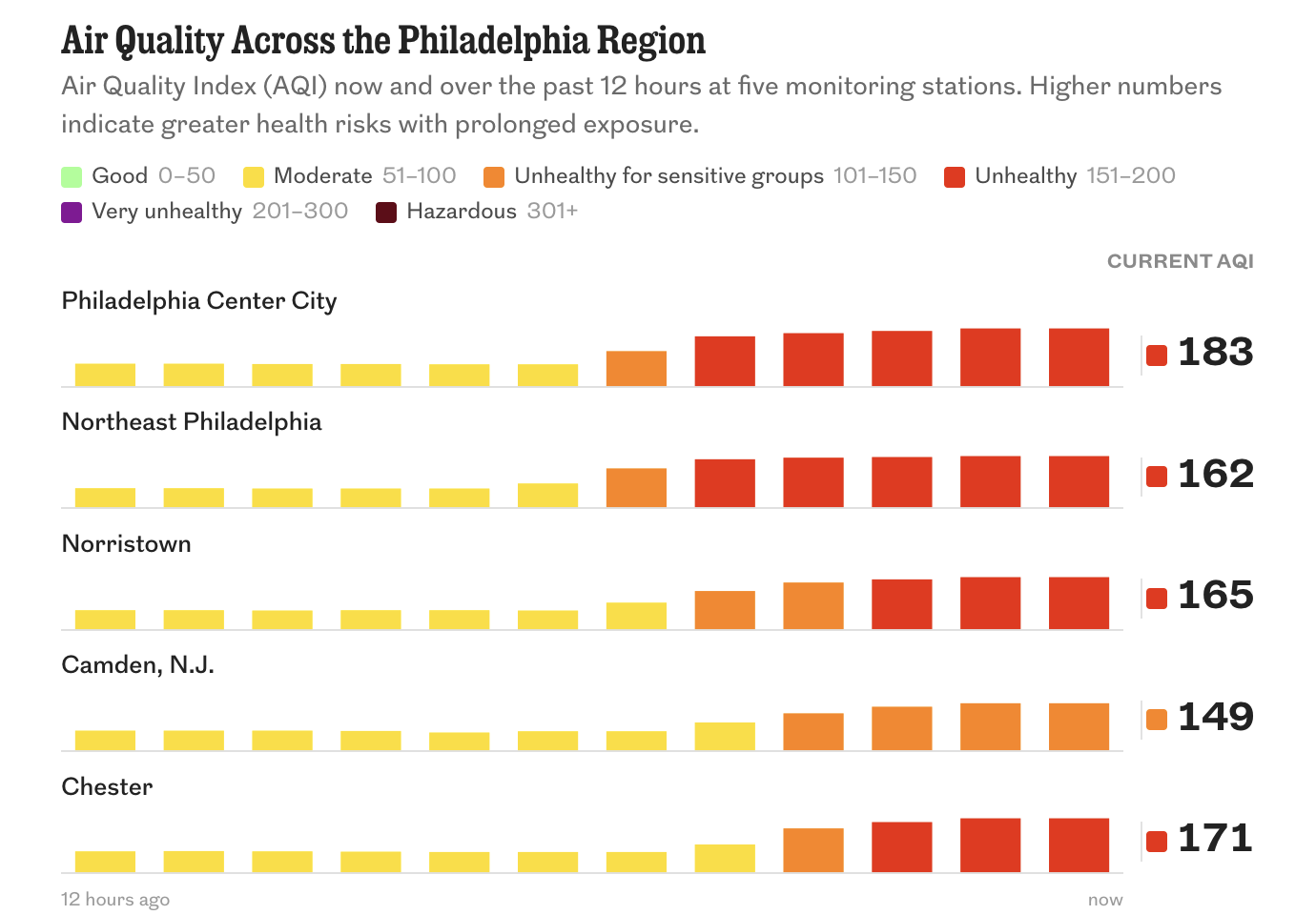
Another July day, another heatwave in Philadelphia. But this time we have the added bonus of Canadian wildfire smoke—apparently we call them wildfires and not forest fires now? Just last summer the US administration pointed the finger at Canada for not doing more to prevent and contain these wildfires, but I would humbly suggest that…
-
My First Half of Music (Streams)
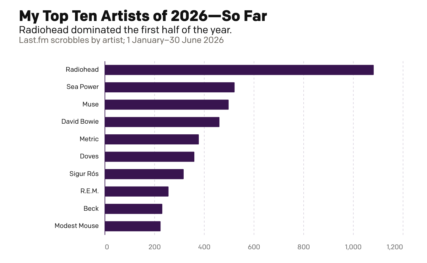
Because I am headed out of town for several days, today is basically this week’s Friday post—just for fun. Last week I looked at my musical tastes via the vinyl. Today I look at the digital streams of music. This is far less surprising and arguably more representative of my tastes more broadly. Unlike records,…
-
My First Half of Music (Records)
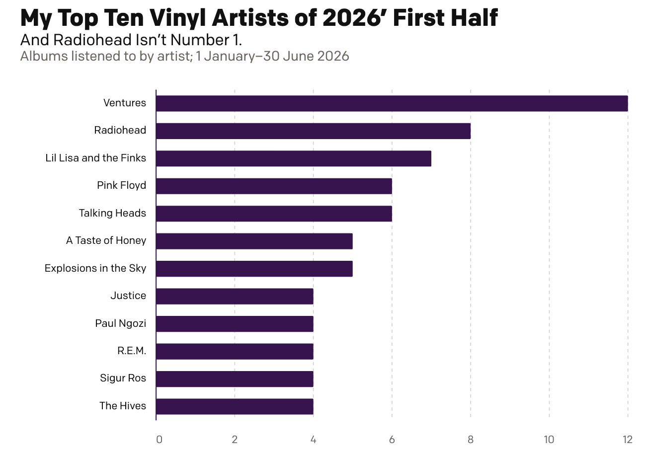
Two Christmases ago, my mother gifted me a record player. Ever since I have been slowly buying records—and then listening to them. And over the last year I have been recording those record plays and with 2026 now half over, I decided to run the numbers and see where I am at. As context, my…
-
A Dan Miller Coronation?
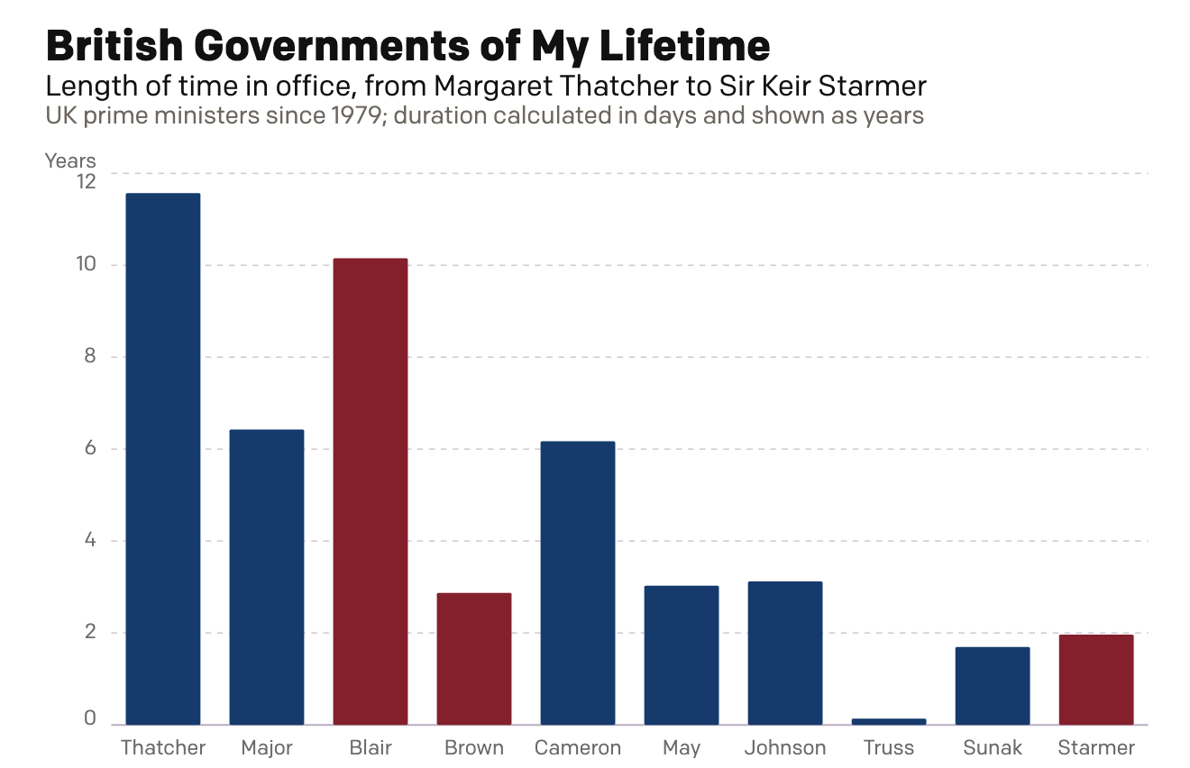
Six weeks ago I created a small interactive chart on the news that Wes Streeting, the then British health secretary, resigned in order to challenge Prime Minister Sir Keir Starmer for the leadership of the Labour Party. Six weeks hence, Starmer has resigned. Lo and behold, my interactive graphic still works: British Governments of My…
-
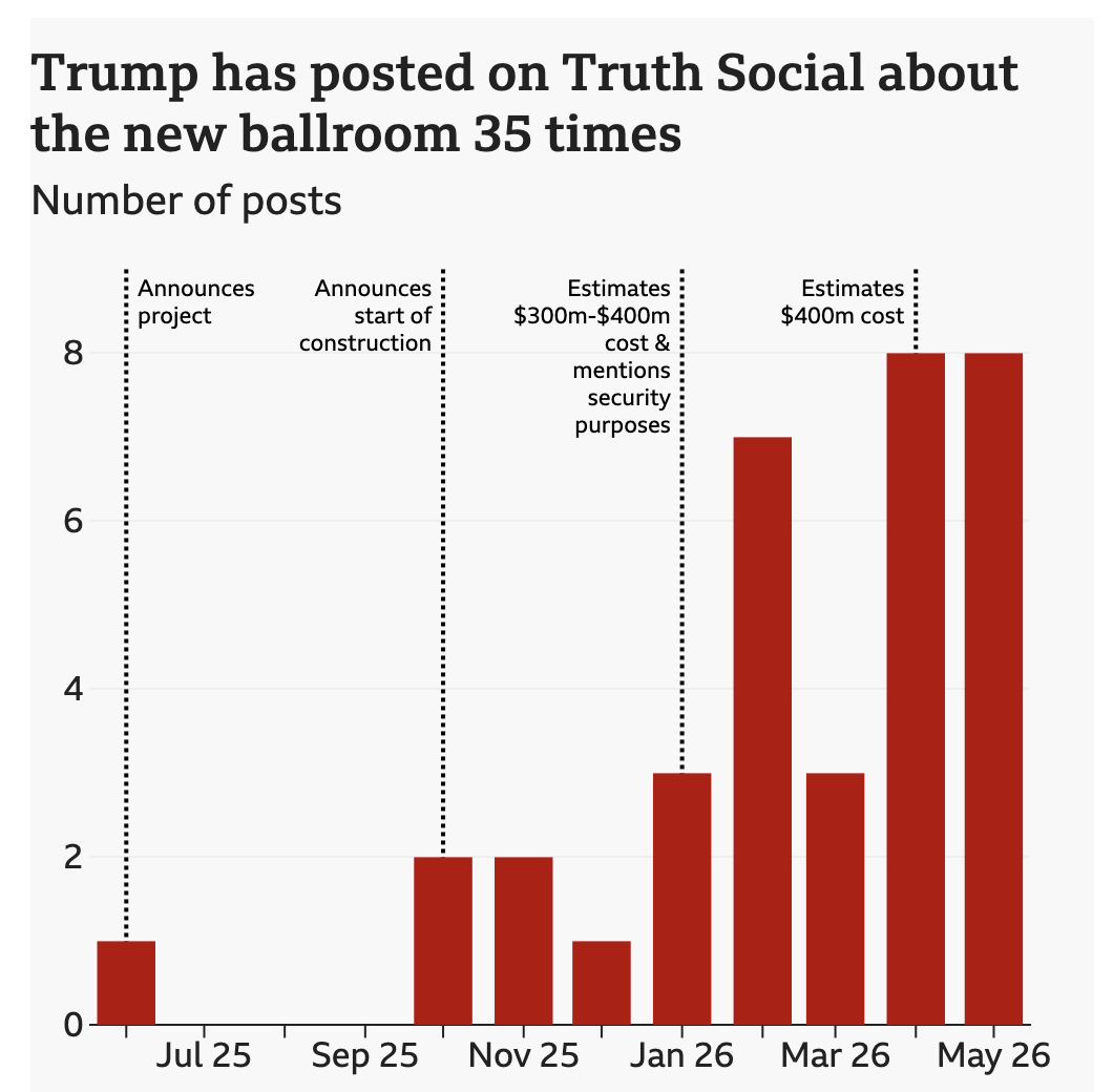
Big Beautiful Ballroom
Last week the BBC published a look at the new White House ballroom promised by President Trump. The ballroom required demolishing the existing East Room. Instead of focusing on the legality of the move, I want to focus on the ever increasing cost of the project. The article does include a great before/after photograph of…
-
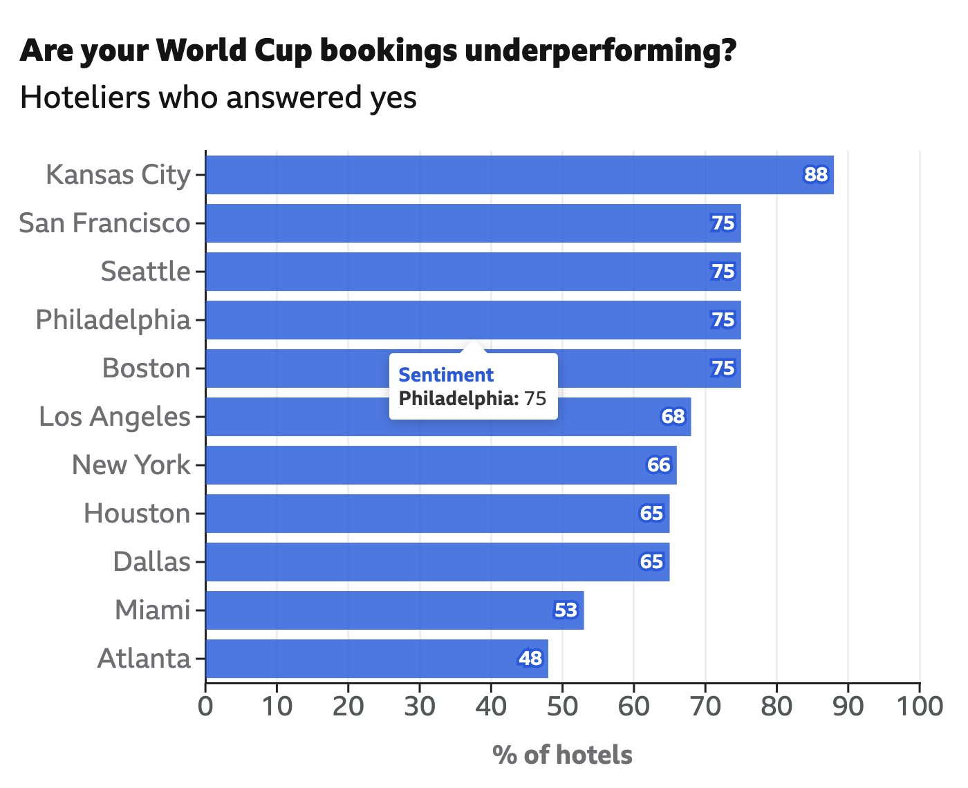
Unnecessary Extra Labelling
I frequently criticise labelling the data values on bar charts, a style seemingly everywhere on the internets. Labels provide precise values, but if you need to see the precise value in a graphic, you don’t really need the graphic—you need a table. Enter this interactive graphic in an article from the BBC exploring hotel bookings…
-
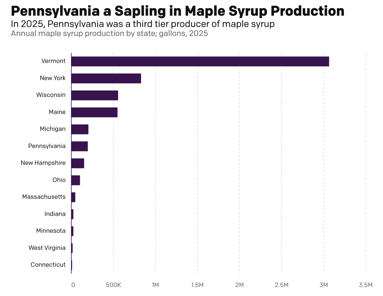
Maple Syrup Monday
This morning over breakfast I was reading an article in the Philadelphia Inquirer about Pennsylvania maple syrup production. My breakfast was oatmeal with maple syrup, cinnamon, and all space along with orange juice and a cup of tea. They talked about Pennsylvania’s production and compared it to Vermont’s, which made me want nothing more than…
-
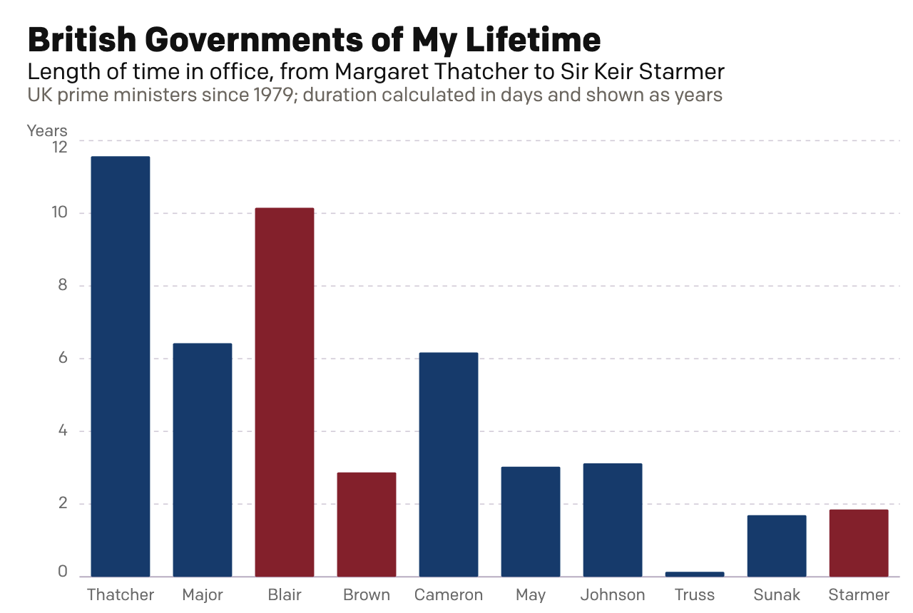
Rise of the Nutters
For most of my life I have been interested in British politics. I can recall talking with my mates about Tony Blair’s Prime Minister’s Questions (PMQs) in high school and at university. During the Brexit debate, my American friends would frequently ask me just what was going on across the pond. Through that point in…
-
Go Fly a Kite
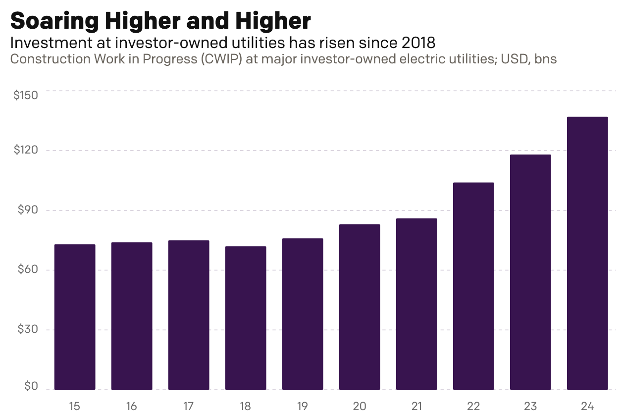
This past weekend I read an article over on Reuters about the cost of electricity for Americans, especially as it pertains to unfinished electrical generation projects. To be fair, I did not read it thinking I would be getting an opportunity to talk about something here on Coffeespoons. Rather, I just received a letter from…