
Friday I wrote about an interactive air quality web application I designed for my website after seeing a similar type of dynamically generated graphic in my local rag, the Philadelphia Inquirer. I did not have a lot of time to finish the project, and so it lacked the planned overview page, where I intended to show the air quality conditions in the 12 US cities I selected to cover.
But during a smoke-filled sky on Saturday, I took a few hours to create it. And here is the screenshot to prove it.
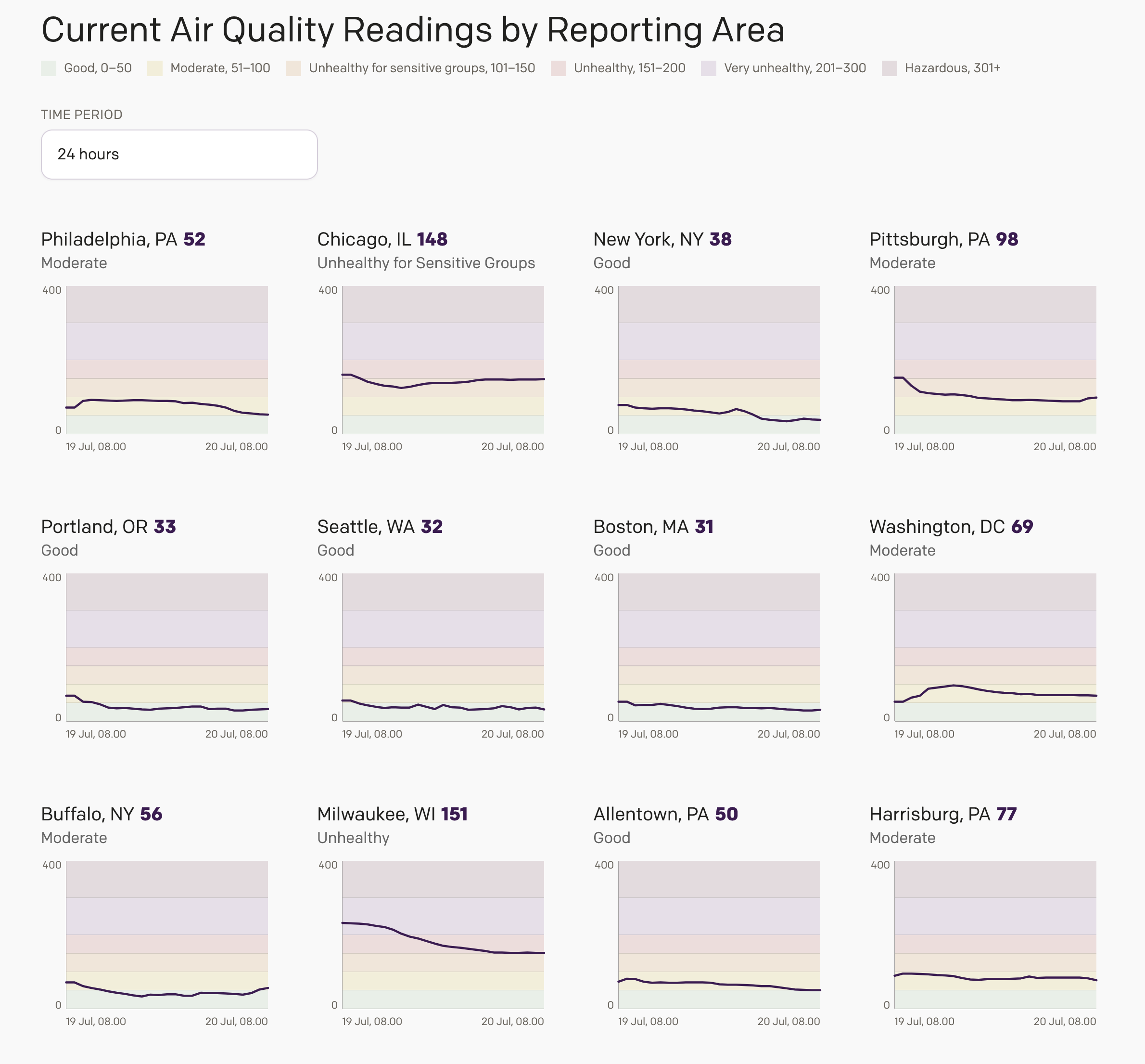
The design incorporates small multiples of the city detail page charts. The EPA wants those who use their data to adhere to the classification, definitions, and colour palettes they use. I did have to dial down the saturation of their colours to make the lines and details visible, but otherwise these are their choices and classifications—not mine.
Yesterday, with the World Cup final in New York and part of the coverage focusing on the poor air quality around the Northeast, I was at least able to see the New York region’s air quality at the start of the match.
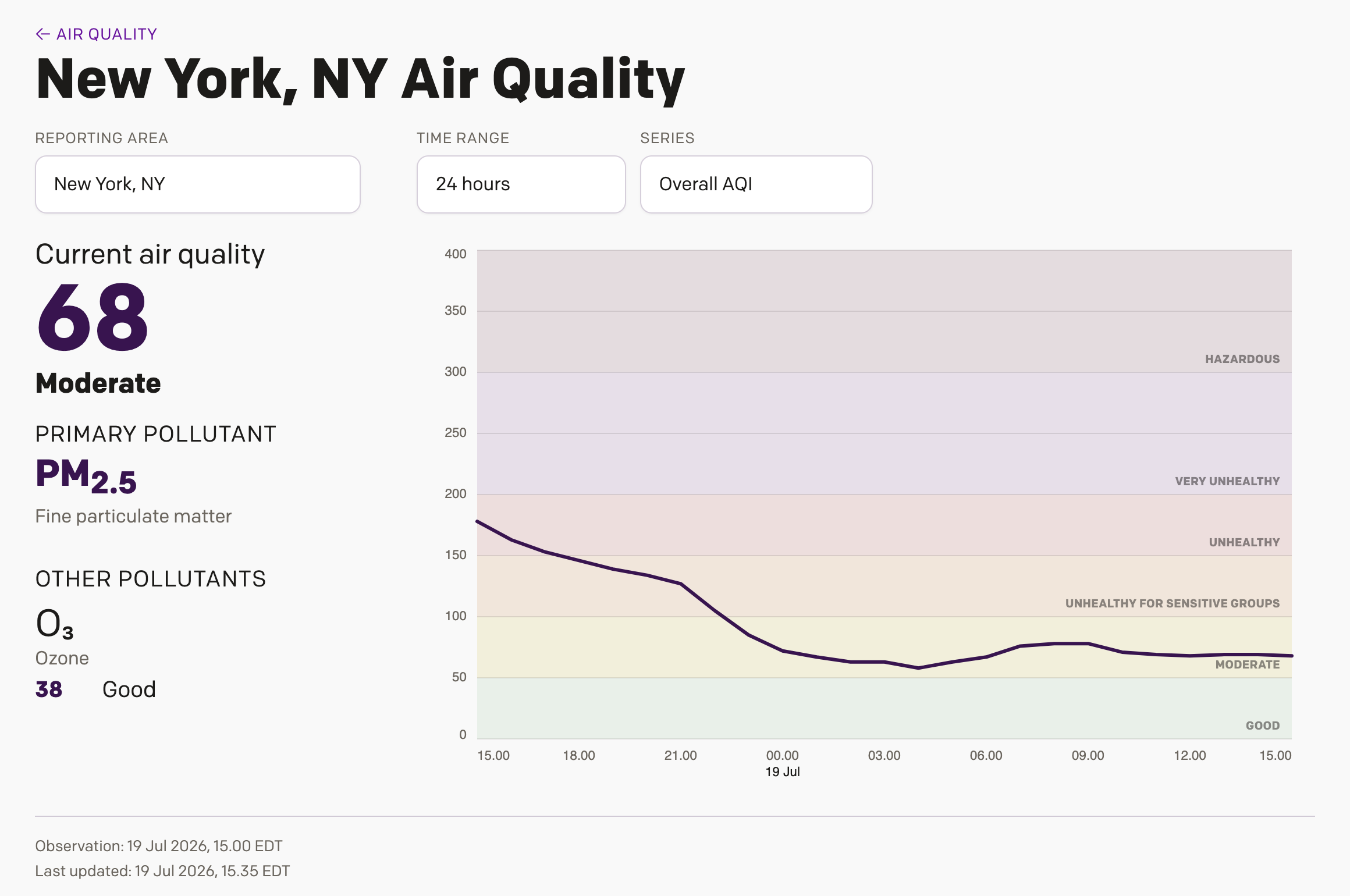
Here is just hoping that, in time, the wildfires in Minnesota and Canada will burn themselves out and the air here in the Northeast will become a bit more breathable. And when that happens, I look forward to seeing a dozen lines floating around that Good band.
Credit for the piece is mine.