
To be clear, I read this as a joke. But we can also use it as a learning opportunity, because I have certainly seen quite a bit of poor data visualisation out in the internet lands of late. Compounding the issue, a seemingly declining level of data visualisation comprehension amongst the consumers in magical computer land.
Second, thanks to my former coworker, Kate, for sharing this with me.
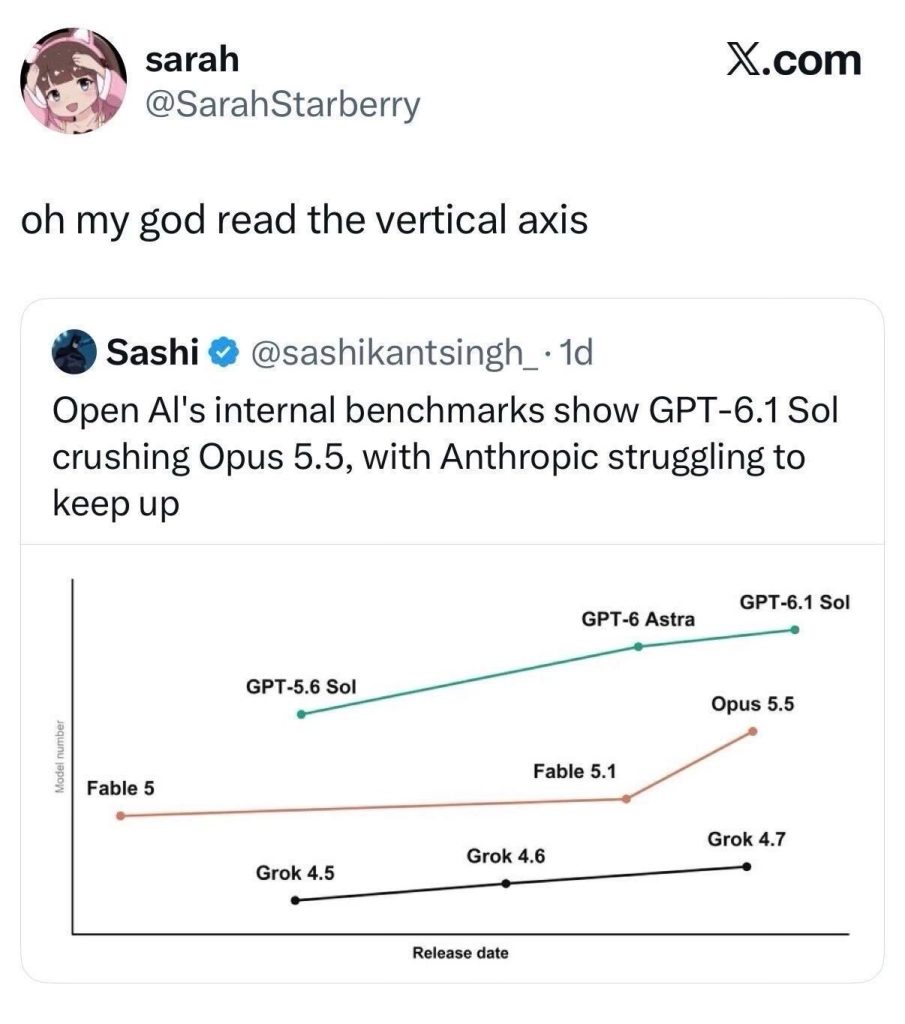
For my money, what gives this away? The typography. Look at the font size for the label on the x-axis and then compare it to the font size for the label on the y-axis. Second look at the weight—meaning bold vs. regular vs. light—of the labels. Third look at the colour of the labels.
Those are three different design variables that should, for a standard chart, be the same. Yes, you could have a data or design exception for a difference in one or maybe two, but think of most PowerPoint or Slides presentations you have sat through over the years. When do those charts use such differently scaled axis labels?
So what does the harder to read text on the y-axis say? Model number. A poor metric with which to compare AI models as I think we can all agree. I cannot claim to understand the discourse around the various AI models. But I read this as a piece perhaps criticising Open AI’s benchmark system. (Another clue? “Struggling to keep up” is a peculiar choice for a line showing rapid growth of model number.)
My concern is more the use—misuse?—of poor charting to sway public opinion, especially in the United States, as we head into the home stretch before November’s midterm election. This is nothing new. Fox News famously published and aired misleading charts and graphics for years. (For all I know they still do, but I cannot say I have watched Fox News in a very long minute.)
I also do not want to say Sarah necessarily fell for Sashi’s tweet. But again, as a teaching moment, this episode shows the importance of reading the chart, the map, the graphic. Labels matter. Data definitions matter. In an era when it has become so easy to create false or misleading graphics and images, we all need to practice a bit more media/data visualisation literacy.
Personally, I fail to understand the need for instant “takes” and reactions to things. (Get off my lawn, kids.) I prefer a more measured and considered approach. Let things sit. Contemplate the things. If something seems outrageous, ridiculous, too good to be true…well, it probably is.
As October rolls along and into November, carefully consider those inflation charts, unemployment charts, political support charts, &c.
Credit for the piece goes to https://x.com/sashikantsingh_ for the original graphic.