Today’s post looks at education across a set of 65 countries from a standardised test backed by the OECD, basically a group of wealthy countries. The test results found that some poor countries have surprisingly good education systems whereas some of the world’s wealthiest countries—here’s looking at you, United States—perform poorly. The Huffington Post created this graphic to plot the data.
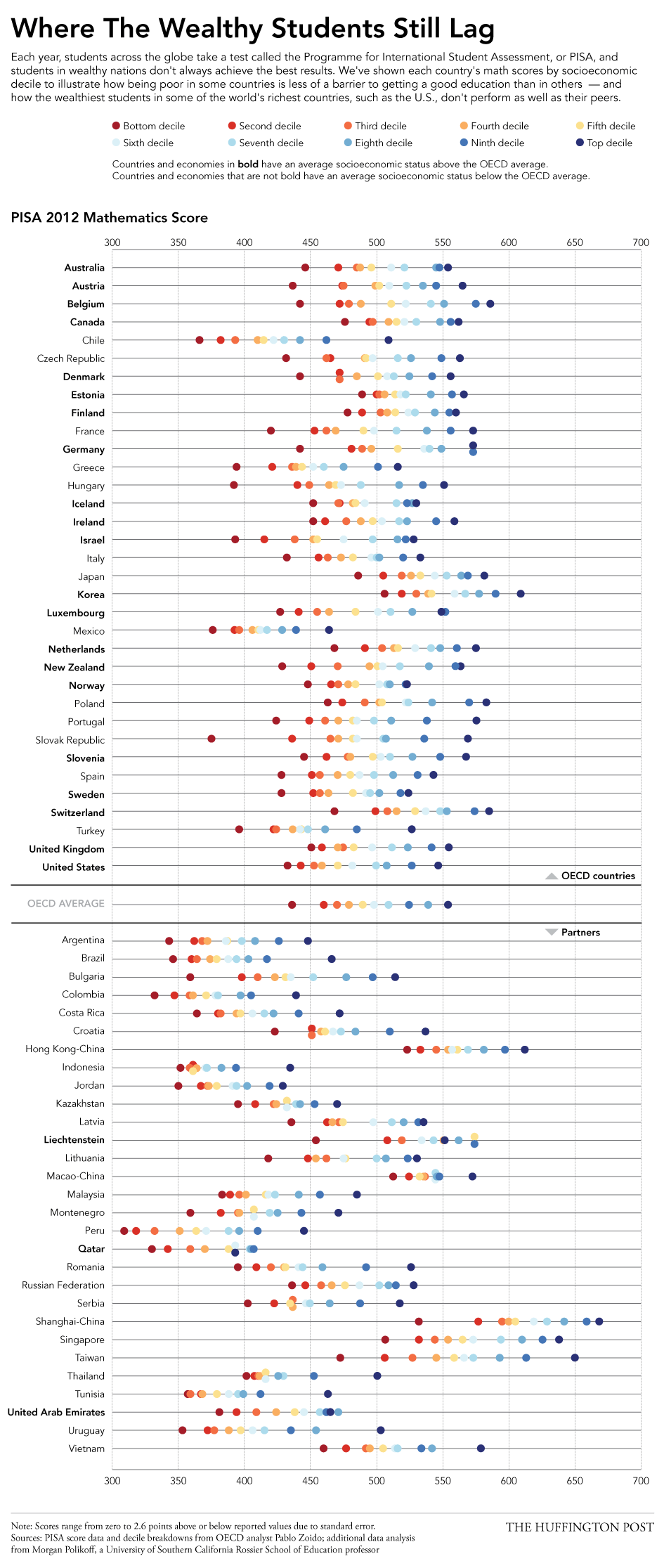
I really enjoy this piece. It plots each income decile’s results, blocks the countries into OECD members versus their partners, and then each country’s average socioeconomic status is shown as being above or below the OECD average. This is the type of piece I see as a static image that I would want to see made interactively—though I fully understand how difficult and time-consuming that can be—so that I could begin to filter and re-arrange the data. Could discoveries be made by organising countries by geographic regions? Could one just look at the top or bottom deciles?
Credit for the piece goes to Jan Diehm.
Leave a Reply
You must be logged in to post a comment.