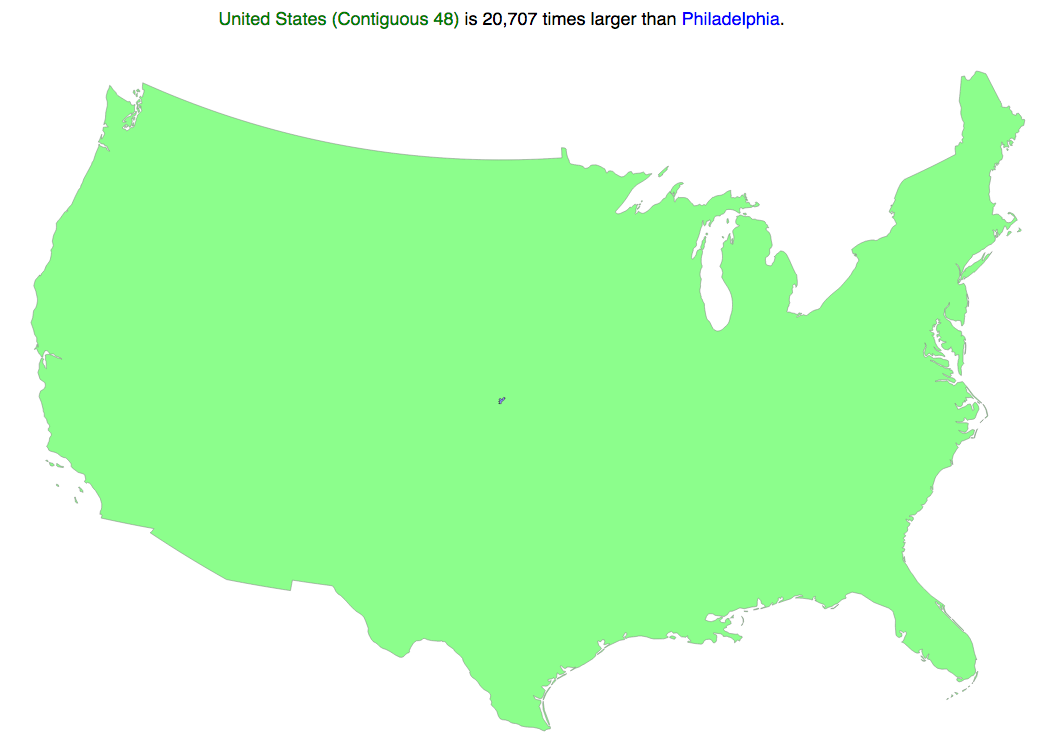
Sometimes we need to compare the sizes of things. For Americans, this is obviously best done by comparing everything to America. Thankfully for geography, we now have Comparea to get a better sense of scale. Though, I am highly suspicious about this particular comparison. I think they have it backwards.
Credit for the piece goes to Comparea.
Leave a Reply
You must be logged in to post a comment.