I will be trying to do a longer piece on the data visualisations surrounding the shootings in Orlando later this week. But for starters, a simple point through this piece from the BBC—not that they are the only culprits of this. Not all data-driven stories need visualisations. Sometimes a nicely typeset table will do the job better and faster.
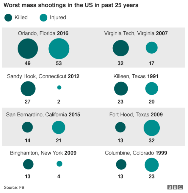
An actual table with typographic emphasis on the tables would have been better and clearer than this. Or with a little more time and effort—not that those always exist in a journalism organisation—something more appropriate to the type of data could have been designed.
Credit for the piece goes the BBC graphics department.
Leave a Reply
You must be logged in to post a comment.