Tag: critique
-
Just a Thought About a Thing That’s Been Nipping at Me
The democratisation of design tools ostensibly allows people to create high-quality graphics. But I think we can all admit to ourselves we see a lot of work that…misses its mark. As a general rule, I do not often post work here by untrained designers. My peers and I have the benefit of education and experience…
-
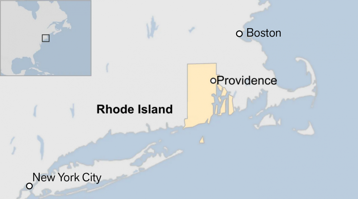
Off on the Road to Rhode Island
Yesterday I read an article from the BBC about this weekend’s shooting at Brown University, one of the nation’s top universities. The graphic in question had nothing to do with killings or violence, but rather located Rhode Island for readers. And the graphic has been gnawing at me for the better part of a day.…
-
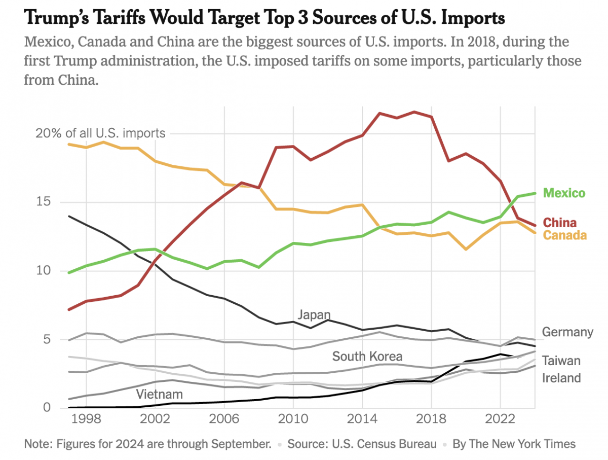
Imports, Tariffs, and Taxes, Oh My!
Apologies, all, for the lengthy delay in posting. I decided to take some time away from work-related things for a few months around the holidays and try to enjoy, well, the holidays. Moving forward, I intend to at least start posting about once per week. After all, the state of information design these days provides…
-
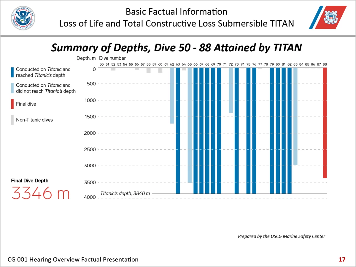
Three-dimensional Charts Are Back, Baby
I thought three-dimensional charts died back in the 2010s. Alas, here we are in 2024 and I have to discuss one once again. have been following the Titan Inquiry this week and the opening presentation included this gem of data visualisation. To be fair, I do not know how many designers, let alone specialist information…
-

Where in the World Is Carmen Santiagova?
In the grand scheme of things, this graphic is not the end of the world. On the other hand, it is probably more than half of the world. In particular, I am talking about this graphic from a BBC article about a recent helicopter crash on the Kamchatka Peninsula in Russia’s Far East. As you…
-
The Great British Baking
Recently the United Kingdom baked in a significant heatwave. With climate change being a real thing, an extreme heat event in the summer is not terribly surprising. Also not surprisingly, the BBC posted an article about the impact of climate change. The article itself was not about the heatwave, but rather the increasing rate of…
-
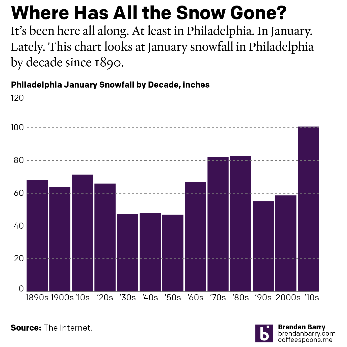
Legendary Adjustments
The other day I was reading an article about the coming property tax rises in Philadelphia. After three years—has anything happened in those three years?—the city has reassessed properties and rates are scheduled to go up. In some neighbourhoods by significant amounts. I went down the related story link rabbit hole and wound up on…
-
New Mexico Burns
Editor’s note: I was having some technical issues last week. This was supposed to post last week. Editor’s note two: This was supposed to go up on Monday. Still didn’t. Third time’s the charm? Yesterday I wrote about a piece from the New York Times that arrived on my doorstep Saturday morning. Well a few…