Tag: BBC
-
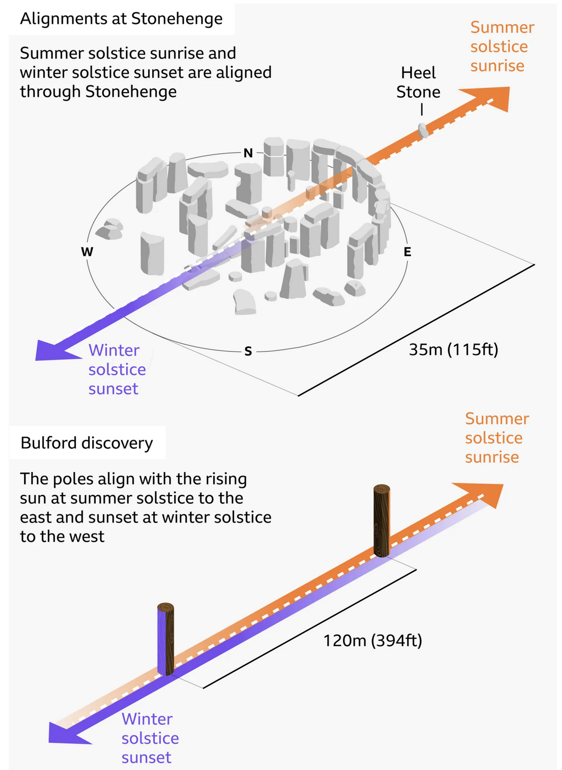
Stone Hard(ing)ly Beats Wood
At least in chronological dating. I debated posting this today or Monday, given that this weekend is a three-day holiday in the States, and that the selected graphic—in this case an illustration—explains the alignment of Stonehenge and—the focus of the BBC article wherein this graphic appears—a prehistoric, pre-Stonehenge, well, henge of wood posts only a…
-

Big Beautiful Ballroom
Last week the BBC published a look at the new White House ballroom promised by President Trump. The ballroom required demolishing the existing East Room. Instead of focusing on the legality of the move, I want to focus on the ever increasing cost of the project. The article does include a great before/after photograph of…
-
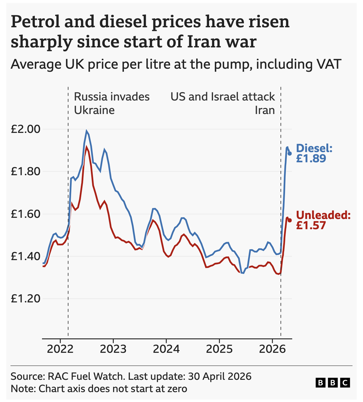
Pain at the Pump Across the Pond
Over the past week I did a bit more driving than usual. Every single day I watched the digital display at the local Wawa tick up by a penny or two. But I read the news and see reports of fuel shortages and restrictions, especially in Europe and Asia. This morning the BBC reported on…
-

Unnecessary Extra Labelling
I frequently criticise labelling the data values on bar charts, a style seemingly everywhere on the internets. Labels provide precise values, but if you need to see the precise value in a graphic, you don’t really need the graphic—you need a table. Enter this interactive graphic in an article from the BBC exploring hotel bookings…
-

Aches, Fevers, and Chills, Oh My!
Last week I suffered from the aforetitled and wondered what just might be ailing me. My sore throat woke me up in the middle of the night with intense, sharp pain and reminded me of stories I had read earlier this flu season about “razor blade” sore throat associated with the latest COVID strain, Nimbus.…
-
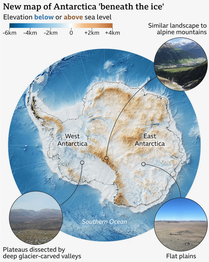
A View Beneath the Ice
I love maps. And above the ocean’s surface, we generally have accurate maps for Earth’s surface with only two notable exceptions. One is Greenland and its melting ice sheet is, in part, contributes to the emerging conflict between the United States and Denmark over the island’s future. The other? Antarctica. Parts of the East Antarctic…
-
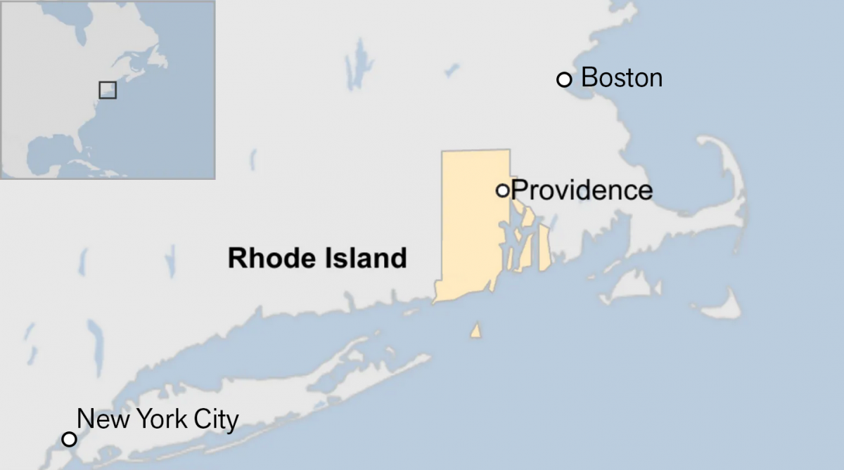
Off on the Road to Rhode Island
Yesterday I read an article from the BBC about this weekend’s shooting at Brown University, one of the nation’s top universities. The graphic in question had nothing to do with killings or violence, but rather located Rhode Island for readers. And the graphic has been gnawing at me for the better part of a day.…
-
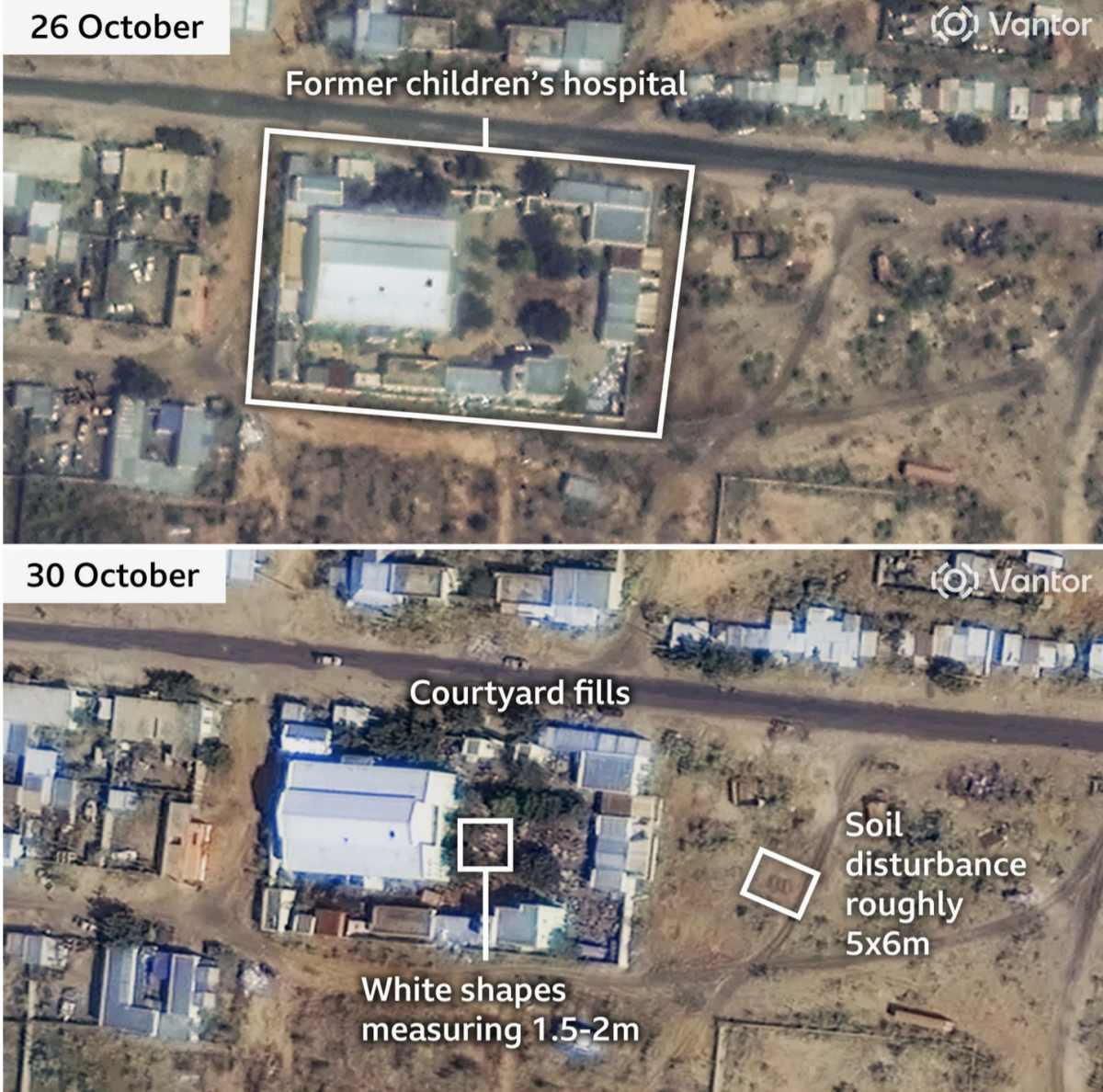
When the Walls Fell
Back in September I wrote about the siege of el-Fasher in Sudan, wherein the town and its government defenders faced the paramilitary rebel forces, the Rapid Support Force (RSF). At the time the RSF besiegers were constructing a wall to encircle the town and cut residents and defending forces off from resupply and reinforcements. At…
-
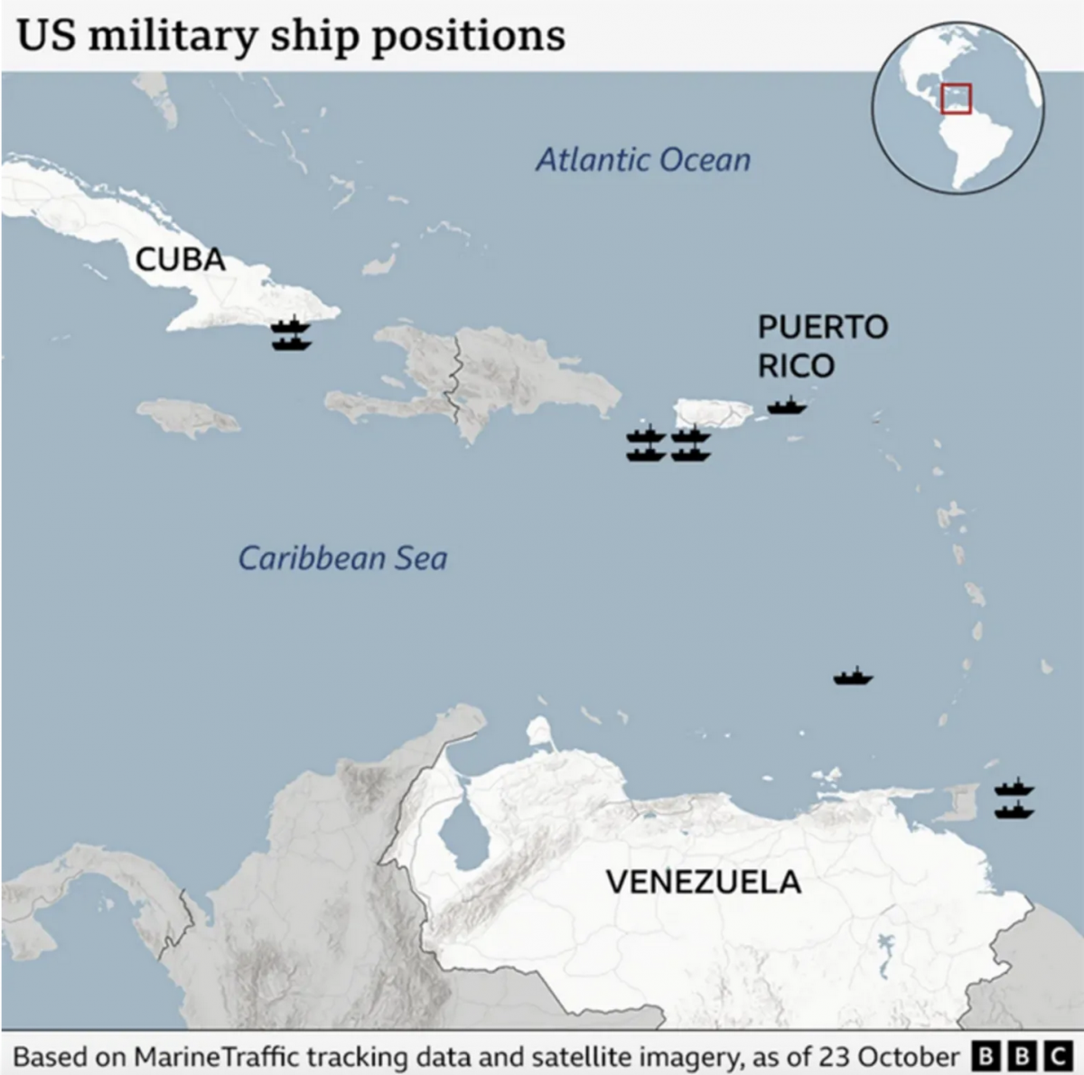
Where’s the Tin Can?
After a few weeks away for some much needed R&R, I returned to Philadelphia and began catching up on the news I missed over the last few weeks. (I generally try to make a point and stay away from news, social media, e-mail, &c.) One story I see still active is the US threatening Venezuela.…
-
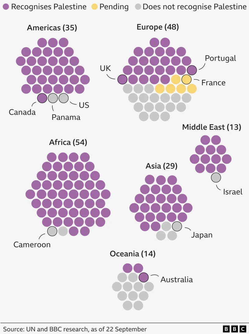
Palestine. The Newest Country in the World?
One of the most debated questions one could ask at pub trivia: How many countries are there in the world? To start, the question cannot be answered completely. What is a country? What is a state? What is a nation? Define recognition. Whose definition? When I worked at Euromonitor International I had to edit a…