Happy Friday, all. Another week and we made it.
This Friday I want to highlight a graphic from xkcd that, strictly speaking, isn’t really data visualisation, but it does speak to that world because it’s about the underlying data.
And as with the best humour, there’s an element of truth in it.
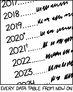
Credit for the piece goes to Randall Munroe.
Leave a Reply
You must be logged in to post a comment.