After a rainy weekend in Philadelphia thanks to Hurricane Henri, we are bracing for another heat wave during the middle of this week. Of course when you swelter in the summer, you seek out shade. But as a recent article in the Philadelphia Inquirer pointed out, not all neighbourhoods have the same levels of tree cover, or canopy.
From a graphics standpoint, the article includes a really nice scatter plot that explores the relationship between coverage and median household income. It shows that income correlates best with lack of shade rather than race. But I want to focus on a screenshot of another set of graphics earlier on in the article.
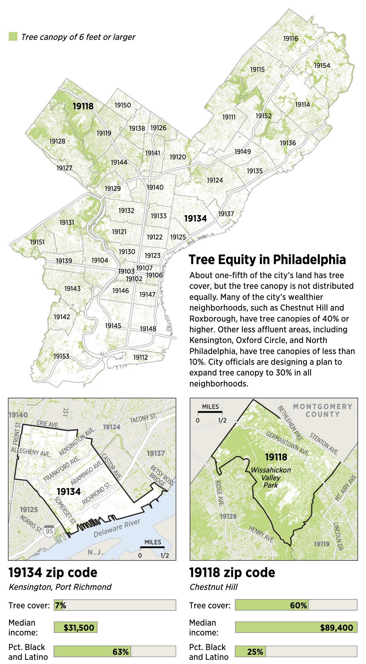
I enjoyed this graphic in particular. It starts with a “simple” map of tree coverage in Philadelphia and then overlays city zip codes atop that. Two zip codes in particular receive highlights with bolder and larger type.
Those two zip codes, presumably the minimum and maximum or otherwise broadly representative, then receive call outs directly below. Each includes an enlarged map and then the data points for tree cover, median income, and then Black/Latino percentage of the population.
I don’t think the median income needs to be in bar chart form here, especially given the bars do not line up so that you can easily compare the zip codes. The numbers would work well enough as factettes or perhaps a small dot plot with the zip codes highlighted could work instead.
Additionally, the data labels would be particularly redundant if a small scale were used instead. That would work especially well if the median income were moved to the lowest place in the table and the share charts were consolidated in one graphic. Conceptually, though, I enjoy the deep dive into those two zip codes.
Then I wanted to highlight some great design work on the maps. Note how in particular for Chestnut Hill, 19118, the outline of the zip code is largely in a thicker, black stroke than the rest of the map. At the upper right, however, you have two important roads that define the area and the black stroke breaks at those points so the roads can be clearly and well labelled. The other map does the same thing for two roads, but their breaks are shorter as the roads run perpendicular to the border.
Overall this was just a great piece to read and I thoroughly enjoyed the graphics.
Credit for the piece goes to John Duchneskie.
Leave a Reply
You must be logged in to post a comment.