Tag: ancestry
-
Still Irish
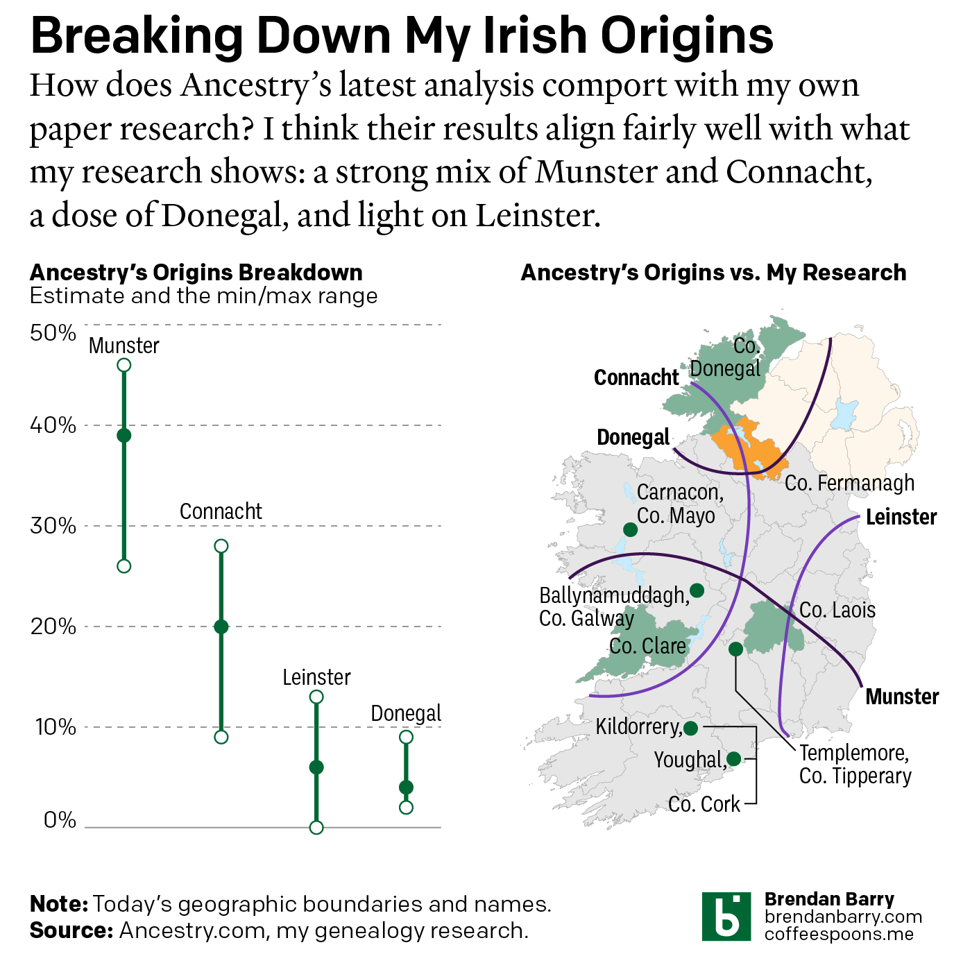
Last October Ancestry.com updated their ethnic origins breakdowns. Longtime readers will know these are not the most useful tools for helping one in their genealogical research. But, if they garner interest in one’s family history and motivate people to explore their own pasts, more power to them. I only encourage those people to dig a…
-
My Irish Heritage
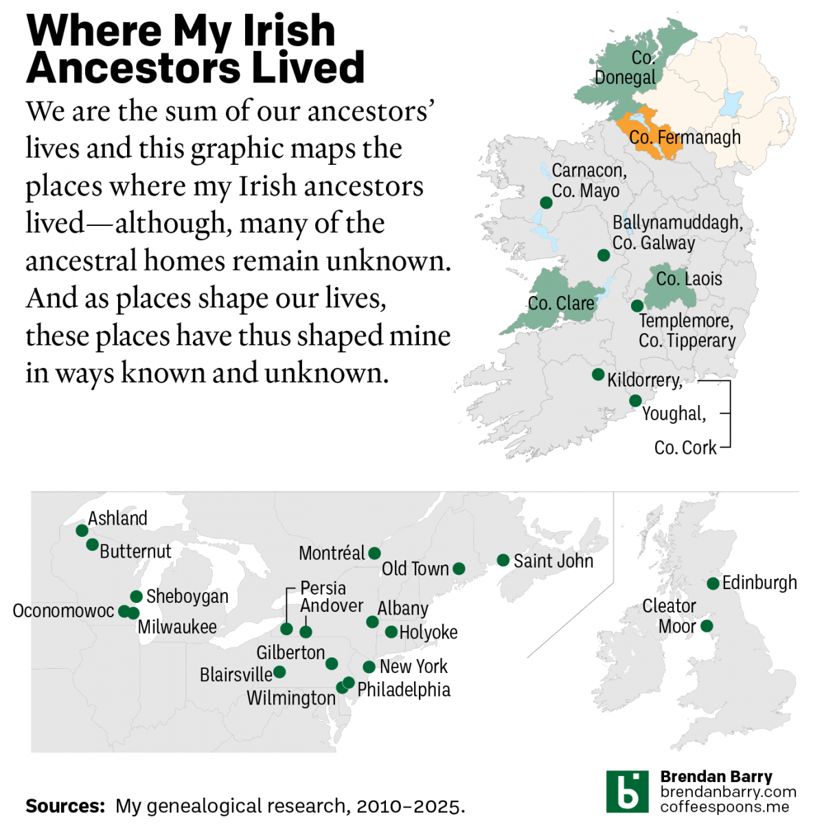
This week began with Saint Patrick’s Day, a day that here in the States celebrates Ireland and Irish heritage. And I have an abundance of that. As we saw in a post earlier this year about some new genetic ancestry results, Ireland accounts for approximately 2/3 of my ancestry. But as many of my readers…
-
A Refreshed Look at My Ethnic Heritage
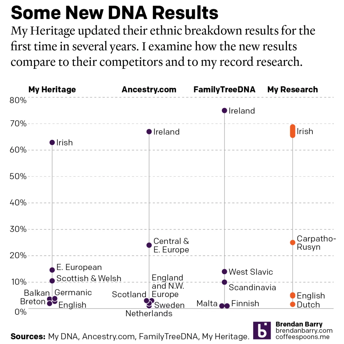
Late last week I received an update on my ethnic breakdown from My Heritage, a competitor of Ancestry.com and other genealogy/family history/genetic ancestry companies. For many years, the genealogical community had been waiting for this long-promised update. And it has finally arrived. For my money, My Heritage’s older analysis, v0.95, did not align with my…
-
No Matter What You Say, I’m Still Me
As many long-time readers know, I was long ago bitten by the genealogy bug and that included me taking several DNA tests. The real value remains in the genetic matches, less so the ethnicity estimates. But the estimates are fun, I’ll give you that. Every so often the companies update their analysis of the DNA…
-
Updated DNA Ethnicity Estimates
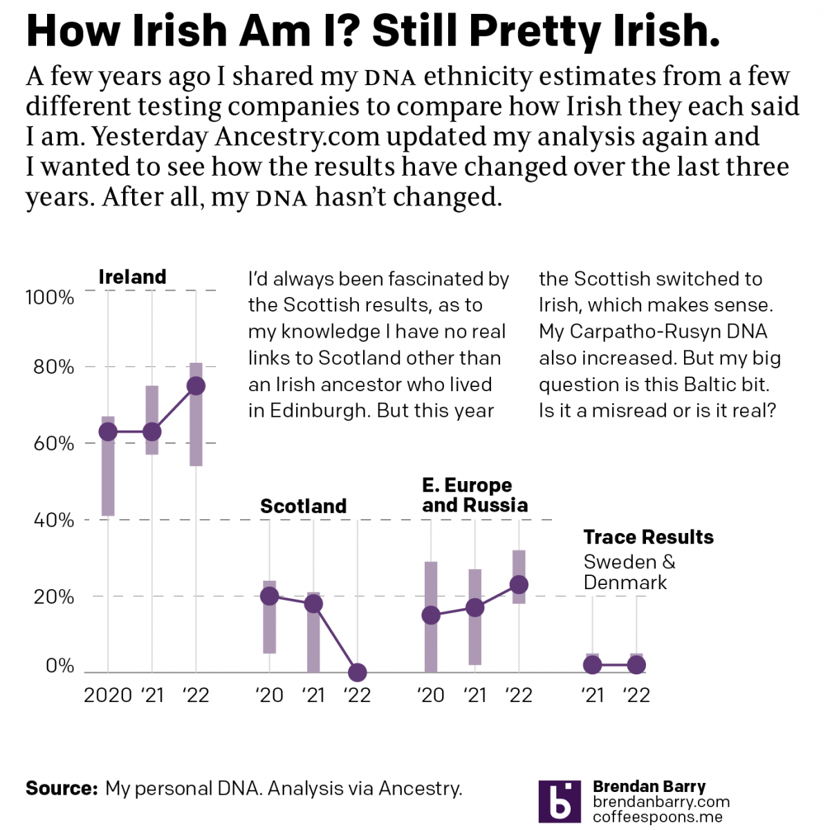
Earlier this year I posted a short piece that compared my DNA ethnicity estimates provided by a few different companies to each other. Ethnicity estimates are great cocktail party conversations, but not terribly useful to people doing serious genealogy research. They are highly dependent upon the available data from reference populations. To put it another…
-
Update on Tiffany
Last month on another Friday I shared some graphics from a video by CCP Grey that looked at the origin and history of the name Tiffany. It’s a great video and I highly recommend it. But last week he published…an addendum I guess you could call it. The piece takes a look at a research…
-
Tiffany
Happy Friday, all. We made it through another week of Covid, vaccinations, asteroids, and all that pleasant stuff. So let’s end with an upbeat note. Over on YouTube there’s a channel I have long enjoyed, CCP Grey, who creates videos about, well lots of things, but sometimes really interesting historical, geographical, and political topics. This…
-
Biden’s English Ancestry Revisited
Last week I posted about an article in the BBC on the English ancestry of American president Joe Biden. And these types of article are a bit pro forma, famous person has an article about their personal ancestry with a family tree attached. Interestingly, this article did not, just the timeline I mentioned and a…
-
Difficult Descendancy Charts
The holiday break is over as your author has burned up all his remaining time for 2020 and so now we’re back to work. And that means attempting to return to a more frequent and regular posting schedule for Coffeespoons. I wanted to start with the death of Diego Maradona, a legendary Argentinian footballer. He…