We all know Joe Biden as the Irish American president. And that’s no malarkey. But, go back far enough in your family tree and you may find some interesting ancestry and ethnic origins and that’s no different with Joe Biden. Keep in mind that our number of ancestors doubles every generation. You have four grandparents, and many of us met most of them. But you had eight great-grandparents. How many of those did you know? And you had 16 great-great-grandparents, you likely didn’t know any of them personally. It becomes pretty easy for an ethnic line to sneak into your ancestry.
And in Biden’s case it may well be English. Although sneaking in is probably a stretch, as this BBC article points out, because his patrilineal line, i.e. his father’s father’s father’s, &c., is likely English. Of course back in the day the Irish and the English mixing would have been unconscionable, at least as my grandmother would have described it. And so it’s easy to see how the exact origins of family lines are quietly forgotten. But that’s why we have genealogists.
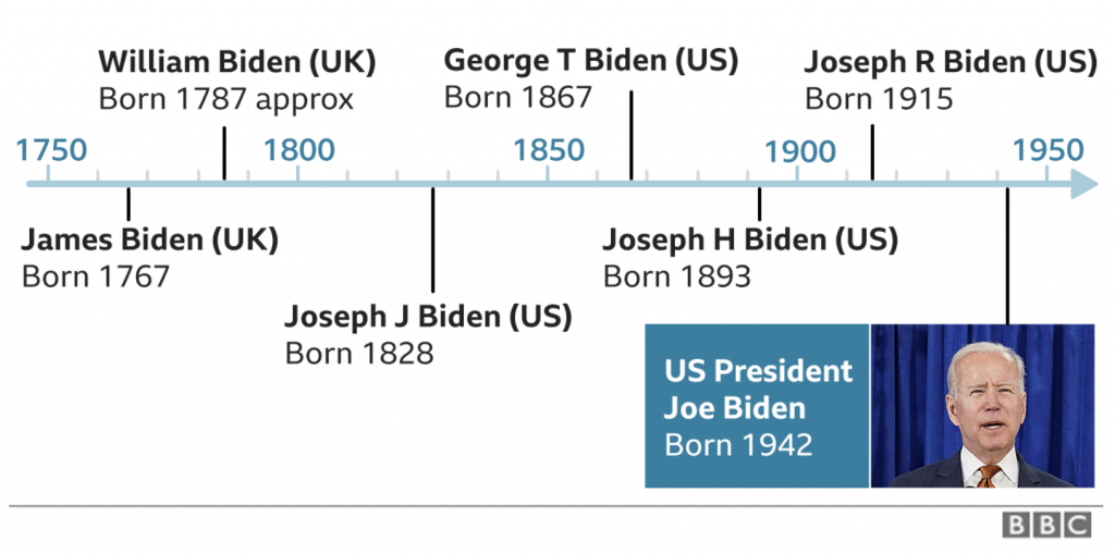
The article eschews the traditional family tree graphic and instead uses only two charts. The first is a simple timeline of Biden’s direct ancestors.

No, it’s no family tree, but timelines are a critical tool used by genealogists because at its core, genealogy is all about time and place. And a timeline has got one of those two facets covered.
Timelines help visualise stories in chronological order. I cannot tell you the number of family trees I have seen where people who create trees casually simply copy and paste data without scrutiny. Children born well after the deaths of parents are common. Or children born to parents in their 50s or 60s—perhaps not strictly impossible, but certainly highly irregular. And so to see Biden’s ancestors plotted out chronologically is a common graphic for those who do any work in genealogy, which my regular readers know is my hobby.
That alone would make the article worth sharing. Because, I enjoyed that graphic. I probably would have created a separate line for the birthplace of each individual, but I quibble.
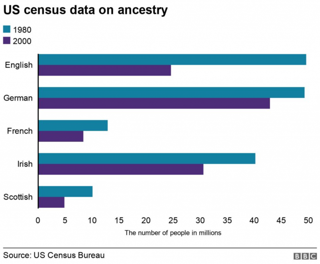
However, we have another graphic that’s not so great. And once again with the BBC I’m talking about axis lines.

Here we have a chart looking at US ancestry as claimed in the US censuses of 1980 and 2000. But we do not have any vertical lines making it easy for readers to accurately compare the lengths of the various bars. Twice lately I’ve posted about axis lines and the BBC. Third time’s the charm?

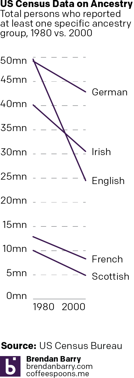
We can also look at using these not as bars, but as line charts as I did in this re-imagining to the right.
First, we no longer need two distinct colours, though you could argue the English line should be a highlight or call out colour given its role in the article. Instead each line receives a label at the right and only the English line crosses any other, but given their point-to-point slope, it’s not confusing like a line chart with all years between 1980 and 2000 could be.
Secondly, the slope here of the line reinforces the idea of falling population numbers. The bar chart also shows this, but through a leftward movement in bars. The bar option certainly works and there’s nothing wrong with it, but these lines offer a more intuitive concept of falling numbers.
I also added some clarification to the data definition. These lines represent the number of people who reported at least one ethnic ancestry—at the time US census respondents could enter upwards of two. For myself, as an example, I could have entered Irish and Carpatho-Rusyn. But my own small sliver of English ancestry would have been left off the list.
Ultimately, the declining numbers of responses along with some reporting on self-identification points to the disappearing concepts of “Irish American” or “English American” as many increasingly see themselves as simply White Americans. But that’s a story for another day.
In the meantime, we have Joe Biden, the Irish American president, with a small bit of English ancestry. Those interested in the genealogy, the article also includes some nice photos of baptismal records and marriage records. It’s an interesting read, though I’m hungry for more as it’s a very light duty pass.
Credit for the BBC pieces goes to the BBC graphics department.
Credit for my reimagination is mine.
Leave a Reply
You must be logged in to post a comment.