The holiday break is over as your author has burned up all his remaining time for 2020 and so now we’re back to work. And that means attempting to return to a more frequent and regular posting schedule for Coffeespoons.
I wanted to start with the death of Diego Maradona, a legendary Argentinian footballer. He died in December of a heart attack and left behind a complicated inheritance situation. To help explain the situation, the BBC created what in genealogy we call a descendancy chart. You typically use a descendancy chart to show the children, and sometimes grandchildren, of a person. (You can also attach people above the person of interest and show the person’s ancestral families.)
This is an example of a descendancy chart from my research into an unrelated family.
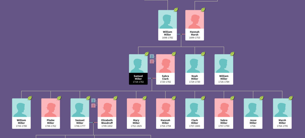
You can see Samuel Miller married Sabra Clark and had at least nine children with her. And I followed one of them, another Samuel, who married Elizabeth Woodruff and they had four children. In this version, you can also see Samuel the elder’s parents and siblings.
But Diego presents a complicated situation. He was married and had two children, then divorced. That’s not terribly uncommon. But he then went on to have potentially eight children with potentially five different women. (I say potentially because some of the claims are still working their way through the courts via paternity tests.)
The above type of chart works well with one couple. In my own family, I have at least one ancestor who had potentially two husbands (the second marriage has not yet been confirmed, but she definitely had children with two different men). And when we use this chart type to look at my ancestor’s descendants, you can see it becomes tricky.
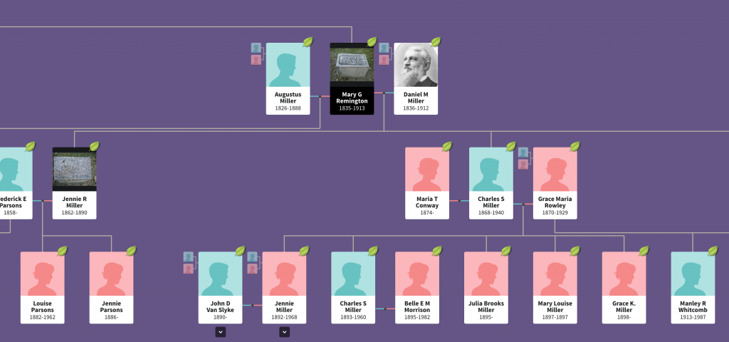
Her children’s fathers can be placed to either side and then the children flow out from that. But whereas in the first chart we could see all nine children in one glance, Mary Remington had four and we only see two in this same view.
So how do you deal with one person who has six total relationships that have offspring?
The BBC opted for a vertical chart that uses colour to link the couples. Diego and his ex-wife receive a red line, and that link moves vertically down from Diego with the two daughters shown as descendants on the right.
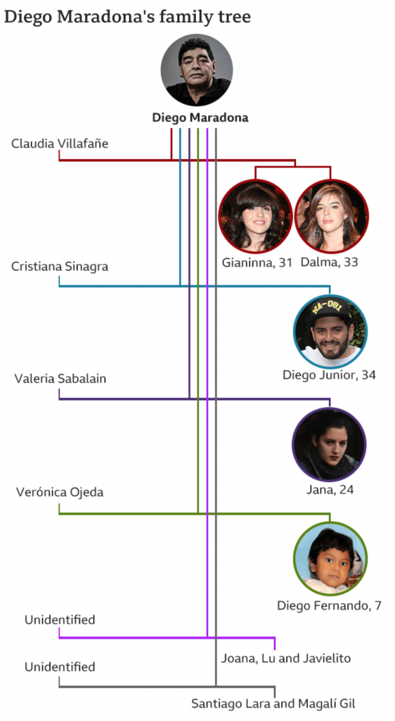
Each subsequent relationship with offspring receives its own colour and continues to move vertically down the page, linking the mother on the left to the children on the right.
What I find interesting is the inconsistency within the chart, however. At the end, with the unidentified women, we have two instances of multiple children. Santiago Lara and Magali Gil, for example, descend from one stem. But note at the top how Diego’s two daughters Gianinna and Dalma each receive their own stem. Is there a reason for combining the two children from one unidentified mother into one branch?
And why the vertical format? You can see in my two examples, we are looking at a horizontal format. It works well when I am working on my desktop. The format is less useful on a mobile. I wonder if the BBC knows from their analytics that most people access their content like this via mobile phone and created a graphic that best uses that tall but narrow proportion. Because the proportions do not work well when the article is viewed on a desktop.
The vertical descendancy chart here is an intriguing solution to show descendants from multiple partners in a single mobile screen display. I am not sure how useful it would be as a new form, because I am not certain of how many times we would run into issues of children from six partners, but it could be worth exploring.
Credit for the images from my examples goes to the designers at Ancestry.com.
Credit for the BBC graphic goes to the graphics department of the BBC.
Leave a Reply
You must be logged in to post a comment.