Last week I posted about an article in the BBC on the English ancestry of American president Joe Biden. And these types of article are a bit pro forma, famous person has an article about their personal ancestry with a family tree attached. Interestingly, this article did not, just the timeline I mentioned and a graphic as part of an aside on the declining self-identification as English-American.
And that, normally is it. Perhaps the article comes out with a few revisions upon the famous person’s marriage, birth of children, and more rarely death, but that is it. Yesterday, however, the BBC posted a follow-up article about an English family claiming kinship with Joe Biden. This article, however, included a family tree of sorts.
This isn’t a family tree in the traditional sense, I would argue it’s the sort of chart genealogists would use to highlight two parties’ relationship to their most recent common ancestor (MCRA). But this chart does something odd, it spaces out the generations inconsistently and so Joe Biden appears at the bottom, aligned with the grandchildren of Paul Harris, the man at the centre of the story.
If you compare the height/length of the lines linking the different generations you can see the lines on Biden’s side of the graphic are very long compared to those on the Harris’ side. This isn’t technically incorrect, but it muddies the water when it comes to understanding the generational differences. So I revisited the design below.
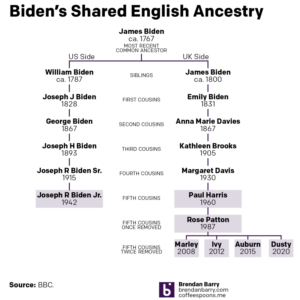
Here I dropped the photographs because, primarily, I don’t have access to them. But they also eat up valuable real estate and aren’t necessary to communicate the relationships. I kept the same distance between generations, which does a better job showing the relationship between Joe Biden and Paul Harris, who appear to be actual fifth cousins. Joe is clearly at a different level than that of Paul’s grandchildren.
I added some context with labelling the generational relationship. At the top we have William and James Biden, assuming they are brothers, listed as siblings. The next level down are first cousins, then second, &c. Beyond Paul, however, we have two additional generations that are removed from the same relationship level. This is where the confusing “once-removed” or “twice-removed” comes into play. One way to think of it is as the number of steps you need to take from, say, Paul’s grandchildren, to get to a common generational level. In their case two levels, hence the grandchildren are fifth cousins to Joe Biden, twice removed.
These types of charts are great to show narrow relationships. Because, if we assume that up until recently each of the generations depicted above had four or five children, that tree would be unwieldy at best to show the relationship between Paul’s family and Joe Biden. If you ever find yourself working on your family ancestry or history and need to show someone how you are related, this type of chart is a great tool.
Credit for the original goes to the BBC graphics department
Credit for my remake is mine.
Leave a Reply
You must be logged in to post a comment.