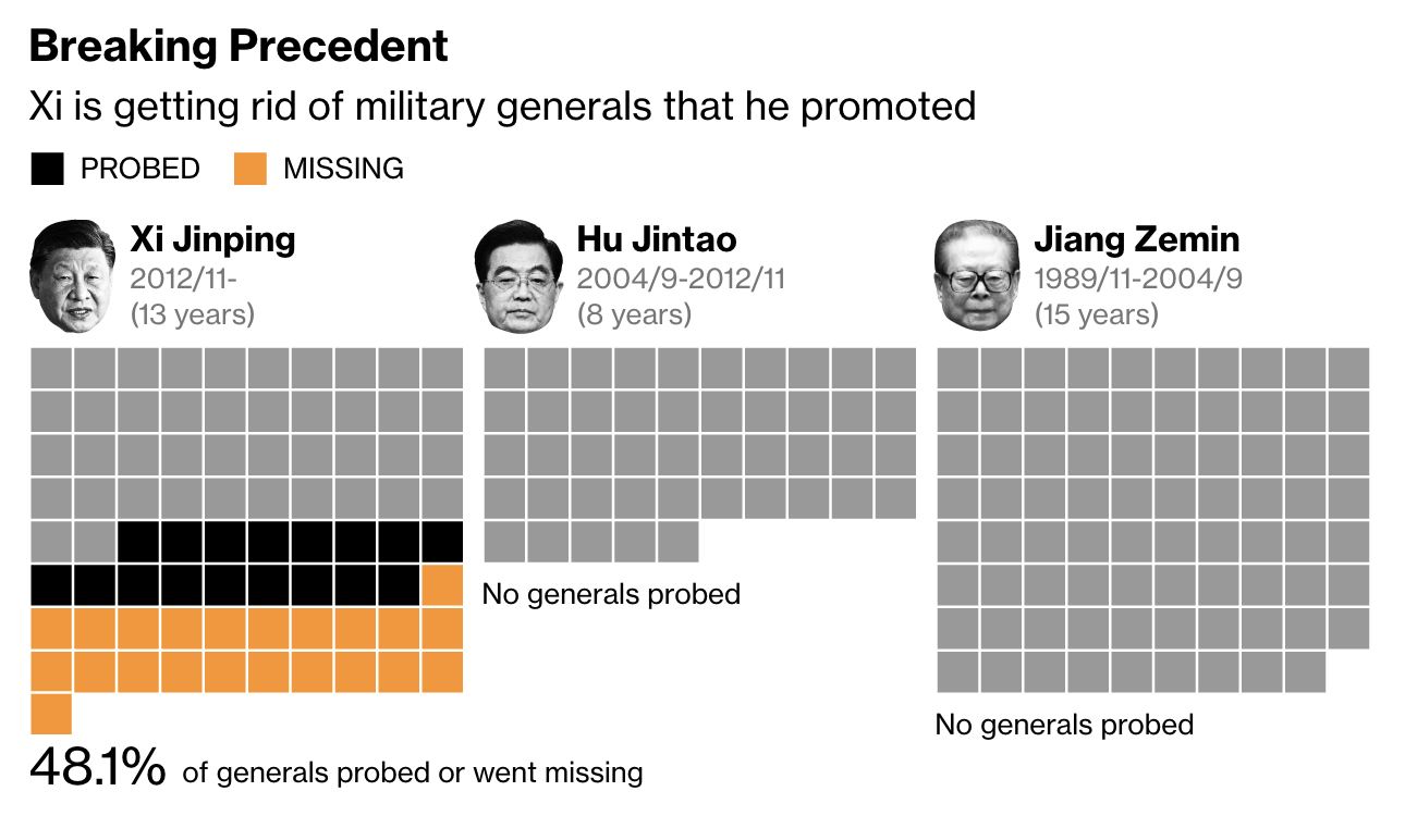
Exposing More of China’s Crimes in Xinjiang

For those who don’t know, China currently engages in ethnocide, or cultural genocide in its western province of Xinjiang, a province with a majority of its population being Uighurs, a Turkic Muslim people. Ethnocide is a term I prefer over genocide as genocide more commonly refers to practices like those in Nazi Germany or 1990s Rwanda and Bosnia wherein people are systematically executed and murdered. Ethnocide leaves a people alive but aims to destroy and extinguish their culture ultimately replacing it with that of another. In this case, Beijing’s policy is to strip the Uighurs of their Muslim culture and identity and replace it with loyalty to China and the Chinese Communist Party.

The BBC have just published what they call the Xinjiang Police Files, files and data hacked off of Chinese government servers and then handed over to a US-based expert on Xinjiang and the atrocities there. That person then handed copies to the BBC, which has verified much of the content.

There is not much by way of data visualisation or information design, but the story is worth mentioning because maybe over one million people are being forcibly detained and “re-educated” by Beijing. One of the articles about the files, however, does have a small graphic of one of the “re-education camps”, i.e. prison, and details its design and the facilities therein.

Certainly not like any school I have ever attended…

Political liberalism and pluralism are messy. Often it means we hear and listen to things with which we disagree, sometimes vehemently. Freedom of speech, expression, and religion can make us feel uncomfortable, hurt our feelings, and even sick to our stomachs. But that is also the price of our liberty to speak, express, and pray ourselves. Because we only need to look to China to see what happens when a society or a government decides what is or isn’t acceptable speech (peaceful protests against the government), expression (growing out a beard), or religion (praying in a mosque). An authoritarian regime, an anti-liberal regime, will attempt to stifle, silence, and ultimately imprison those who go against the (Chinese Communist) party line.

1984 rings a little more true each year.

Credit for the piece goes to John Sudworth and the BBC’s Visual Journalism Team.

Finding Home with a Homemade Map

We’re going to start this week out with some good news and for that we turn to China. 30 years ago, child traffickers kidnapped four-year old Li Jingwei from his family and sold him to another family over 1,000 miles away. A BBC article from earlier this month covered Li Jingwei’s reunion with his family. How did it happen? Because of a map he drew and shared with the internet.

Here’s a screenshot of that map.

It’s missing a Starbucks though

We all create mental maps of our surroundings. And not surprisingly they grow larger as we get older. But this man’s ability to recall details of his family hometown allowed internet sleuths, and eventually the police, to identify the village. DNA tests then connected Li to a woman whose son had been abducted.

When we draw out these maps ourselves they become a link to the cartographic world. And that this man was able to use his own mental map to find his home. Well, like I said, we’re going to start the news off with some good news.

Credit for the piece goes to Li Jingwei.

You Thought That Was All China Was Doing in Its Western Deserts?

Yesterday I wrote about some new ICBM silos China is building in its western desert. These things clearly interest me and so I was doing a little more digging when I found this even more recent article, this one from the BBC about an entirely different ICBM silo field that China is building in another western desert.

In terms of data visualisation and information design, we are looking at the same kind of graphic: an annotated satellite photograph. But the story it paints is the same: China is rapidly expanding its nuclear missile arsenal.

Similar to the earlier piece we see dots to indicate missile silo construction sites. But the Federation of American Scientists noted these silos appear to be at earlier phase of the construction process given that sites were still being cleared and prepared for construction activity.

You get a silo, and you get a silo, and you get a silo…

But put it together with the publicly available information from yesterday and, again, we can only draw the conclusion that China wants to greatly increase its nuclear arsenal. And like yesterday we’re left with the same question:

How will the United States and her allies respond?

Credit for the piece goes to the Federation of American Scientists.

It’s the Big Things That’ll Kill You

We can move from the microscopic things that will kill us to the very big things that will kill us. Nuclear missiles.

Because satellite photography from late June indicated that China is presently building over 100 ICBM silos in its western deserts. China has long had nuclear weapons, but has also long kept its arsenal small, compared to the two nuclear behemoths: the United States and the Soviet Union/Russia. But you don’t begin building over 119 missile silos unless you intend to build ICBMs.

To be clear, this doesn’t mean that China will build 119 missiles. More than likely it’ll be a very expensive and potentially deadly shell game. How many missiles are underneath the silo covers? Can you keep track of them? But even if China builds a fraction of 100, modern ICBMs come with multiple independent reentry vehicles (MIRVs) that allow a single missile to target several cities independently.

We also know that China has been building shorter and more intermediate range ICBMs. But some of those are thought to be equipped with conventional warheads, designed to target and sink American supercarriers in the Pacific. The goal to deny American sea and airpower effective bases to defend Taiwan or other allies in the South China Sea.

We know about this most recent buildup because of a Washington Post article that used satellite photography to pinpoint those new silos.

Beware the missile gap

Of course this isn’t news to the defence and intelligence agencies. For sometime now they’ve been warning of China’s build-out of its military capacities. The question will be is how does the United States and her allies respond?

Credit for the piece goes to Planet/Center for Nonproliferation Studies.

Erasing Culture One Tomb at a Time

As many of my readers know, I have a keen interest in genealogy. And for me that has often met spending hours—far too many hours—wandering around cemeteries attempting to find memorials to ancestors, links to my history, a context to that soil from a different time.

But if you live in Xinjiang or more broadly western China, and you’re not Han Chinese, you probably don’t have that luxury. The Uighurs, a Turkic Muslim people native to that part of Asia, have long been oppressed by the Chinese central government. Most recently they have been in the news after scholars and leading figures have “disappeared”, after news of re-education and concentration camps (though thankfully I have read nothing of industrialised death camps).

Instead, now Chinese authorities are destroying mosques (not news), but also now cemeteries, as this article in the Washington Post explains.

That's a lot of empty space. Well done, Beijing.
That’s a lot of empty space. Well done, Beijing.

The piece just uses some simple before and after photography to visualise its point. Sadly it does it to great effect.

I forget who originally said it, but someone once said that we all die, each of us, two deaths. The first time is when we die and our buried in the ground. The second and final time is when the last person who remembers us forgets us.

And we are now watching thousands of Uighurs in western China die for the second and final time.

Credit for the piece goes to Bahram Sintash.

Hong Kong Identity

One of the things I have been following closely the last few months has been the protests in Hong Kong. The city is one of China’s few Special Administrative Regions—basically the former British colony of Hong Kong and the former Portuguese colony of Macau, two cities bordering mainland China and separated by the Pearl River estuary.

Long story short, but since 1997 Hong Kong should enjoy 50 years of a legal system that is more aligned to that of its former status of a British colony than that of mainland China. But increasingly since Xi Jinping took power, he has been eroding those rights and the youth of Hong Kong have taken to the streets to protest, a right they enjoy but not the rest of mainland Chinese.

And so we have a survey looking at the identity by which those people living in Hong Kong choose to identify.

And it’s not Chinese.

Not a good trend for Beijing

From a news perspective, this poses problems for a Beijing-based Chinese government that is making pains to promote a greater Chinese identity throughout the world, least of all by pushing for a reunification with Taiwan by force if necessary. A generation of several million Hong Kongers and the way they raise their children, in addition to their friends and supporters abroad, weakens the authority of Beijing.

Hence the threat of a Tiananmen Square style crackdown on Hong Konger protestors.

Alas, the United States has been far more concerned with its trade dispute than it has been the democratic and human rights of several million people. At least, that is the impression given by the White House.

But, as to the design, I do not love the spaghettification of the line charts. Though I do appreciate that the Hong Kong identity has been separated by the maroon-coloured line. I wonder if labelling the lines in the small multiples is necessary given the decision to include the legend at the top of the chart.

The other tricky thing with this type of chart is that the data series is a population cohort. And yet the data is based on a time series. And so the cohorts vary over time. It might not be entirely clear to the audience that this (appears to be)/is a sample of people of an age at a particular date. How do those people change over the years? It’s hard to see that trend by separating out the data.

Overall, it’s a solid piece. And it’s important given the gravity of the protests in Hong Kong.

Credit for the piece goes to the Economist Data team.

Trade War Retaliation

About a week and a half ago the Economist published an article about the retaliatory actions of the European Union and China against the tariffs imposed by the Trump administration. Of course last week we had a theme of sorts with lineages and ancestry. So this week, back to the fun stuff.

What makes today’s piece particularly relevant is that over the weekend, Trump announced he might increase the tariffs proposed, but not yet implemented, upon Chinese goods. So some economists looked at the retaliatory tariffs proposed by the EU and China.

Ultimately Trump's tariffs are not paid by foreign governments, but by US citizens.
Ultimately Trump’s tariffs are not paid by foreign governments, but by US citizens.

Each targets Trump voters, albeit of different types. But China appears more willing to engage in a brutal fight. Its tariff proposal would not just harm Trump voters, but would also harm Chinese citizens. The EU’s plan appears tailored to maximise the pain on Trump voters, but minimise that felt by its own citizens.

A few minor points. I like how the designers chose to highlight high impact categories with colour. Lower impact shares are two shades of light grey. But after that, the scale changes. I wonder how the maps would compare if each had been set to the same scale. It looks doable as the bottom range of the maximum bin is 6% for the EU and 8% for China. (Their high limit is much higher at 22% compared to the EU’s 10%.)

That said, it does a good job of showing the different geographic footprints of the two retaliatory tariff packages. Tomorrow—barring breaking news—we will look at why that is important.

Credit for the piece goes to the Economist Data Team.

Where’s All the Oil Going?

Hint: not China.

Today’s piece is a nice little graphic from the Economist about the oil and natural gas industry in the United States. We have a bar chart that does a great job showing just how precipitous the decline in Chinese purchases of oil and liquid natural gas has been. Why the drop off? That would be the trade war.

Will they take it? For all the tea in China?

The second graphic, on the right, is far more interesting. The data comes from BP, so the proverbial grain of salt, but it compares expected GDP and demand for energy by source from a baseline model of pre-Trumpian trade war policies to a future of “less globalisation”. Shockingly (sarcasm), the world is worse off when global trade is hindered.

You all know where I stand on stacked bar charts. They are better than pie charts, but still not my favourite. If I really want to dig in and look at the change to, say, coal demand, I cannot. I have to mentally remove that yellow-y bit from the bottom of the bar and reposition to the 0 baseline. Or, I could simply have coal as a separate bar next to the other energy sources.

Credit for the piece goes to the Economist Data Team.

Chinese Urban Clusters

Yesterday the Economist posted a graphic about Chinese urban clusters, of which the Chinese government is planning to create 19 as part of a development strategy. In terms of design, though, I saw it and said, “I remember doing something like that several years ago”.

The Economist piece looks at just the geography of the Chinese clusters. It highlights three in particular it discusses within the article while providing population numbers for those clusters. Spoiler: they are large.

The Economist graphic does little else beyond labelling the cities and the highlighting of the three features clusters. But that is perfectly okay, because that was probably all the graphic was required to do. I am actually impressed that they were able to label every city on the map. As you will see, we quickly abandoned that design idea.

The Chinese government's new urban cluster plan
The Chinese government’s new urban cluster plan

So back in 2015, using 2014 data, my team worked on a series of graphics for a Euromonitor International white paper on Chinese cities. The clusters that the analysts identified, however, were just that, ones identified by researchers. Since the Chinese government had not yet created this new plan.

We added some context to our cluster map

We also looked at more cities and added some vital context to the cluster map by working to identify the prospects of the various Chinese provinces. Don’t ask me what went into that metric, though, since I forget. The challenge, however, was identifying the four different tiers of Chinese city and then differentiating between the three different cluster types while overlaying that on a choropleth. Then we added a series of small multiples to show how now all provinces are alike despite having similar numbers of cities.

Credit for the Economist piece goes to the Economist Data Team.

Credit for the Euromonitor piece is mine. I would gladly give a shoutout to those that worked with me on that project…but it’s been so long I forget. But I’m almost certain both Lindsey Tom and Ciana Frenze helped out, if not on that graphic, on other parts of the project.

Tariffs and Trade with China

Following up on yesterday’s post about the facts on tariffs, today we look at an article from Politico that polled voters on their feelings about trade and trade policy. Now the poll dates from the beginning of June and unfortunately a lot of things have changed since then. But, the data overwhelmingly supports the conclusion that voters, at that time at least, do not support placing tariffs on goods coming into the US.

Let’s take a look at another component of the article, however, a chart exploring the infamous trade deficit. First of all, trade deficits do not work like how the president says they do—but we will come back to that in another post. In short, trade deficits are neither good nor bad. They are just one way of describing one facet of a trade relationship between two countries.

This piece looks at the trade balance between the United States and China.

We will get into why this isn't all bad in another post
We will get into why this isn’t all bad in another post

Now, from the topical standpoint, it does a really nice job of showcasing how our imports have surged above our experts. From a topical standpoint, however, we do not know if this is a total trade deficit or just in goods, like the president prefers to talk about, or in goods and services, the latter of which accounts for way more than half of the US economy.

From a design perspective, I have a few thoughts and the first is labelling. The chart does label the endpoints of the data set, 1985 and 2017. But aside from a grey bar representing the Financial Crisis, there are few other markers to indicate the year. In smaller charts, I often do this myself, because space. But here there is enough space for at least a few intervening years to be labelled.

Secondly, the white outline of the red line. I have talked before of a trend to showcase a line over other lines with that thin stroke. But this is the first time I can recall the effect being used over an area filled with colour. Is it necessary? Because the area is light and the line dark and bright, probably not.

Then the outline appears on the text in the graphic, in particular the labels of imports, exports, and the trade deficit label. The labels for the imports and exports likely are necessary because of that light grey used for the text. But, as with the line for the trade deficit, its label likely provides sufficient contrast the thin white outline isn’t necessary.

Credit for the piece goes to Jeremy C.F. Lin.