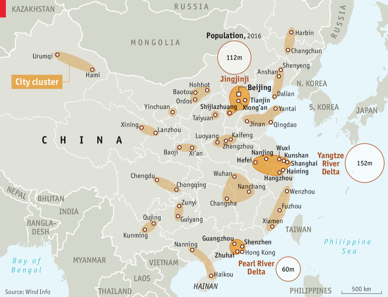
Yesterday the Economist posted a graphic about Chinese urban clusters, of which the Chinese government is planning to create 19 as part of a development strategy. In terms of design, though, I saw it and said, “I remember doing something like that several years ago”.
The Economist piece looks at just the geography of the Chinese clusters. It highlights three in particular it discusses within the article while providing population numbers for those clusters. Spoiler: they are large.
The Economist graphic does little else beyond labelling the cities and the highlighting of the three features clusters. But that is perfectly okay, because that was probably all the graphic was required to do. I am actually impressed that they were able to label every city on the map. As you will see, we quickly abandoned that design idea.
So back in 2015, using 2014 data, my team worked on a series of graphics for a Euromonitor International white paper on Chinese cities. The clusters that the analysts identified, however, were just that, ones identified by researchers. Since the Chinese government had not yet created this new plan.
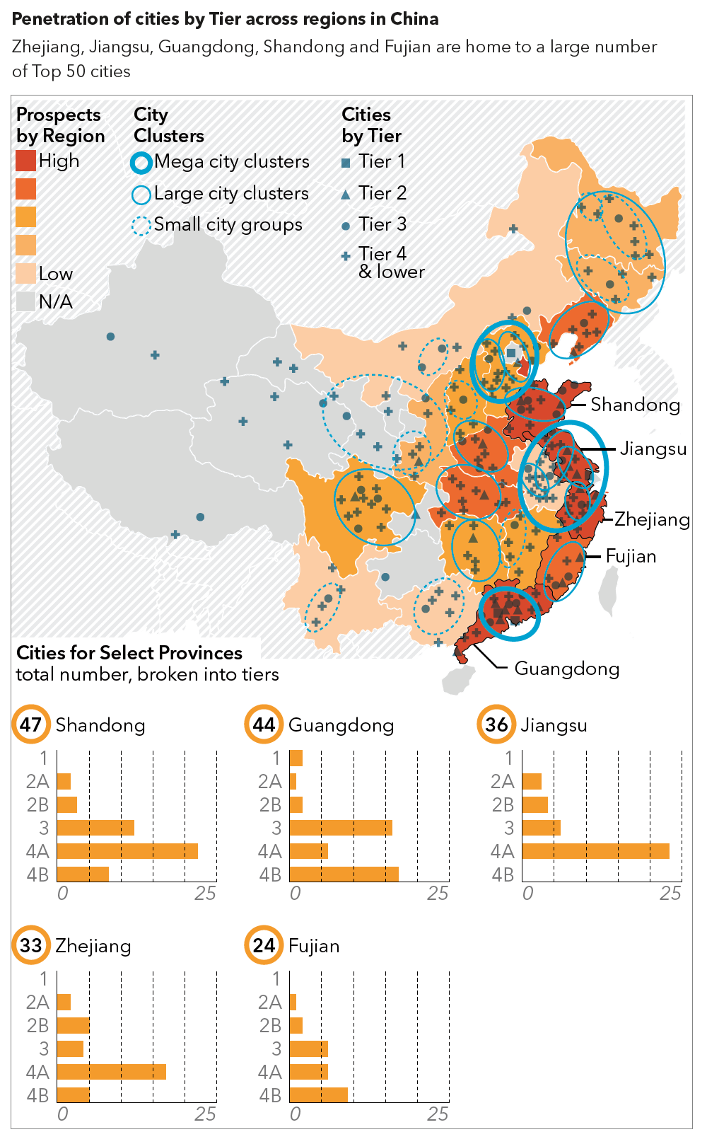
We also looked at more cities and added some vital context to the cluster map by working to identify the prospects of the various Chinese provinces. Don’t ask me what went into that metric, though, since I forget. The challenge, however, was identifying the four different tiers of Chinese city and then differentiating between the three different cluster types while overlaying that on a choropleth. Then we added a series of small multiples to show how now all provinces are alike despite having similar numbers of cities.
Credit for the Economist piece goes to the Economist Data Team.
Credit for the Euromonitor piece is mine. I would gladly give a shoutout to those that worked with me on that project…but it’s been so long I forget. But I’m almost certain both Lindsey Tom and Ciana Frenze helped out, if not on that graphic, on other parts of the project.
Leave a Reply
You must be logged in to post a comment.