Hint: not China.
Today’s piece is a nice little graphic from the Economist about the oil and natural gas industry in the United States. We have a bar chart that does a great job showing just how precipitous the decline in Chinese purchases of oil and liquid natural gas has been. Why the drop off? That would be the trade war.
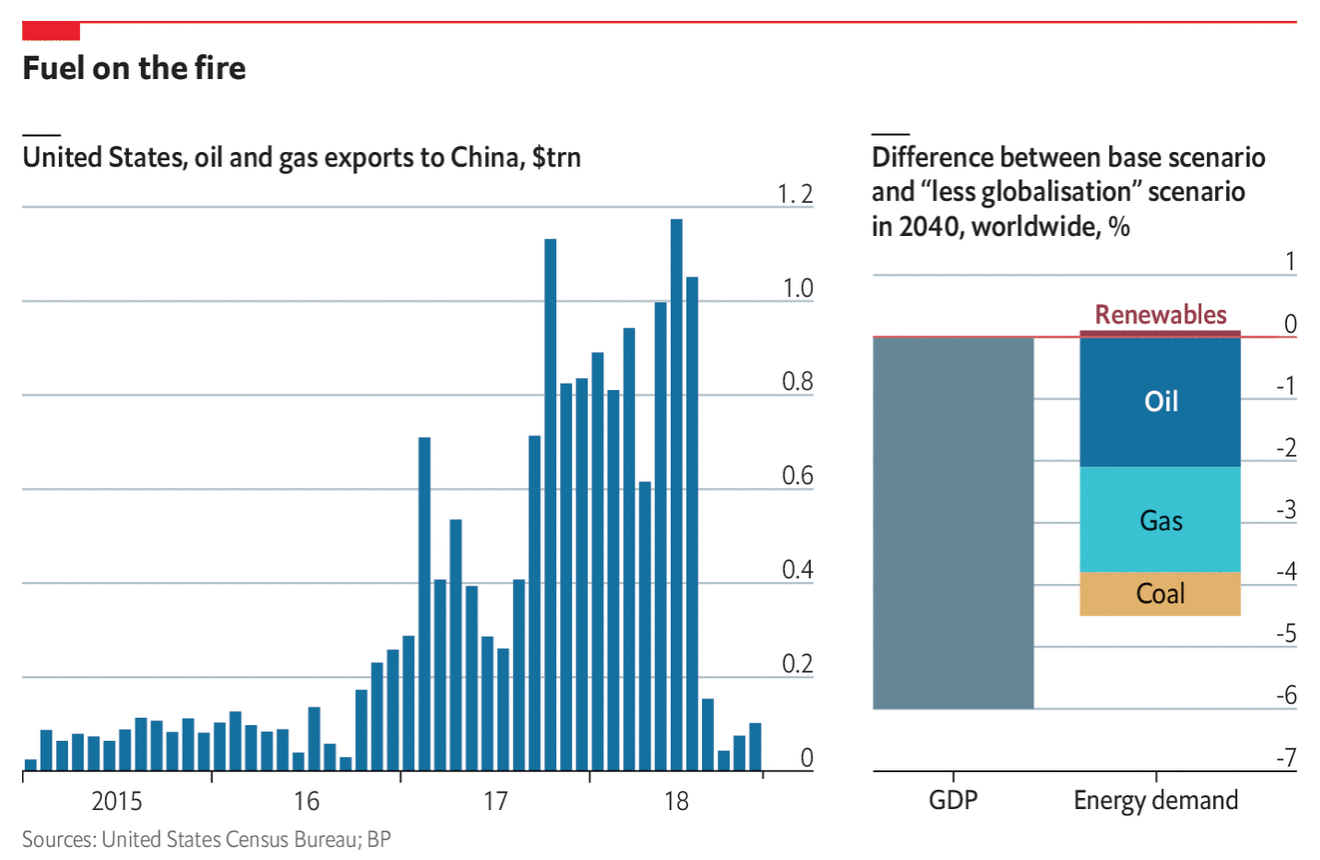
The second graphic, on the right, is far more interesting. The data comes from BP, so the proverbial grain of salt, but it compares expected GDP and demand for energy by source from a baseline model of pre-Trumpian trade war policies to a future of “less globalisation”. Shockingly (sarcasm), the world is worse off when global trade is hindered.
You all know where I stand on stacked bar charts. They are better than pie charts, but still not my favourite. If I really want to dig in and look at the change to, say, coal demand, I cannot. I have to mentally remove that yellow-y bit from the bottom of the bar and reposition to the 0 baseline. Or, I could simply have coal as a separate bar next to the other energy sources.
Credit for the piece goes to the Economist Data Team.
Leave a Reply
You must be logged in to post a comment.