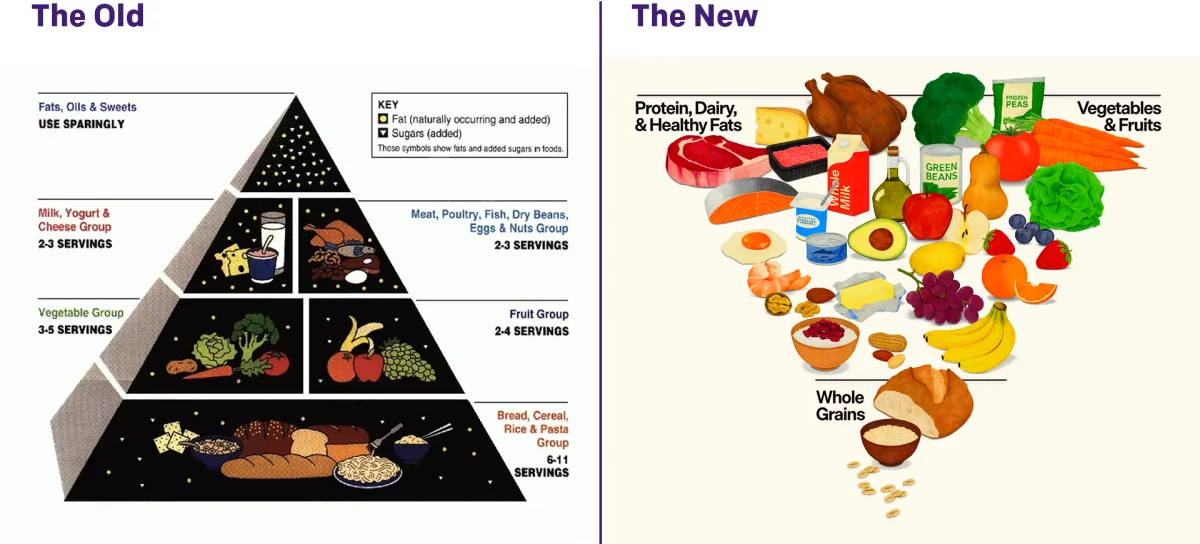
Food Flows Connect Counties

For my American audience, this week is Thanksgiving. That day when we give thanks for Native Americans giving European settlers their land for small pox ridden blankets. And trinkets. Don’t forget the trinkets. But we largely forget about the history and focus on three things: family, food, and American football. Not necessarily in that order.

But this week I am largely going to want to focus on the food.

Today we can look at a graphic coming from a team of researchers at the University of Illinois who examined the flows of food across the United States, down to the county level. It helped produce this map that shows the linkages between counties.

Oh look at that Mississippi River trail

To be sure, the piece uses some line charts and other maps to showcase the links, but the star is really this map. But aside from its lack of Alaska and Hawaii, I think it suffers from one key design choice: leaving the county borders black.

The black lines, while thin, compete with the faint blue lines that show the numerically small links between counties. Larger trade flows, such as those within California, are clearly depicted with thicker strokes that contrast with the background political boundaries of the counties. But the light blue lines recede into the background beneath the borders.

I wonder if a map of solid, light grey fills and white county borders would have helped showcase the blue lines and thus trade flows a little bit better. After all, the problem is especially  noticeable in the eastern half of the United States where we have much geographically smaller counties.

Hat tip to friend and former colleague Michael Schaefer for sharing the article in question.

Credit for the piece goes to Megan Konar et al.

The Climate Impact of Your Food

Climate change is a thing. And facing it will require a lot of our societies. But the longer we choose not to act, the more the impact will be felt by later generations. Consequently, across the world, young students have been walking out of class to shine light on an issue on which they, as children, have little direct impact. Yet. But what about us? The ones who can vote and make lifestyle decisions?

The BBC had a piece where, after soliciting questions from their readership, they answered questions. One question being, what can individuals do to reduce their impact. And while clearly individuals need to do more than one thing, one facet can be examining one’s diet. The article included this graphic on the climate impact of various food types, vis-a-vis greenhouse gas emissions.

Is this saying I should drink more beer?

Essentially we are looking at a simplified box plot of greenhouse gas emissions per serving of food (and drink) type. The box plot looks at a range of values for a specific item. It usually shows the extremes at both ends; the range of a significant number of the data points, e.g. 80% of the set, or by decile, or by quartile; and then lastly the average, be it mean or median. Here we have only low impact, high impact, and average impact. Presumably the minimum, maximum, and then either mean or median.

And it works really well. Chocolate is a great example of how on average, chocolate isn’t terrible. But certain chocolates can have far worse ramifications than low-impact beef, or average-impact lamb and prawns. And beef is well known to be one of the most impactful types of food.

From a design standpoint, I don’t know if the colours necessarily help. The average beef impact, for example, is worse than the high-impact maximum of every other food listed. But the association of green=good and red=bad  here has little value because by that logic, the average=gold beef should be red as it sits above the high-impact everything else. A less editorial choice could be made of say a light grey or blue and then have the bright colour, maybe still orange, indicate where the average sits on that spectrum.

I do like the annotations on the chart. It highlights particular stories, like the aforementioned chocolate one, that the casual, i.e. skimming, reader may miss.

I could probably do without the little food illustrations. But the designer did a good job of making them all recognisable in such a small space—far from an easy task. And being so small, they don’t really distract or take away from the whole graphic.

Overall, this is a strong graphic.

Credit for the piece goes to the BBC graphics department.

Education and Eatery Preferences

Last week the Economist posted an intriguing article about the relationship between culinary choices/preferences and education and income. It began with an article by David Brooks in the Times, which I have not read, talking about how culture can create inequality as much as economics or government policy. The Economist then conducted a survey looking at the relationship between food preferences and both education and income. This is a screenshot of some of their results.

To be fair, I rarely eat sushi because I don't much care for it.
To be fair, I rarely eat sushi because I don’t much care for it.

Yes, correlation is not causation, but these are some fascinating findings that suggest we should perhaps explore the idea in more depth.

As to the graphics, we have nothing super sophisticated, just a matrix of small multiples. But that goes to the point of “simple” graphics sometimes can do wonders for a story.

Credit for the piece goes to the Economist graphics department.

Fruits and Vegetables

Friday is finally here and so for many that means it is time for the desserts and the drinks. But before you get that far, we all need to eat our fruits and vegetables. Thankfully the Washington Post has an article that examines changes in the appearance of our fruits and veggies over time.

Portrait of a man made in fruit and veggies

Credit for the piece goes to Giuseppe Arcimboldo. It’s not everyday I credit a Renaissance artist on the blog.

McDonald’s All-day Breakfast

I don’t know about you, but I have seen a lot of those all-day breakfast bags sitting about the city of Chicago the last few days. (That they are not in waste bins is a different story.) CBS took a look at where the biscuit vs. McMuffin offering is available in the US—hint, not Chicago—and compared that geographic spread to something else. It’s worth a quick look.

Where to go for biscuits

Credit for the piece goes to CBS graphics department.

Spicing It Up (Or Not If You Like Caraway)

Here is a post for all you cooks and bakers out there: spices. Over the weekend I came upon a piece FiveThirtyEight ran earlier this year about American spice consumption. They use spice availability as a proxy for consumption, because no such data exists—and unfortunately the standard for reporting changed in 2012 so data is only available until then. But the piece uses some nice small multiples and a combined line chart to show some changes. Of note is the decision not to include ginger in the first, most likely because its scale would distort the rest of the chart. Anyway, if you are hungry, probably a good idea not to check this out.

How some spices have changed

Credit for the piece goes to the FiveThirtyEight graphics department.

Fast Food on the Internets

Let’s aim for something a bit lighter today. Well, lighter in all things but calories, perhaps. Today we have a piece from the Wall Street Journal that looks at the social media presence of several large fast food brands. Overall, it has a few too many gimmicky illustrations for my comfort. But, the strength of the piece is that it does look at some real data, e.g. plotted Twitter response rates, and then contextualises it with appropriate callouts.

Who cares about your tweets?

The illustrations are killing me, though.

Credit for the piece goes to Marcelo Prince and Carlos A. Tovar.

Chipotle and Calories

In my office, Chipotle is a popular fast-casual lunch choice. I am not sure, however, whether people would want to see today’s piece, an article from the New York Times about the nutritional value of a Chipotle meal. The piece makes good use of a few bar charts and nice photographs and table to explain how calorific a burrito there can be. Maybe I should be having a salad for lunch today…

Chipotle calories
Chipotle calories

Credit for the piece goes to Kevin Quealy, Amanda Cox, and Josh Katz.

When is Hummus Not Hummus?

The subject matter of this one interested me. I am new to hummus. Well, sort of. I never ate it before moving to Chicago. But when I did, I understood it to be essentially a dip made from chick peas. According to an article from Quartz, It turns out that’s what most Americans believe. Even if they’re not necessarily buying it. Literally (sort of). Because some popular brands contain no chick peas. (Disclosure: I work for the company that provided some of the market sizing data used in the piece.)

Kind of needs chickpeas.

Credit for the piece goes to David Yanofsky.