Climate change is a thing. And facing it will require a lot of our societies. But the longer we choose not to act, the more the impact will be felt by later generations. Consequently, across the world, young students have been walking out of class to shine light on an issue on which they, as children, have little direct impact. Yet. But what about us? The ones who can vote and make lifestyle decisions?
The BBC had a piece where, after soliciting questions from their readership, they answered questions. One question being, what can individuals do to reduce their impact. And while clearly individuals need to do more than one thing, one facet can be examining one’s diet. The article included this graphic on the climate impact of various food types, vis-a-vis greenhouse gas emissions.
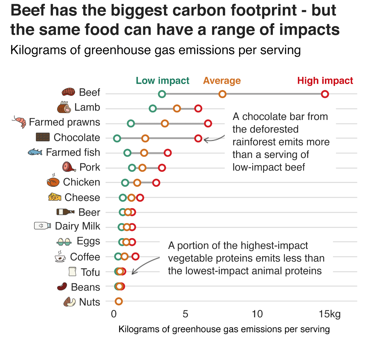
Essentially we are looking at a simplified box plot of greenhouse gas emissions per serving of food (and drink) type. The box plot looks at a range of values for a specific item. It usually shows the extremes at both ends; the range of a significant number of the data points, e.g. 80% of the set, or by decile, or by quartile; and then lastly the average, be it mean or median. Here we have only low impact, high impact, and average impact. Presumably the minimum, maximum, and then either mean or median.
And it works really well. Chocolate is a great example of how on average, chocolate isn’t terrible. But certain chocolates can have far worse ramifications than low-impact beef, or average-impact lamb and prawns. And beef is well known to be one of the most impactful types of food.
From a design standpoint, I don’t know if the colours necessarily help. The average beef impact, for example, is worse than the high-impact maximum of every other food listed. But the association of green=good and red=bad here has little value because by that logic, the average=gold beef should be red as it sits above the high-impact everything else. A less editorial choice could be made of say a light grey or blue and then have the bright colour, maybe still orange, indicate where the average sits on that spectrum.
I do like the annotations on the chart. It highlights particular stories, like the aforementioned chocolate one, that the casual, i.e. skimming, reader may miss.
I could probably do without the little food illustrations. But the designer did a good job of making them all recognisable in such a small space—far from an easy task. And being so small, they don’t really distract or take away from the whole graphic.
Overall, this is a strong graphic.
Credit for the piece goes to the BBC graphics department.
Leave a Reply
You must be logged in to post a comment.