For my American audience, this week is Thanksgiving. That day when we give thanks for Native Americans giving European settlers their land for small pox ridden blankets. And trinkets. Don’t forget the trinkets. But we largely forget about the history and focus on three things: family, food, and American football. Not necessarily in that order.
But this week I am largely going to want to focus on the food.
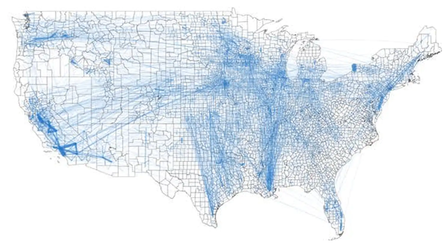
Today we can look at a graphic coming from a team of researchers at the University of Illinois who examined the flows of food across the United States, down to the county level. It helped produce this map that shows the linkages between counties.

To be sure, the piece uses some line charts and other maps to showcase the links, but the star is really this map. But aside from its lack of Alaska and Hawaii, I think it suffers from one key design choice: leaving the county borders black.
The black lines, while thin, compete with the faint blue lines that show the numerically small links between counties. Larger trade flows, such as those within California, are clearly depicted with thicker strokes that contrast with the background political boundaries of the counties. But the light blue lines recede into the background beneath the borders.
I wonder if a map of solid, light grey fills and white county borders would have helped showcase the blue lines and thus trade flows a little bit better. After all, the problem is especially noticeable in the eastern half of the United States where we have much geographically smaller counties.
Hat tip to friend and former colleague Michael Schaefer for sharing the article in question.
Credit for the piece goes to Megan Konar et al.
Leave a Reply
You must be logged in to post a comment.