Tag: illustration
-
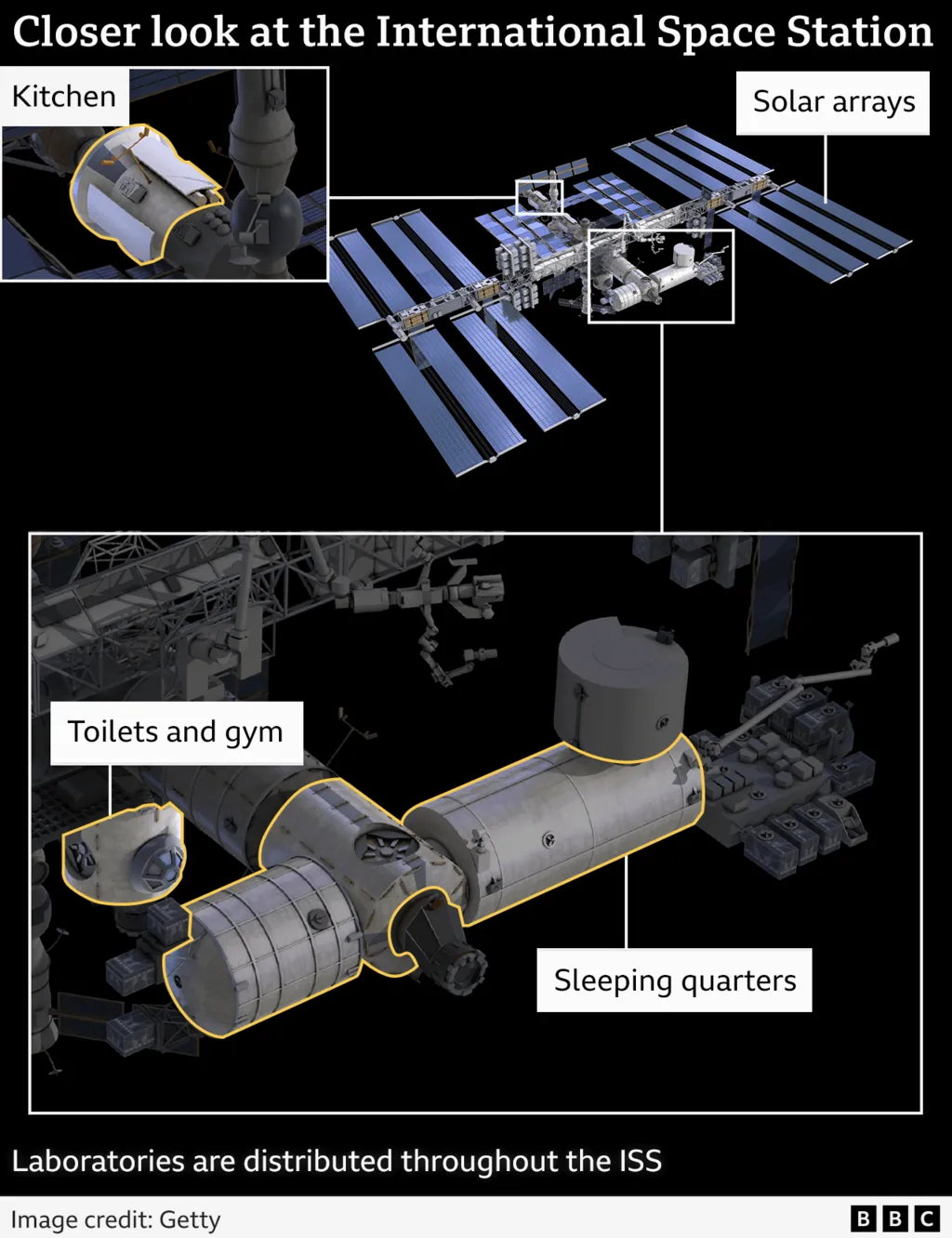
Life Aboard the International Space Station
This weekend I read a neat little article from the BBC about astronauts’ lives aboard the International Space Station (ISS). This comes on the heels of two NASA astronauts being left on the station due to some uncertainty about their Boeing spacecraft’s safety. The article featured a number of annotated photographs and illustrations, but this…
-
Datagraphics as Marketing Materials
I spent the last two weeks out of town, and my post for the Friday before didn’t happen because there was a fire at my building—I and my unit are fine—that knocked out internet for about 24 hours. But now I have returned. One of the things I did was visit the city of Pittsburgh…
-
James Webb
It’s cool. In the darkness of space. We made it to the end of the week, a big week for space news. So with that, enjoy this illustration from xkcd about the James Webb Space Telescope. Credit for the piece goes to Randall Munroe.
-
L2 Halo for JWST
Yesterday I received a question about where the new James Webb Space Telescope is located. Is it in orbit of the Earth, like Hubble? Is it out in deep space? The answer is no, not really. Now I spent this morning trying to illustrate the answer to that question myself. However, it’s taking me too…
-
Those Quirky Quarks
Last week scientists working at the Large Hadron Collider in Switzerland announced the discovery of new sub-atomic particles: a pentaquark and tetraquarks. This BBC article does a really good job of explaining the role of quarks in the composition of our universe, so I encourage you to read the article. But they also included a…
-
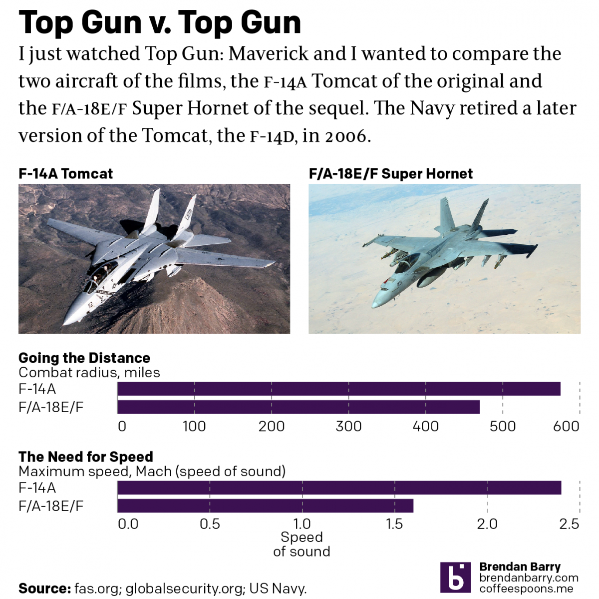
Top Gun
Last night I went to see Top Gun: Maverick, the sequel to the 1986 film Top Gun. Don’t worry, no spoilers here. But for those that don’t know, the first film starred Tom Cruise as a naval aviator, pilot, who flew around in F-14 Tomcats learning to become an expert dogfighter. Top Gun is the…
-
Serfs Up, Bro
Now get him into the fields. Well that was a week. But at least we made it to Friday and for my American readers and myself this weekend and its bank holiday on Monday, Memorial Day, mark the unofficial beginning of summer. So thanks to Indexed, it’s time to head down to the beach and…
-
Exposing More of China’s Crimes in Xinjiang
For those who don’t know, China currently engages in ethnocide, or cultural genocide in its western province of Xinjiang, a province with a majority of its population being Uighurs, a Turkic Muslim people. Ethnocide is a term I prefer over genocide as genocide more commonly refers to practices like those in Nazi Germany or 1990s…
-
Hey, Cousin!
As many of my long-time readers know, I count genealogy as one of my hobbies. A few weeks ago for Orthodox Easter I travelled up to the hometown of my late grandfather. There I get to see people to whom I’m related as many of us can point to ancestors from the same few villages…
-
Off the Deep End
Summer rapidly approaches. As does this weekend. Combining those two elements, we can thank xkcd for a wonderful explainer about how the deep ends of pools form. Credit for the piece goes to Randall Munroe.