Tag: illustration
-
Not the Momma
Well, we made it to the weekend once again. Sometimes—often if I’m being honest—I will sit and watch birds hop around on my balcony, chirping to each other for a minute or two before they fly off to destinations unknown. And in the back of my mind I am always thinking, that little guy is…
-
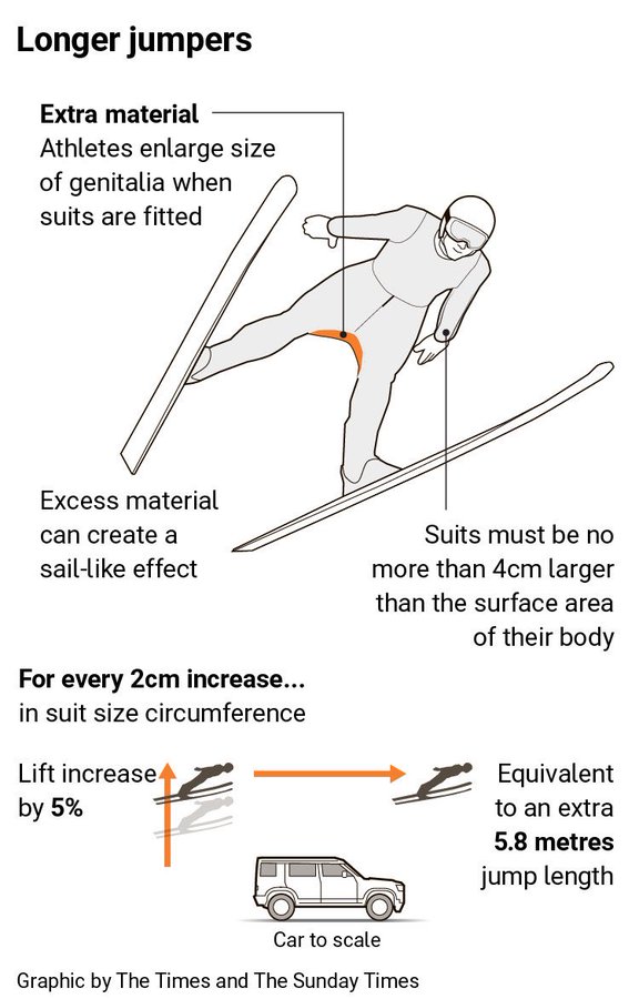
A Matter of Millimetres
Well we have made it to the weekend. And so it is the time to look at the area of men’s genitalia. This week on baseball Twitter the following graphic made the rounds. The graphic itself claims to be from the Times—the original, not the New York version for my American audience—though I have been…
-
Space Is Cool
Well we made it to Friday. One of my longtime goals is to see the aurora borealis, or Northern Lights. My plan for the winter of 2020 was to travel to Norway, maybe visit a friend, and then head north to Tromsø and take in the Polar Night and, fingers crossed, catch the show. Then…
-
The Sun’s Over the Yardarm
After all, matey, ’tis Friday. For those unfamiliar with the expression, what is a yardarm you ask? On traditional sailing vessels the tall thing holding the sail is the mast. Back in the day it was often crafted from a tall tree—see the critical timber industry of New England and the white pines provided to…
-
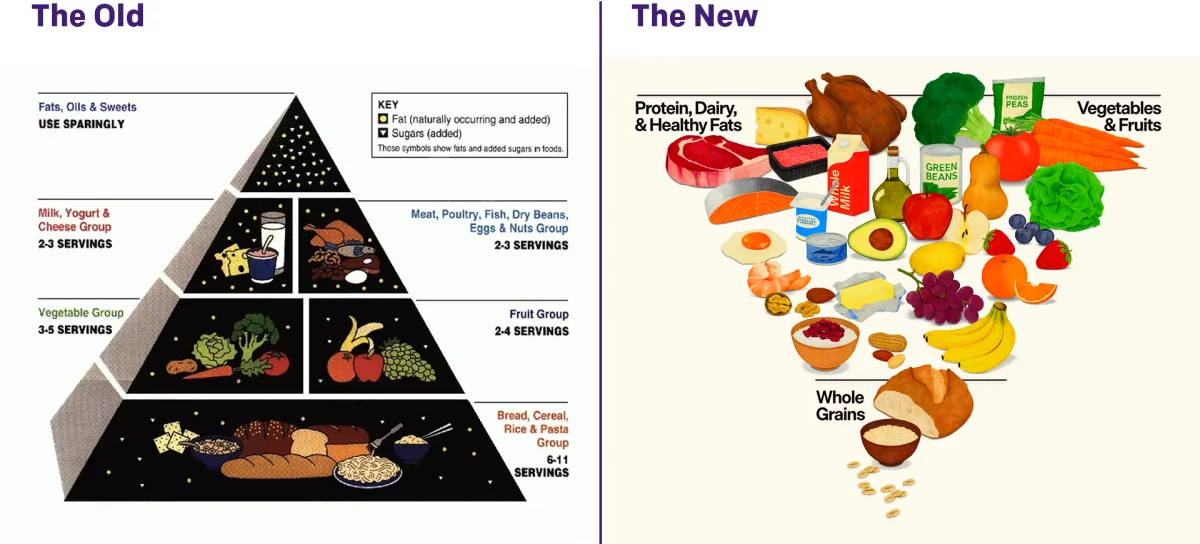
Turning the Pyramid Upside Down
Literally. Last week amongst all the things, the administration released new dietary guidelines, including a brand new food pyramid. The guidelines needed some tweaking as dietary and nutritional science evolves. The administration made a big deal about replacing the old pyramid with the new pyramid, and you can see the comparison here. I am not…
-
Bridging the Difference
When I was a wee lad, I entered the school science fair and made models of different types of bridges. Suspension, cantilever, &c. I saw this a little while back and bookmarked it. As I am trying to get back into the swing of publishing here on Coffee Spoons, it’s time to bring back the…
-
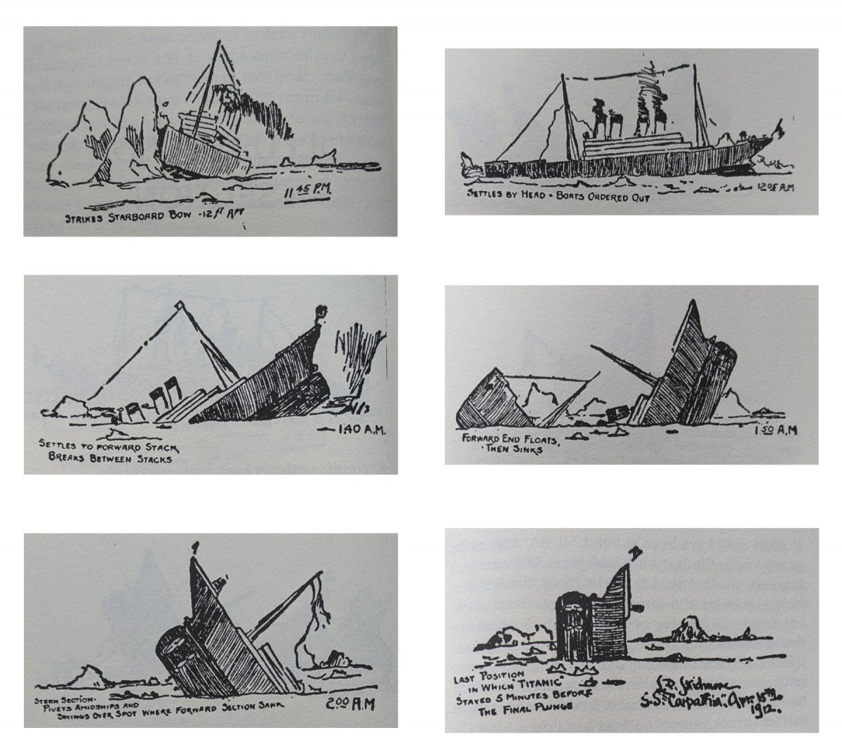
Illustrating the Sinking of RMS Titanic
After all the years of writing and publishing here on Coffeespoons, content centred on the sinking of RMS Titanic remains the most popular. And it was in the early hours of 15 April 1912 when she slipped beneath the surface of the North Atlantic. 700 people survived. 1500 people did not. Titanic’s sinking was the…
-

When Is a Torpedo Is Not a Torpedo?
When it’s a torpedo bat. Last week I looked at baseball’s new torpedo bats in a humourous light. But I did want to take a more serious look, because bat evolution has been part of the tale of baseball since its beginning. Back in the day bats featured long lengths and heavier weights. These days,…
-

Damn the Torpedoes!
Baseball is back and so bring forth the controversies. One of the ones from last week? The torpedo bat. To be clear, the torpedo bat has been around for a few years—it’s not new. However, on Opening Weekend, the Yankees beat up on Milwaukee Brewers’ pitching. But a Yankees announcer specifically pointed out the design…
-

113 Years Later and We’re Still Talking About Watertight Compartments
Earlier this week, a Portuguese-flagged cargo container ship collided with an American-flagged tanker just off the Humber estuary in Yorkshire, England. The American-flagged ship, the Stena Immaculate, carries aviation fuel for the US Air Force. The Solong, the Portuguese-flagged tanker, carries alcohol, which is far better than the toxic chemicals initially feared. We still know…