Tag: pollution
-
Boy, Does That Stink
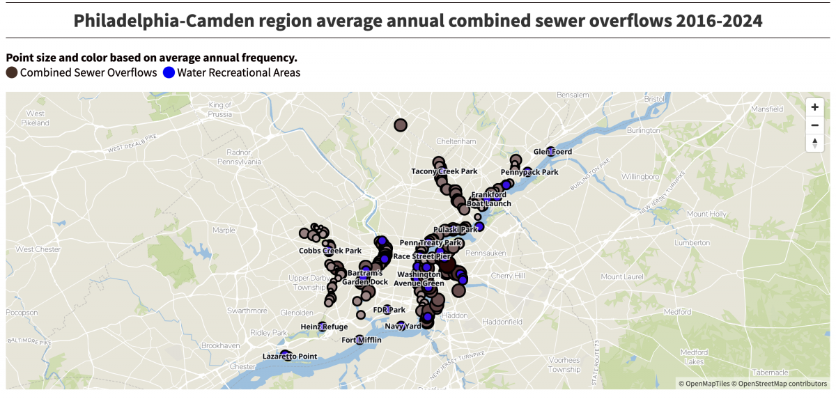
(Editor’s note, i.e. my post-publish edit: The subject matter, not the work.) Last week the Philadelphia Inquirer published an article about the volume of sewage discharged into the region’s waterways over nearly a decade. It cited a report from Penn Environment, which claimed 12.7 billion tons of sewage enter the Delaware River’s watershed. I clicked…
-
Some People Never Had Experience with…
Air is an art project by Marina Vitaglione and written about by the BBC. The project seeks to raise awareness of the air pollution in and around London. She used cyanotypes to capture the pollution in the area. She collected evidence of the pollution in circular areas on paper and then exposed them as cyanotypes.…
-
Auto Emissions Stuck in High Gear
The last two days we looked at densification in cities and how the physical size of cities grew in response to the development of transport technologies, most notably the automobile. Today we look at a New York Times article showing the growth of automobile emissions and the problem they pose for combating the greenhouse gas…