Thankfully today’s forecast calls for cooler temperatures. Your author is not a fan of hot weather, which means being outside in summer is…less than ideal. It also means that the air conditioner runs frequently and on high for a few months. (Conversely, I can probably count on one hand the number of times I turned on the heat this winter.)
The problem is, the two biggest contributors to US carbon emissions? Heating/cooling and transport. In other words, heating your home in the winter, cooling it in the summer, and then driving your non-electric vehicle.
After the recent heatwave in New England, the Boston Globe examined the impact of the heatwave on the environment. The article led with the claim it used four charts to do so. I quibble with that distinction because this is a screenshot of the second graphic.
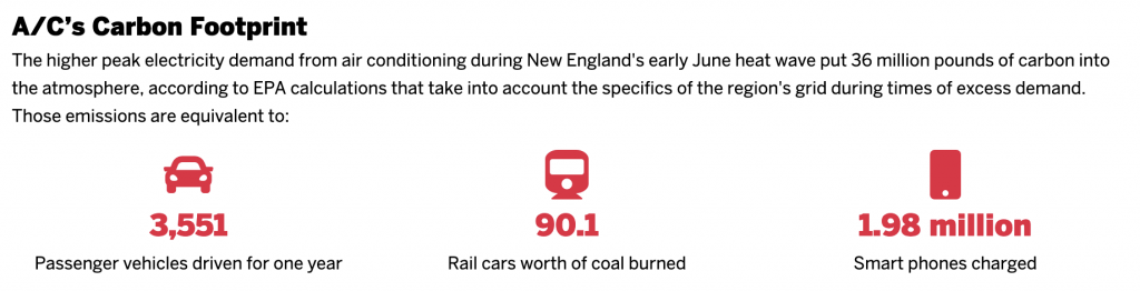
I mean, it’s not prose text. Rather, we have three factettes paired with illustrations. At the top of this post, I mentioned the impact of transport for a reason. In an ideal world, in order to get carbon emissions under control one of the changes we would need to see is getting people out of their personal automobiles and into mass transit. Subways and light rail are far cleaner and can actually be cheaper for households than car ownership. And so we should be encouraging their use and building more of them.
Look above and you’ll see an icon of a subway car. Except it’s not. The graphic/factette is actually talking about rail cars full of coal that transport fuel from mine to generating station. Those look more like this, from James St. James via Wikimedia Commons.

Small, subtle details matter. And so I’d propose a new icon that tries to capture the industrial coal train, ideally something that I spent more than five minutes on.
But it breaks the linkage between passenger train and coal train, which is not ideal for the purposes of an article highlighting the environmental impacts of US households.
That all said, the article did a really good job with the other graphics it used. My favourite was this chart, decidedly not a combination chart.
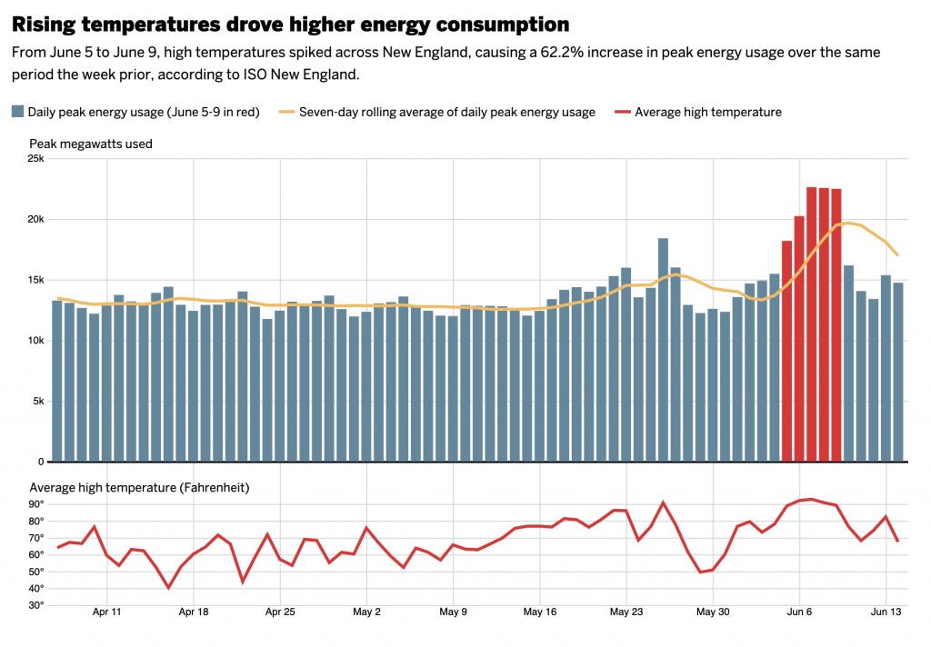
It looks at the correlation between high temperatures and energy usage. But, instead of lazily throwing the temperatures atop the bars, the designers more carefully placed them below the energy usage chart. The top chart should look familiar to those who have been following my Covid-19 charts, a daily number that then has the rolling seven-day average plotted above it to smooth out any one-day quirks. The designer then chose to highlight the heatwave in red.
For temperatures, I like the overall approach. But I wonder if a more nuanced approach could have taken the graph a step farther to excellent. Presently we have a single red line representing daily average high temperature. But in the plot above we use red to indicate the heat wave of early June, five consecutive days of temperatures in excess of 90ºF. What if that line were black or grey or some neutral colour, and then only the heatwave was coloured in red? It would more clearly link the two together. And it avoids the trap of red implying heat, when you need to only go back to late May when the East Coast had early spring like temperatures near 50ºF, decidedly not red on a temperature scale.
Overall, though, it’s refreshing to see a thoughtful approach taken here instead of the usual slapdash throw one chart atop the other.
And the rest of the article uses restrained, smart graphics as well. Bar charts and small multiples to capture air pollution and EMS calls. You should read the full article for the insights and the feedback loops we have.
After all, it’s not that the heating/cooling is itself the problem, especially since the removal of CFCs since the Montreal Protocol in 1987 that banned those pesky chemicals that harm the ozone layer—remember when that was the big environmental issue in the 1990s? The issue is how we generate the electricity that powers the heating/cooling systems—and if you want to use electric cars, whence comes their electric charge—as if we’re using coal plants, that just exacerbates the problem. But if we use carbon-less plants, e.g. nuclear, solar, or wind, we’re not generating carbon emissions.
Credit for the piece goes to John Hancock.
Leave a Reply
You must be logged in to post a comment.