A (Multiethnic) Apple Falls Not Far From The Tree

One of my interests is genealogy/family history. While everyone is certainly more than the sum of their parts, that sum of parts is the history that led to your existence. And I find that notion fascinating.

When looking around the New York Times, I came across this interactive piece about complicated family histories. I am unaware of the exact impetus behind the project, but it probably has something to do with the unfolding US Census results and the increasing number of mixed marriages and thus genealogies. But I cannot say for certain.
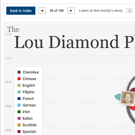
Lou Diamond Phillips Genealogy

The design of the piece is an interesting decision. Instead of a complicated and unwieldy diagram with lots of details, the designers chose to focus merely on photographs, when available, and little, coloured leaves to denote the ethnicity of each individual. This works to a degree in communicating simple ethnic ancestries, however, when one begins to have shades of light blue to distinguish between disparate ethnicities, one can begin to see a flaw in the system.

From an interactive perspective, I certainly think one of the more interesting bits is the inclusion, at least here in Lou Diamond Phillips’ tree, is the inclusion of the audio story as recounted by an individual. It brings a level of human connection that is always lost in diagrams. (Although these diagrams do have softer, curvier lines than most ergo they are more human. No?)

As someone interested in genealogy, the details are a bit light—but that was not likely the main intent of the piece. Beyond that, there are privacy issues with which to contend. But, if you wish, the New York Times does allow you to upload your own tree and even audio—to 10 megabytes. Perhaps in the future I shall upload a simple version of mine.

All in all, an interesting piece.

The Candidate Says Tweet Tweet

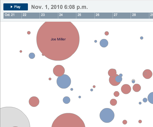
Yesterday, the New York Times released this interactive piece to look at the popularity of particular candidates in that seemingly ubiquitous world of Twitter. Perhaps it was inevitable that the Times or somebody else would create something like this. Regardless, it is out there and I have to say, I am left confused.

A cropping of the interactive piece.

No, not by the how it works. I understand that more activity makes for larger bubbles. (Although at this point I shall refrain from my usual diatribe on bubbles.) And if you click on a particular bubble/candidate, the vector and colour of the little bubbles describes the type of activity. Understand? Check.

But why are the bubbles placed where they are on the screen?

Perhaps the rationale is explained somewhere…but I have yet to find it. And after sitting down with a colleague yesterday, the two of us could not quite figure it out. Vaguely one gets the impression of representing actual geography—except for things like Delaware being in the bottom corner. Perhaps the bubbles’ centre points are randomly generated? They do not appear to be on separate loads of the Flash piece.

And so I am left with the thought that the bubbles are a needless distraction and, in fact, lead to greater confusion. What if, for example, the candidates were not bubbles but bars? The bars would create a visual rhythm as they grow and shrink and each could be clickable. One could sort the bars by some sort of a hierarchy: alphabetic, geographic, political, &c. You could even still click on a bar for more detailed views and perhaps do some other neat things.

I am just left scratching my head on this one.

It’s Hard to be a Saint in Hell

Perhaps the 21st century version of the Pentagon papers, the ‘War Logs’, as they are being called, consist of some 90,000 classified documents centring on the Afghanistan War. While they do not paint a necessarily different picture from what is known publicly, the War Logs do provide interesting glimpses into the war, a war that, like any other, is a messy and ugly business despite the polish of design, propaganda, and the media.  To put it differently and perhaps in another sense, the War Logs offer depth down to the ground-level, unpleasant details of warzone combat. But the documents lack an overall, strategic-level—I daresay antiseptic—breadth of understanding. The War Logs suffer from a lack of the broader context—but they do provide useful and interesting stories, vignettes, and anecdotes that flesh out the story we all broadly know.

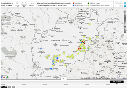
The Guardian is one of three main newspapers that received the leaks in advance; the others were the New York Times and Germany’s Der Spiegel. And one of the things the Guardian did was create an interactive piece exploring improvised explosive devices (IEDs) and where and when they occurred in Afghanistan from 2004 to 2010.

While I understand the use of Google maps, I always see the map as a distraction. For example, why in a story about Afghanistan do I need to see a map that includes the small cities of India. To some degree, the same can be said about the bordering countries like Iran and Pakistan—but as those countries are along the border and are to varying degrees involved in the action, their inclusion can be understood on a case-by-case basis.

Guardian Piece on IEDs

Choice of map aside, the piece  highlights the detonation of IEDs as circles whose area reflects the number of casualties. The colour of each circle represents which ‘group’ of people had the most casualties: civilians, Coalition soldiers, or Afghan soldiers. However, by reducing the data to a single circle of a single colour, we lose the potential added depth of breaking down the event into the deaths of soldiers and civilians alike. Do I have an instant solution on hand? No. But I do note that if one clicks on the specific event, a window appears that breaks down the event into said figures.

One of the more interesting things about this whole story is that at least the Guardian is putting out the data as a spreadsheet. Perhaps in the near to intermediate future those with the time and inclination will take that information and make something truly interesting for the public’s consumption.

Oil and Water

We all know about the BP oil spill in the Gulf of Mexico and so there is no need to rehash what has already been said. However, I do want to point out the continuing and evolving coverage from the New York Times. At the outset they located the spill on a map and began to add interactivity to the map in order to show change over time.

When I returned to the NYT for the latest—after admittedly more than a few days away—I discovered that an interactive supplemental to news articles had transformed into an interactive article in a sense. The story is broken into different chapters or components and each of these chapters uses graphics or photographs or videos to explain just what is going, what happened, and what the effects may be.

The site is worth checking out, though it shall take more than a few minutes to read and look through. But it evidences how the smart use of charts, graphics, and photos can be combined with well written prose to tell a great—or in this case perhaps tragic is more the word—story.

The New York Times' Latest Update