Perhaps the 21st century version of the Pentagon papers, the ‘War Logs’, as they are being called, consist of some 90,000 classified documents centring on the Afghanistan War. While they do not paint a necessarily different picture from what is known publicly, the War Logs do provide interesting glimpses into the war, a war that, like any other, is a messy and ugly business despite the polish of design, propaganda, and the media. To put it differently and perhaps in another sense, the War Logs offer depth down to the ground-level, unpleasant details of warzone combat. But the documents lack an overall, strategic-level—I daresay antiseptic—breadth of understanding. The War Logs suffer from a lack of the broader context—but they do provide useful and interesting stories, vignettes, and anecdotes that flesh out the story we all broadly know.
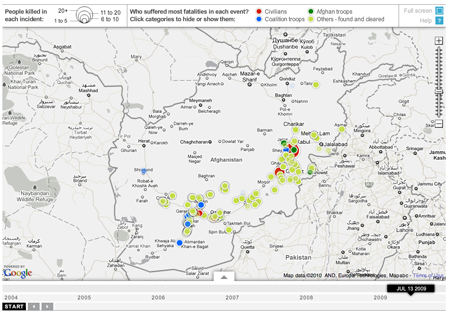
The Guardian is one of three main newspapers that received the leaks in advance; the others were the New York Times and Germany’s Der Spiegel. And one of the things the Guardian did was create an interactive piece exploring improvised explosive devices (IEDs) and where and when they occurred in Afghanistan from 2004 to 2010.
While I understand the use of Google maps, I always see the map as a distraction. For example, why in a story about Afghanistan do I need to see a map that includes the small cities of India. To some degree, the same can be said about the bordering countries like Iran and Pakistan—but as those countries are along the border and are to varying degrees involved in the action, their inclusion can be understood on a case-by-case basis.

Choice of map aside, the piece highlights the detonation of IEDs as circles whose area reflects the number of casualties. The colour of each circle represents which ‘group’ of people had the most casualties: civilians, Coalition soldiers, or Afghan soldiers. However, by reducing the data to a single circle of a single colour, we lose the potential added depth of breaking down the event into the deaths of soldiers and civilians alike. Do I have an instant solution on hand? No. But I do note that if one clicks on the specific event, a window appears that breaks down the event into said figures.
One of the more interesting things about this whole story is that at least the Guardian is putting out the data as a spreadsheet. Perhaps in the near to intermediate future those with the time and inclination will take that information and make something truly interesting for the public’s consumption.
Leave a Reply
You must be logged in to post a comment.