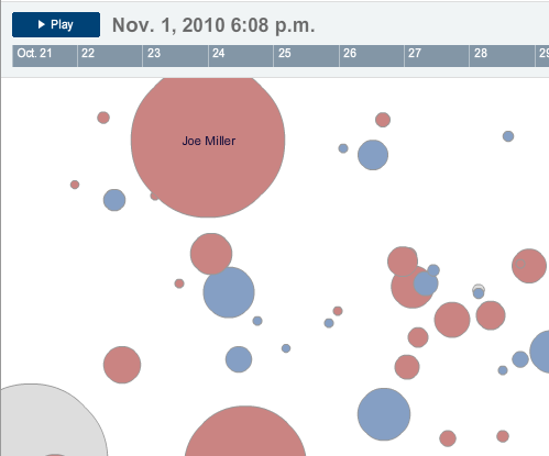
Yesterday, the New York Times released this interactive piece to look at the popularity of particular candidates in that seemingly ubiquitous world of Twitter. Perhaps it was inevitable that the Times or somebody else would create something like this. Regardless, it is out there and I have to say, I am left confused.

No, not by the how it works. I understand that more activity makes for larger bubbles. (Although at this point I shall refrain from my usual diatribe on bubbles.) And if you click on a particular bubble/candidate, the vector and colour of the little bubbles describes the type of activity. Understand? Check.
But why are the bubbles placed where they are on the screen?
Perhaps the rationale is explained somewhere…but I have yet to find it. And after sitting down with a colleague yesterday, the two of us could not quite figure it out. Vaguely one gets the impression of representing actual geography—except for things like Delaware being in the bottom corner. Perhaps the bubbles’ centre points are randomly generated? They do not appear to be on separate loads of the Flash piece.
And so I am left with the thought that the bubbles are a needless distraction and, in fact, lead to greater confusion. What if, for example, the candidates were not bubbles but bars? The bars would create a visual rhythm as they grow and shrink and each could be clickable. One could sort the bars by some sort of a hierarchy: alphabetic, geographic, political, &c. You could even still click on a bar for more detailed views and perhaps do some other neat things.
I am just left scratching my head on this one.
Leave a Reply
You must be logged in to post a comment.