This post comes to us from eBay via cnet. Ebay does a wonderful thing, it fills in the gaps in the marketplace. If you live in, say, the Netherlands, and want something that is available only in the United States, chances are you might find somebody willing to sell it to you from the US.
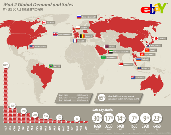
Among those things that people want are iPad 2s. So here eBay has put together an infographic about their sales of iPad 2s from US sellers to foreign buyers.

I must admit to being a bit underwhelmed here. Maps are great and all, but here this map adds nothing to the story except that I can now identify where Poland is. It’s an island country north of Belgium. Or is that France? Wait, what is this lonely sticker-tag for the United Kingdom out in the Atlantic? The data encoded in the map is already present in the datagraphic, if you look to the bar chart of iPad shapes in the lower left quadrant.
But the bar charts do confuse me, I very rarely like using symbols of things for measuring precise numbers of things when those symbols of things represent a number of things more than just one thing. (And that is about as confused as I feel.) And then on another level, I have to strain for a moment to figure out what these three-letter identifiers are. As it just so happens, there is a standardised set of country abbreviations in both two and three letters. When I see UNK, I immediately think Unknown. And RSS makes me think of RSS feeds. Neither connects me to the United Kingdom or Russia.
In the bottom right is the breakdown of sales by model type. Here, where the treatment is simpler we see more success at clearly communicating the information. Could it be more succinct and a touch better organised, yes. But, in all, this is clear and effective. Ergo, it works.
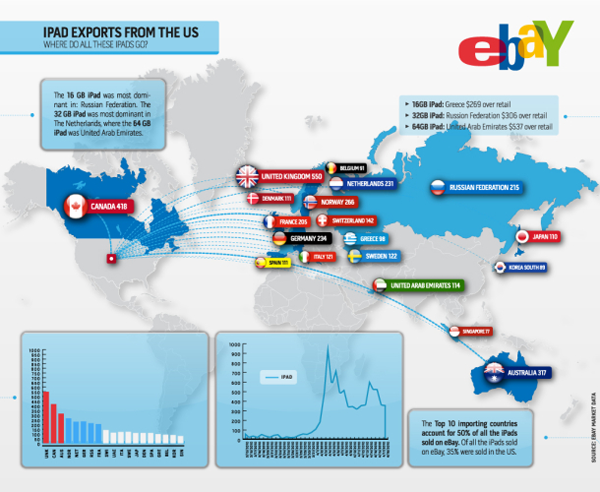
Interestingly, cnet also posted the previous year’s infographic by eBay for sales of the first iPad.

Very loosely (and quickly), I think it is more successful and tells more data. The data on the map, like this year’s, need not be communicated by a map, that much is true—why are the countries two shades of blue, I have no idea if that encodes data. However, the same data is also duplicated in the chart in the lower left quadrant, but here far more succinctly and far more accurately than by weird symbols of the iPad. Last year’s infographic is missing the breakdown by model type, however, instead of those six datapoints, here we have a timeline of iPad sales that, it is safe to say, references more than six datapoints.
In a sense, eBay took a step backwards in their infographics. A pity, because one imagines that if they have the sales data for time periods, they probably have other sets of data that would make for an interesting and richer piece.
Credit to the designers at eBay and cnet for posting the article.
