Today’s post clearly fits within the storyline of mapping, redistricting, and gerrymandering over the last week or so, but the work is a bit older. (Side note, the previously highlighted Pennsylvania 7th Congressional District, well it is in the news for a different story, its congressman just announced he would not be standing for reelection because of a sexual harassment case.)
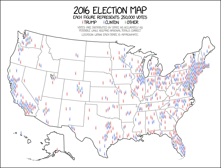
We have the work of xkcd presenting the 2016 election results, but by mapping out the votes (approximately) in terms of 250,000 voters. It does a good job of showing you just where the population of the United States is concentrated (and vice versa).
I am somewhere within that enormous cluster of stick people in the lower-upper-middle right of the map…
Credit for the piece goes to Randall Munroe.
Author: Brendan Barry
I am a graphic designer who focuses on information design. My day job? Well, they asked me not to say. But to be clear, this blog is my something I do on my own time and does not represent the views of…my employers. I think what I can say is that given my interest in information design—be it in the shape of clear charts, maps, diagrams, or wayfinding systems—I am fortunate that my day job focuses on data visualisation. Outside of work, I try to stay busy with personal design work. Away from the world of design, I have become an amateur genealogist and family historian. You will sometimes see that area of work bleed into my posts.
View all posts by Brendan Barry