Earlier this month I wrote-up a piece from the Economist that looked at 2018 GDP growth globally. I admitted then—and still do now—that it was an oddly sentimental piece given the frequency with which I made graphics just like that in my designer days of youth and yore. Today, we have the redux, a piece from the New York Times. Again, nothing fancy here. As you will see, we are talking about a choropleth map and bar charts in small multiple format. But why am I highlighting it? Front page news.

I just like seeing this kind of simple, but effective data visualisation work on the front page of a leading newspaper.
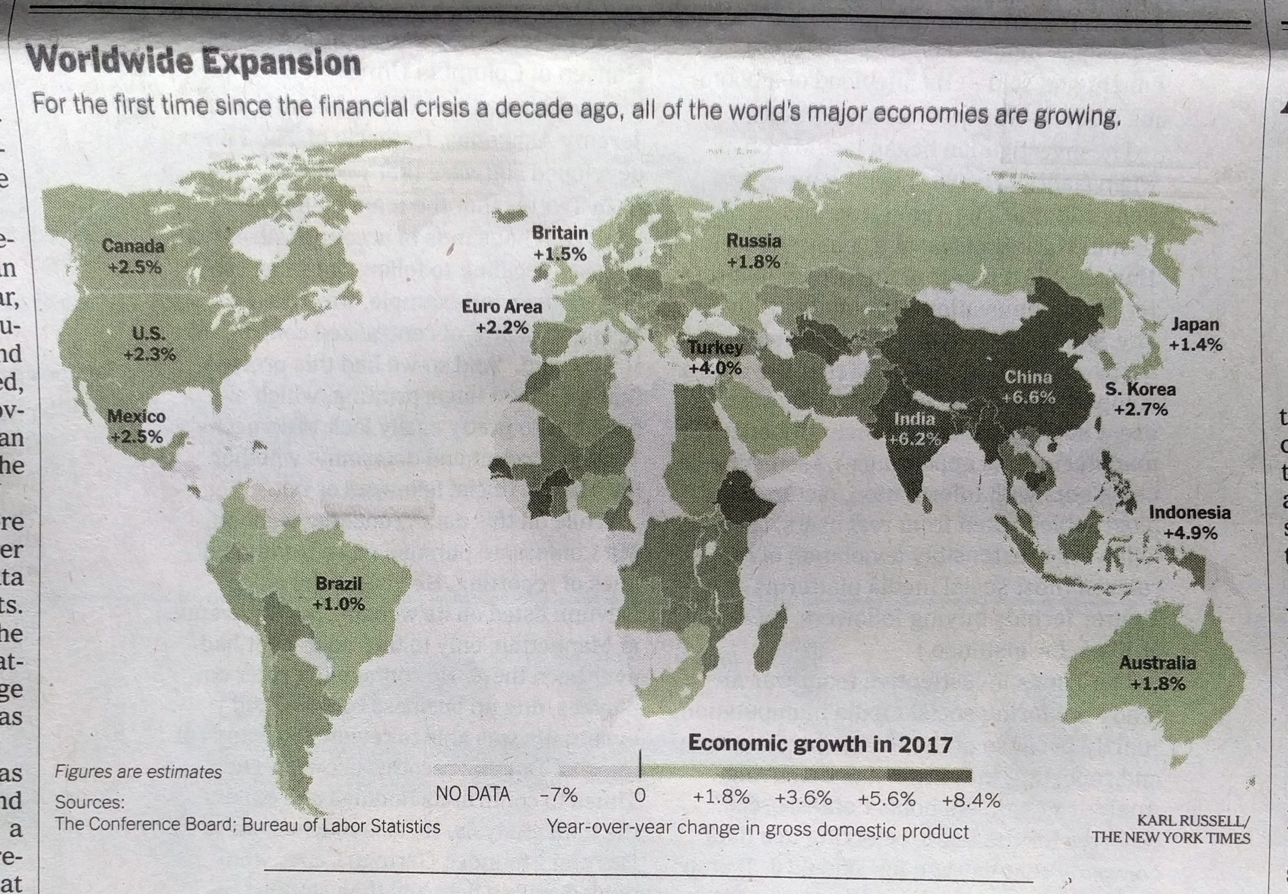
I personally would have used a slightly different palette to give a bit more hint to the few negative growth countries in the world—here’s lookin’ at you, Venezuela—but overall it works. And the break points in the bin seem a bit arbitrary unless they were chosen to specifically highlight the called-out countries.
Then on the inside we get another small but effective graphic.
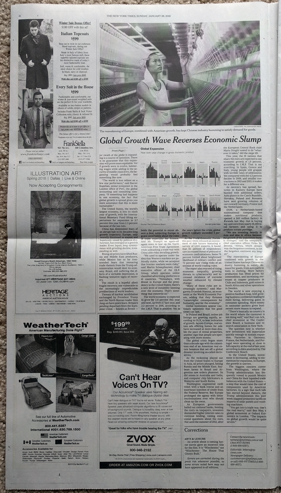
It doesn’t consume the whole page, but sits quietly but importantly at the top of the article.
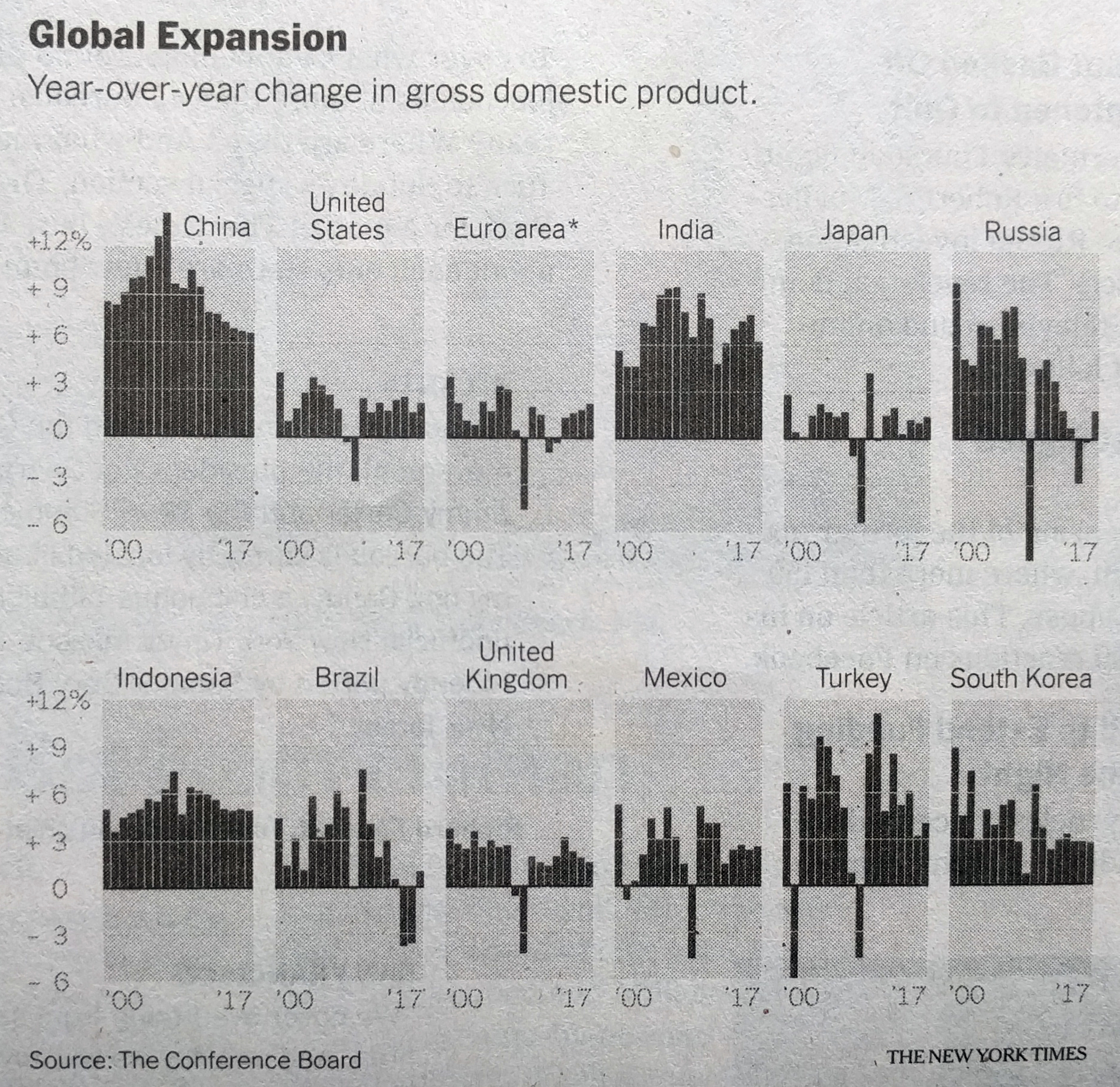
There the small multiples show the year-on-year change—nothing fancy—for the world’s leading economies. A one-colour print, it works well. But, I particularly enjoy the bit with China. Look at how the extreme growth before the Great Recession is handled, just breaking out of the container. Because it isn’t important to read growth as 13.27% (or whatever it was), just that it was extremely high. You could almost say, off the charts.
Overall, it was just a fun read for a Sunday morning.
Credit for the piece goes to Karl Russell and the New York Times graphics department.
Leave a Reply
You must be logged in to post a comment.