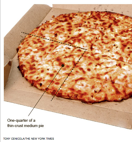
I love pizza. I think most people do too, though, we can all disagree on whether thin crust or thick crust is better. Yet as someone who has now eaten both…well…I shall not wade into the matter. But, I will toss up this piece from the New York Times.

The paper has an article about Domino’s adding more cheese to their pizza to increase sales as part of a plan from a US government-supported agency. At the same time, the US government is also trying to reduce the amount of saturated fats consumed to reduce obesity. And of course cheese contains saturated fat.
Naturally, the supporting graphic should make use of pizza. And in what better form than as a pie chart.
Though having now been looking at this for quite some time, I am in the mood for pizza. Though I could do without the saturated fat…
Leave a Reply
You must be logged in to post a comment.