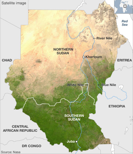
For those who may not be aware, part of Africa’s largest country is holding a referendum on whether it should remain a part of Sudan or secede and become an independent state, Southern Sudan—though one wonders if they would not come up with a different name. About 2005 a peace agreement all-but-ended a decades-long civil war in Sudan and as that violence subsided the attention in Sudan shifted to Darfur. The terms for the peace deal included a referendum on independence for Southern Sudan, long since joined with the northern half of Sudan as part of a British colony in Africa to control the Nile River.

The two halves of the country were and are very much different and the BBC has used maps to highlight these differences. The problem is that there are oil fields along the proposed border and a disputed region, called Abeyi, has significant deposits of its own. And so the question of who controls the oil and thus the money and the power remains. That, however, is a story for another post. This is just to highlight the maps.
Overall, not bad. I find using the different hues for the different subject matters a smart idea. The shift forces the audience to focus on the change in meaning, which is very important if the shape of the coloured area is not otherwise changing. That said, the infant mortality choropleth uses too great a shift in hues between data bins when compared to the water, education, and food security maps. The oil field map, while not necessarily a data-heavy map in the same way as the choropleths, is a nice bookend to what started the series, i.e. the satellite view. These highlight the sheer environmental and, in a fashion, economic differences between the two regions of Sudan.
I find the ethnic groups map, however, the most difficult to fit into the series. Certainly from a subject matter it is the most important. However, the colours chosen to represent the various ethnic groups seem disparate. The southern Dinka, for example, are represented as an olive-green whereas the northern Beja are more of a bluish-green. I think a better solution would have been to keep the three main groups, i.e. the Arabs, Northern Sudan, and Southern Sudan, and then assign each a different hue, for the sake of an example say the three primary colours. Then within those groups, different tints for the various but related ethnic groups. This would highlight the various ethnic groups existing across Sudan, but show the geographic split between the two groups.
Overall, a good effort from the BBC to highlight the stark differences between Northern and Southern Sudan.
Leave a Reply
You must be logged in to post a comment.