My co-worker, Ben, who is far more knowledgable about cars than myself, brought the following to my attention.
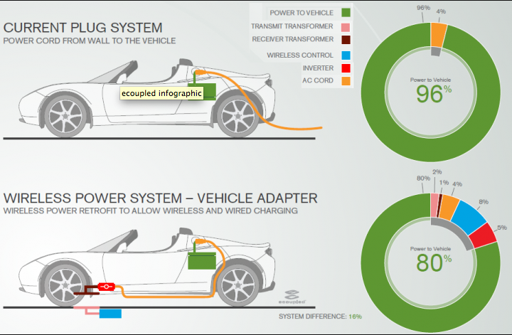
At the Consumer Electronics Show we always get to see the latest in cool, new, must-have toys. This year, however, a company called Fulton Innovations displayed a proof-of-concept, wireless charging-station for electric vehicles. And while one must wonder about the conservation and inefficiencies of such a powering station, Fulton provided information on just how efficient their system would be. In the form of graphics.

And by and large, they are not bad. Yes, yes, the pie charts could be substituted for something else. But, I do like linking the colours in the pie chart to the parts in the power-system located in the diagram of the car. They help to explain just where exactly the inefficiencies in the system are to be found. And by providing the base of the plugged-in car, they also allow one to compare the two methods of wireless charging to that of plugging the vehicle in.
Leave a Reply
You must be logged in to post a comment.