Tag: science
-
To the Moon and Beyond 2: Just Passing By
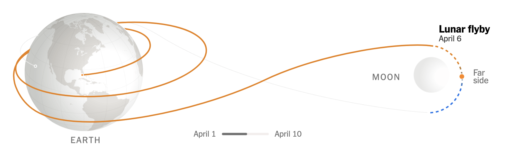
Today’s post was what I alluded to on Friday, thinking it was a fit then but realising perhaps it fit better here because of what a lot of graphics show when it comes to Artemis II and mankind’s return to (the orbit of) the Moon. Most graphics typically show the elongated eight track with the…
-
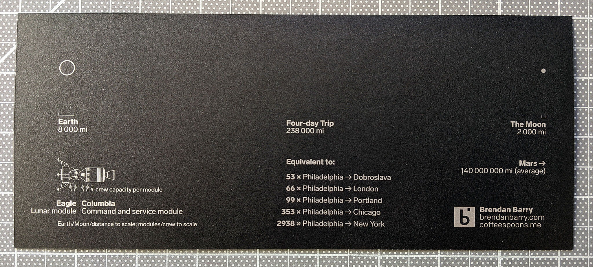
To the Moon, and Beyond!
At least a little beyond. Like the orbital height beyond. For those unaware, if the weather holds, later this evening East Coast time, NASA will launch the Artemis II mission from Cape Canaveral with the intention of sending a crew of four astronauts—three Americans, one Canadian—to the Moon. The last man on the Moon was…
-
L2 Halo for JWST
Yesterday I received a question about where the new James Webb Space Telescope is located. Is it in orbit of the Earth, like Hubble? Is it out in deep space? The answer is no, not really. Now I spent this morning trying to illustrate the answer to that question myself. However, it’s taking me too…
-
Those Quirky Quarks
Last week scientists working at the Large Hadron Collider in Switzerland announced the discovery of new sub-atomic particles: a pentaquark and tetraquarks. This BBC article does a really good job of explaining the role of quarks in the composition of our universe, so I encourage you to read the article. But they also included a…
-
Black Holes and Revelations: Remastered
Two years ago I posted about how the Event Horizon Telescope Collaboration managed to take the first photograph of a black hole, in particular a supermassive black hole at the centre of the M87 galaxy, one of those galaxies far, far away that we see at a long time ago. This morning, the same group…
-
The Continents Will Fall Off the Flat Earth
To be clear, we know the Earth is round. At least most people know that. Some people delude themselves. We also know that sitting atop the mantle we have plates of rock that move around. Sometimes they slip underneath others. Other times they collide and crumple. Plate tectonics explain why there are so many similarities…
-
Let There Be Light
In several decades… Just a quick little piece today, a neat illustration from the BBC that shows how the process of nuclear fusion works. The graphic supports an article detailing a significant breakthrough in the development of nuclear fusion. Long story short, a smaller sort-of prototype successfully proved the design underpinning a much larger fusion…
-
Even Older Family Trees
Yesterday we looked at a graphic about an old family tree, revealed by ancient DNA. But at the end of the day it is a family tree of descent for a human male. But mankind itself fits within a kind of family tree, the circle family tree of life. The tree of life continues to…
-
Space: The Final Frontier
We’re back after a nice holiday break. And one of the most fascinating things to happen was the successful—and seemingly easy, more on that in a bit—launch of the James Webb space telescope. The James Webb was developed by NASA with contributions from both the European Space Agency (ESA) and the Canadian Space Agency (CSA).…
-
Mt Greylock Cross Section
I spent the better part of the last two weeks travelling and hanging out in the Berkshires and Connecticut River Valley in western Massachusetts. One of the coolest experiences was driving up the automobile route for Mt Greylock, the tallest point in Massachusetts. Most of the drive itself was just regularly spectacular as the mid-morning…