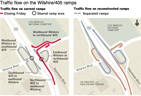
This is certainly not the largest, nor the most glamorous infographic. But to drivers in Los Angeles, probably a very useful one. It is a diagram of forthcoming changes to a series of on- and off-ramps to Interstate 405 and Wilshire Boulevard.

Simple things like having a dangerous red for the soon-to-be-closed ramps set against the calmer, desaturated colours of the safer, separated ramps of the future highlight the important area of the shared lanes. I probably would have called those areas out with something more than a black, many-pointed star, but it does still work.
Credit for the piece goes to Tia Lai and Anthony Pesce.
Leave a Reply
You must be logged in to post a comment.