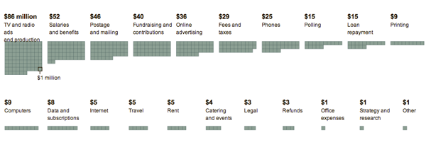
Over the weekend, the New York Times looked at how the Obama campaign has been spending its cash.

I appreciate the value in these sort of block charts, but, I wonder if a bar chart would not have been more clear for the comparison. I like the block charts when the designer is rearranging the data in different ways. For example, if the data set also included when the cash was spent, the blocks could be re-ordered into a day by day or month by month analysis.
Leave a Reply
You must be logged in to post a comment.