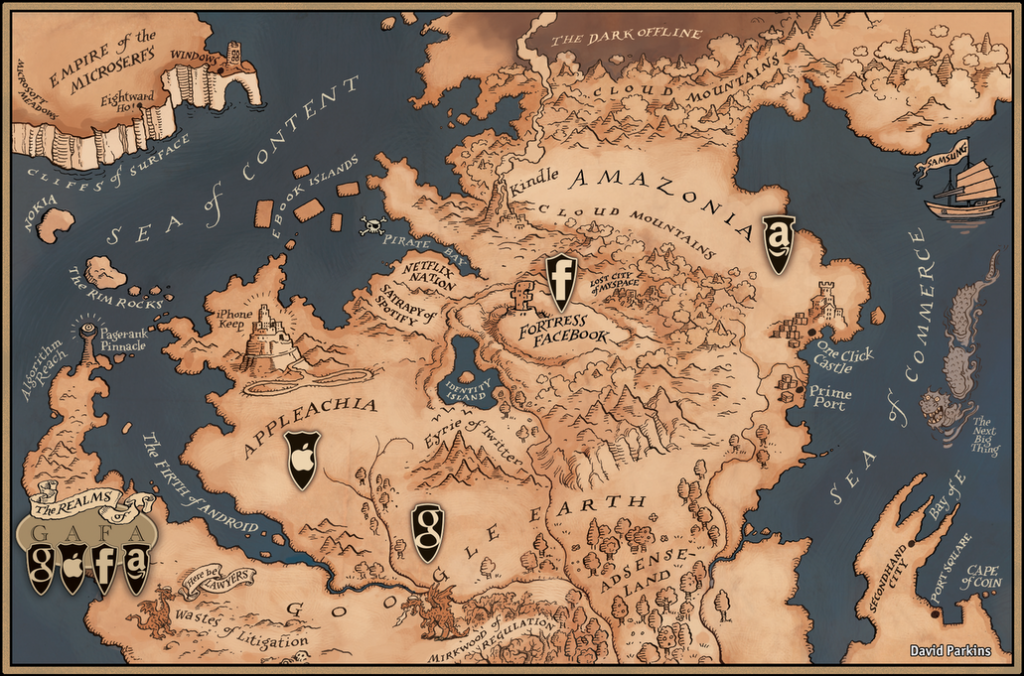
The Economist often does clear, concise graphics to accompany their articles. And from to time they also do more interactive works that allow a more in-depth exploration of data. And then sometimes they do awesome maps like this. The realms of GAFA.

Credit for the piece goes to David Parkins
Leave a Reply
You must be logged in to post a comment.