Let’s face it, governments need money to function. If you want a large military, you have to fund it. If you want pension system, you have to fund it. If you want medical care for the old, the sick, and the poor, you have to fund it. If you want to give everyone unicorns made of rainbow beams, you have to fund it. And…well…nevermind.
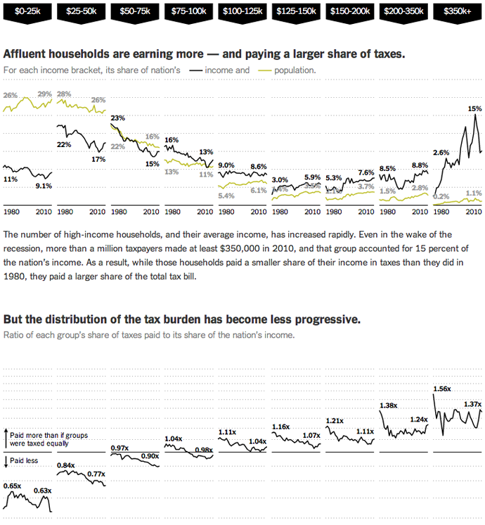
The point is taxes. After an election that focused so heavily on them, we’re still debating them. But here are some facts about them from the New York Times. The designers, Mike Bostock, Matthew Ericson, and Robert Gebeloff used small multiples of line charts—and lots of them—to look at who pays taxes by income band and how they pay different types of taxes. I found particularly interesting the points made near the bottom of the piece about how the progressive tax system is increasingly less so.

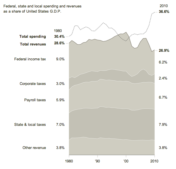
But how do these taxes compare to spending? In a separate graphic for the same article, a stacked bar chart compares revenue to expenditure. With the exception of the balanced budget during President Clinton’s administration, we have been outspending our revenue since 1980. While statements to the effect of the US national budget needs to be managed like a US household budget are both overly simplistic and naive, there is a truth in a long-term mismatch between revenue and expenditure might cause problems. That is why many see the deficit and our debt as a medium-term problem facing the United States.

Credit for the first piece goes to Mike Bostock, Matthew Ericson, and Robert Gebeloff.
Leave a Reply
You must be logged in to post a comment.