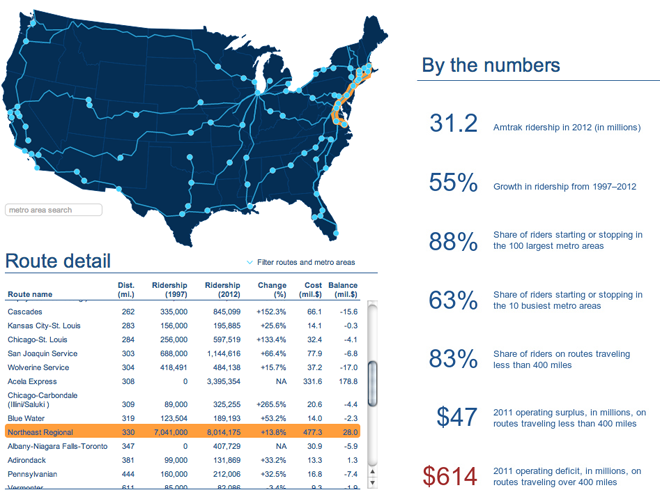
The Brookings Institution released a report investigating the ridership of Amtrak’s various routes in an attempt to identify ways of cutting costs. They also released an interactive piece along with the report that pairs a map with a simple table.
Highlighting a route in the table highlights the route in the map and links the two together for the user. Clicking a dot on the map shows the details for the metropolitan area ridership along with the total number of stations. Lastly, because the table is sortable, the user can identify for themselves the conclusion reached by the report. To become solvent, Amtrak should divest itself of its long-haul routes that run at significant losses and focus on the profitable routes that could subsidise the popular though still minor loss-making routes.

Credit for the piece goes to Alec Friedhoff.
Leave a Reply
You must be logged in to post a comment.